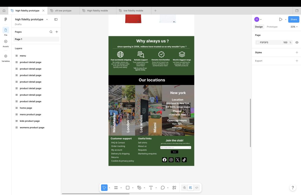
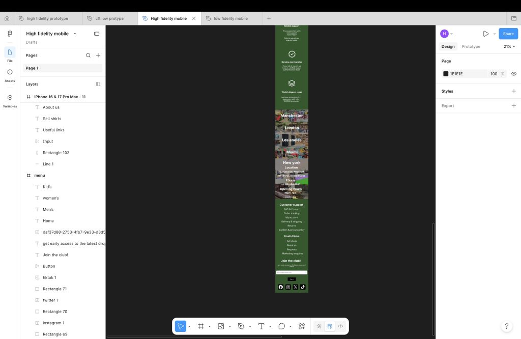
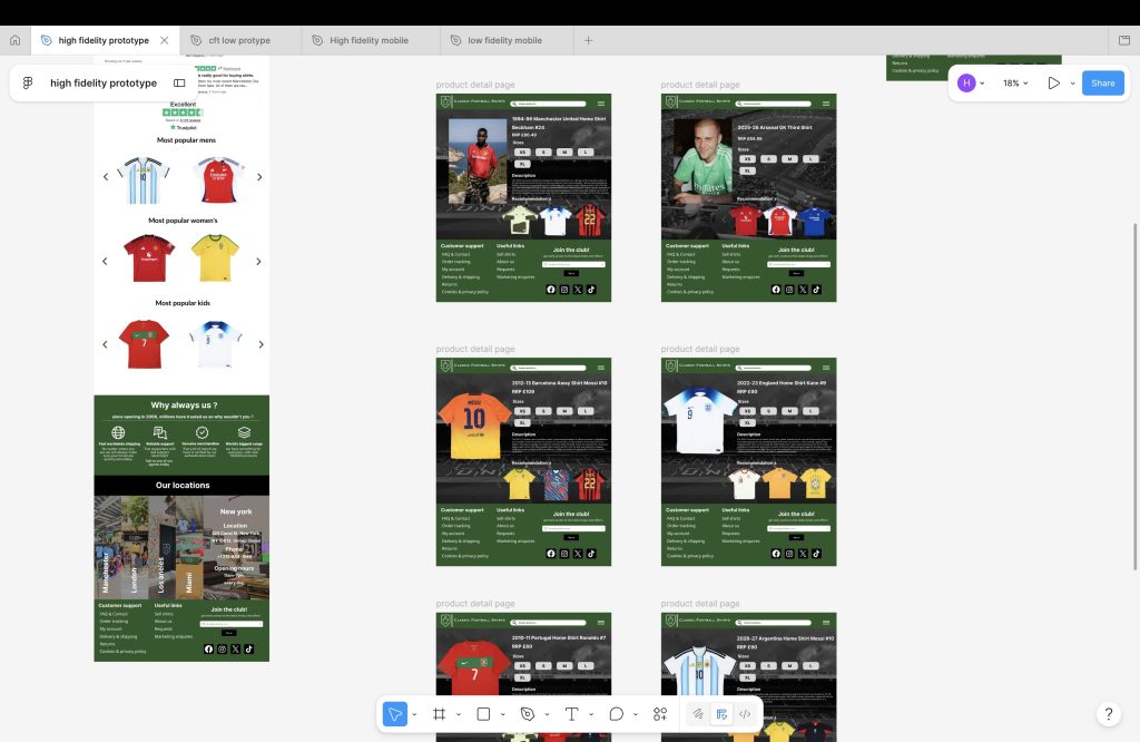
At the start of making the prototypes I did some quick sketches of what I wanted the layout to be like, I wanted simple, easy to navigate and also have touch of this own unique from the original website , some parts of the layout for the website for laptop has a few parts on the home page that look very similar to what they already have such as the locations part at the bottom of the home page, I like how it looks and think oit suits the website much and I didn’t want to make an website that doesn’t have anything at all from the original because it can confuse people who have used the website before and know it well.
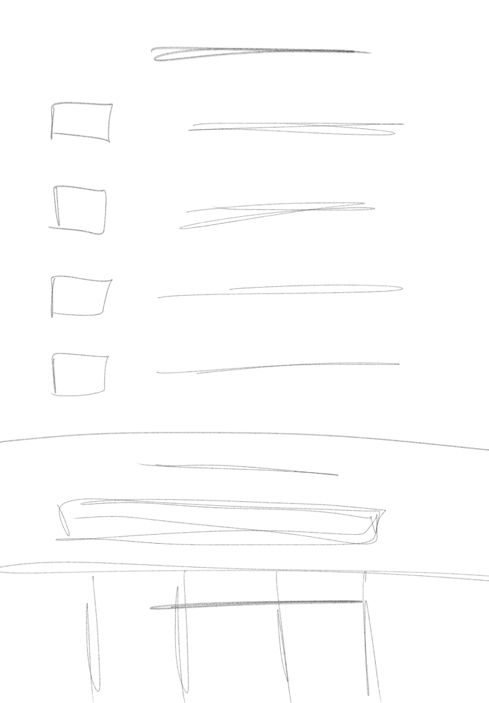
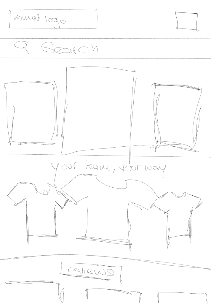
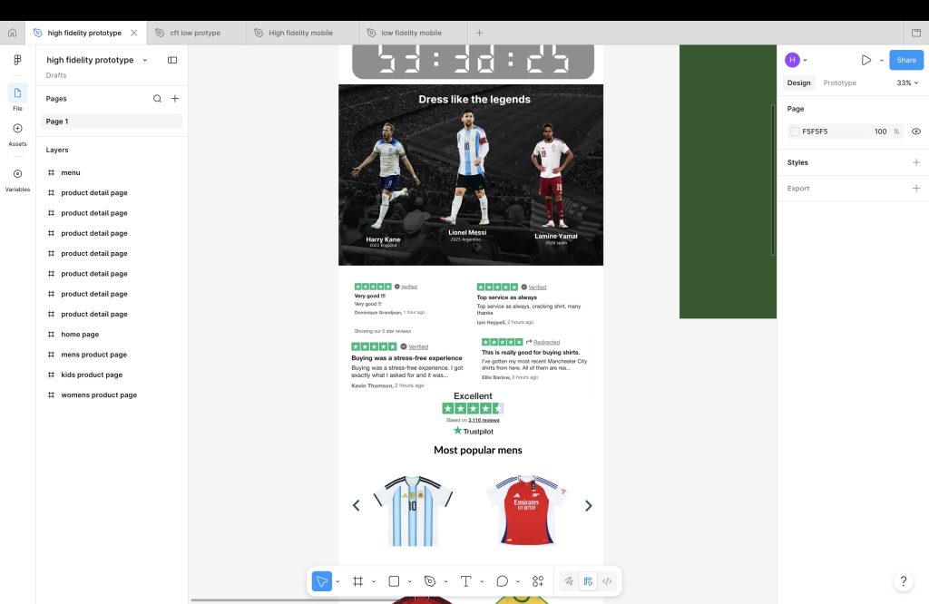
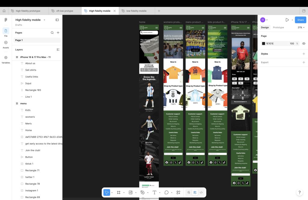
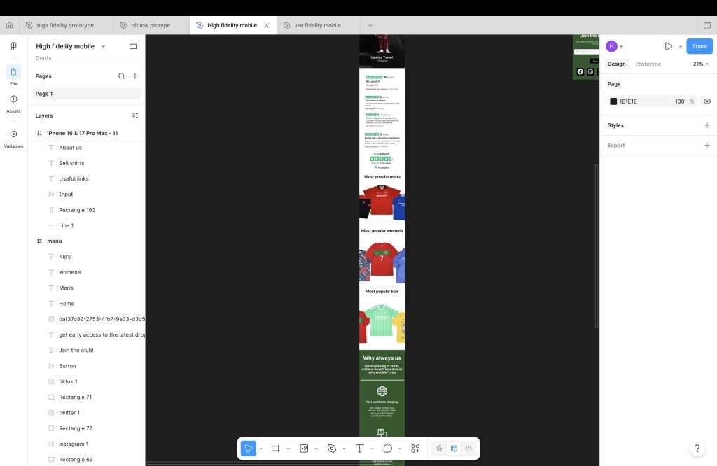
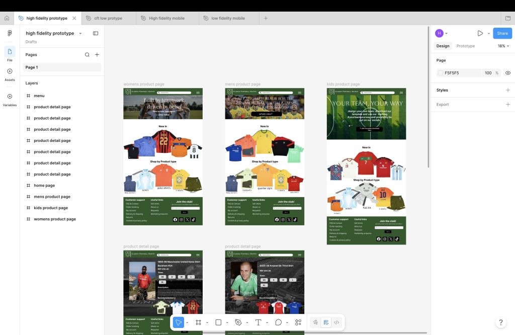
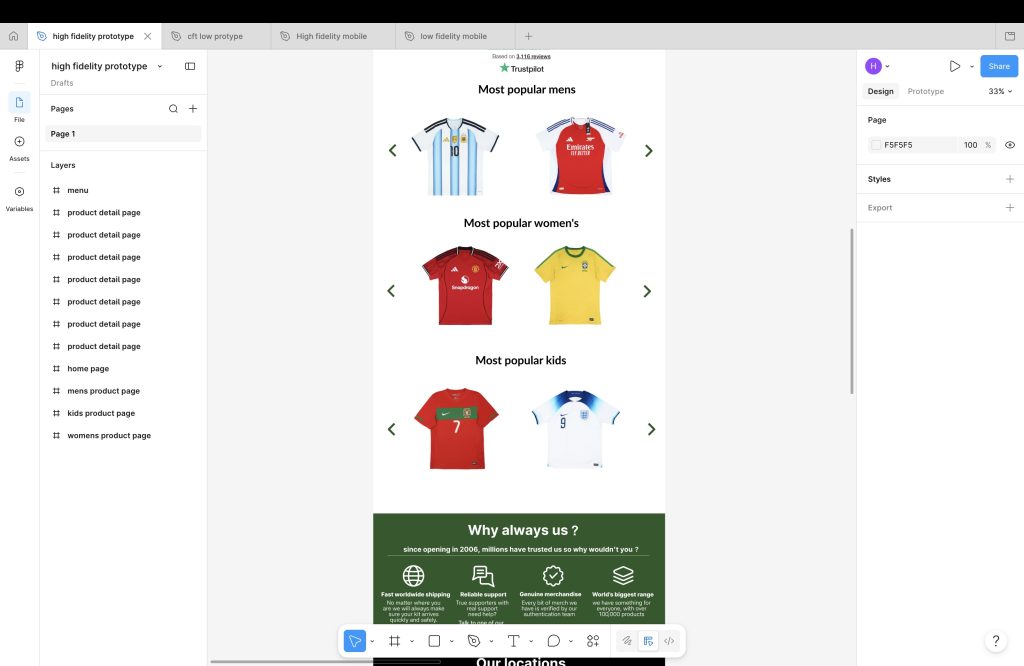
At the top of the website will be a countdown of the world cup and popular footballers underneath promoting the shirt they are wearing and what year its from, also be showing most popular for men, women and kids , why to shop with us , newsletter and more.
At the top of the website will be a countdown of the world cup and popular footballers underneath promoting the shirt they are wearing and what year its from, also be showing most popular for men, women and kids , why to shop with us , newsletter and more.
The layout page for products is quite simple and nice the effect would be a slide like effect when your mouse is on one side of the page the clothes will move and one part will be for new items and the other will be for product type. I wanted the new website to be more simple and easy as the old one just has too many pages and can become annoying to find what you want.
With fonts I choose an very simple and easy to understand font, there is nothing wrong with the current fonts on the website they already have and my fonts are quite similar, colour pallet is also quite similar as I think green suits it well because of a green football patch for example. The first thing I think of when it comes to football is the big green football field
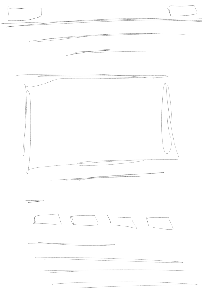
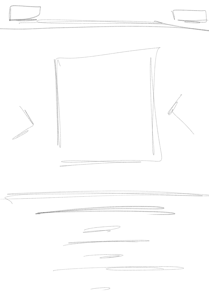
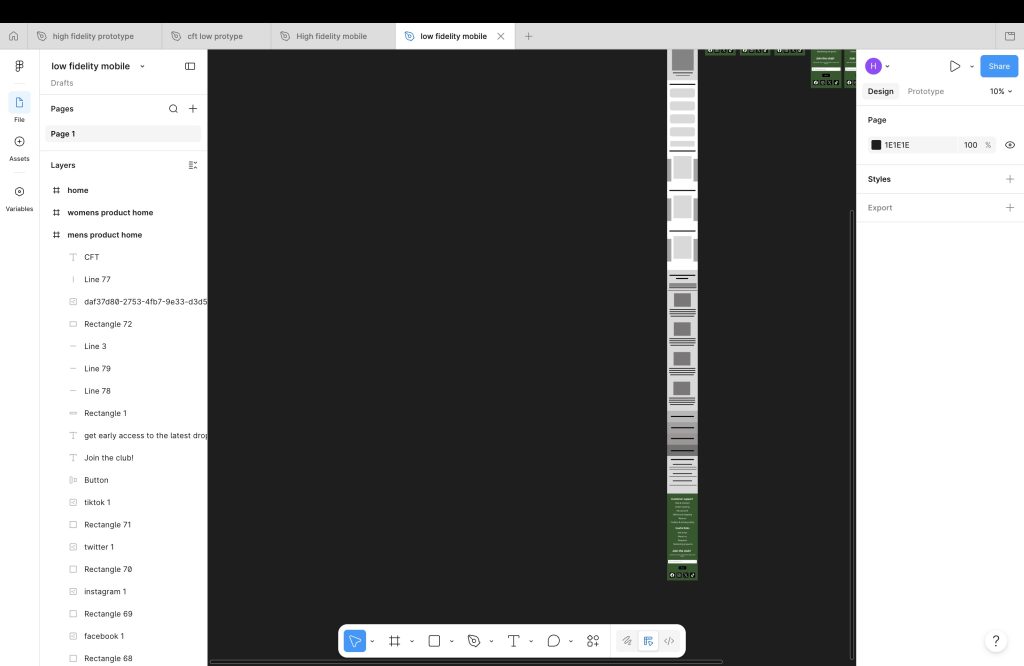
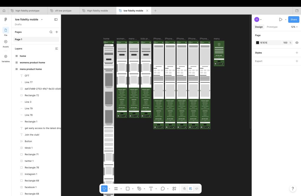
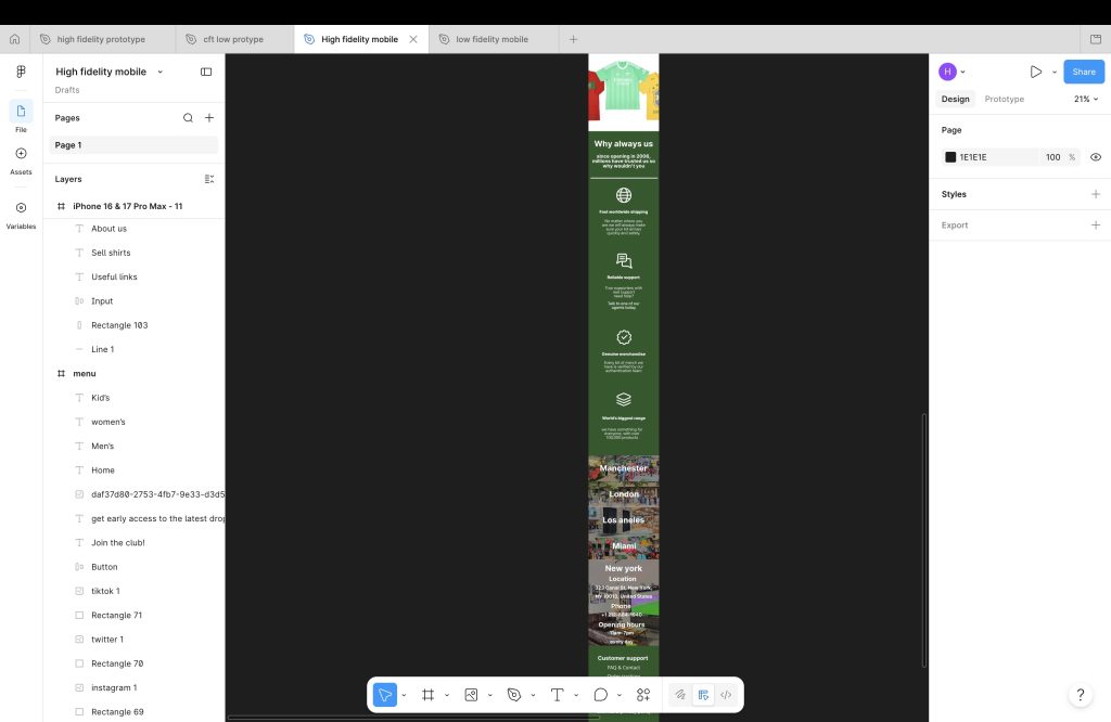
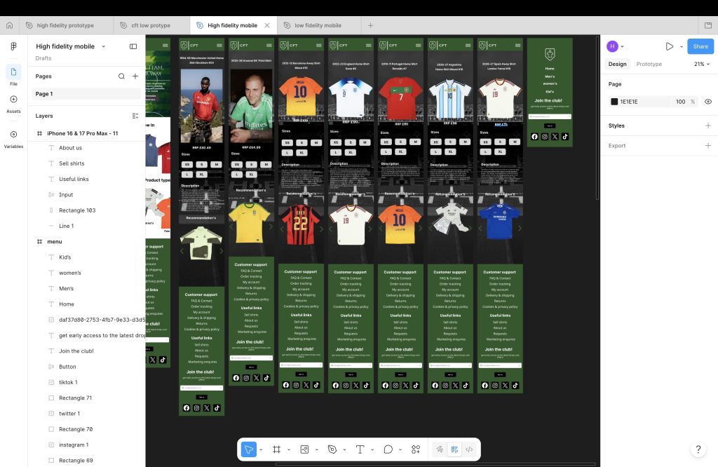
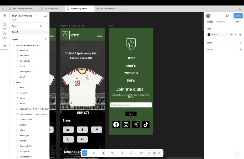
The mobile layout is also very similar but adjusted for it to fit a phone a lot better then a laptop.
The Big Idea: part of the collaborative brief
Working with the businesses and marketing students we had meetings talking about ideas what we all had and what would work best ect… we had two ideas for social media.
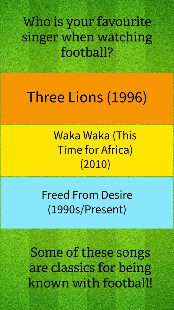
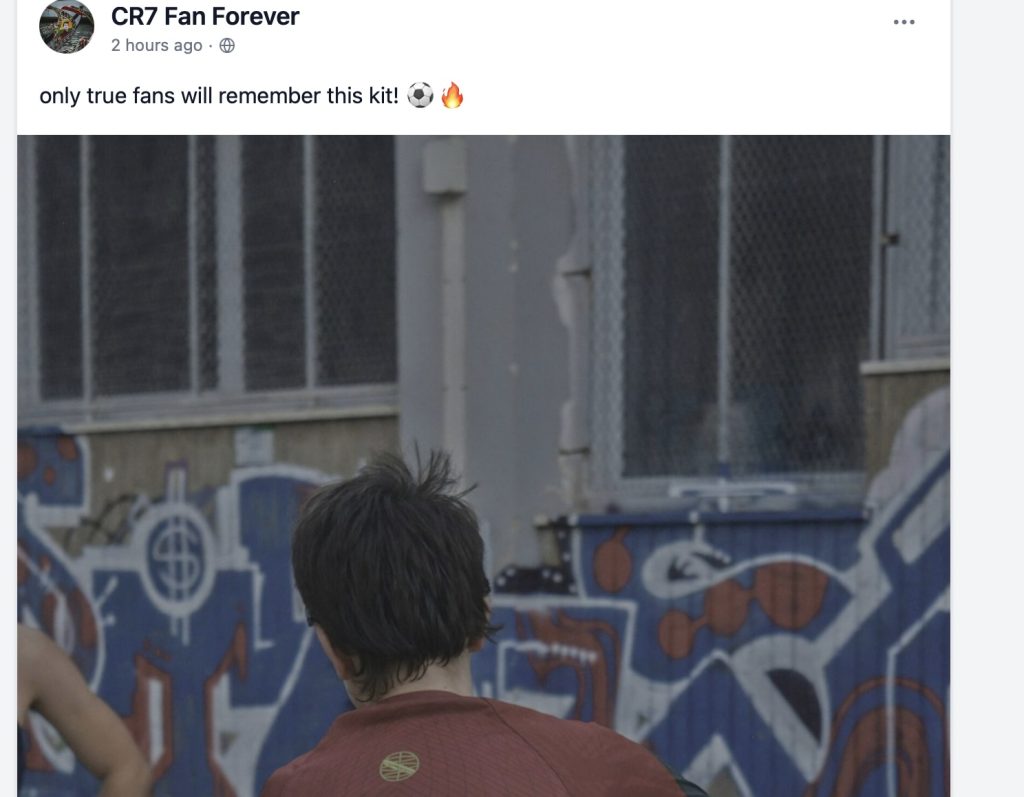
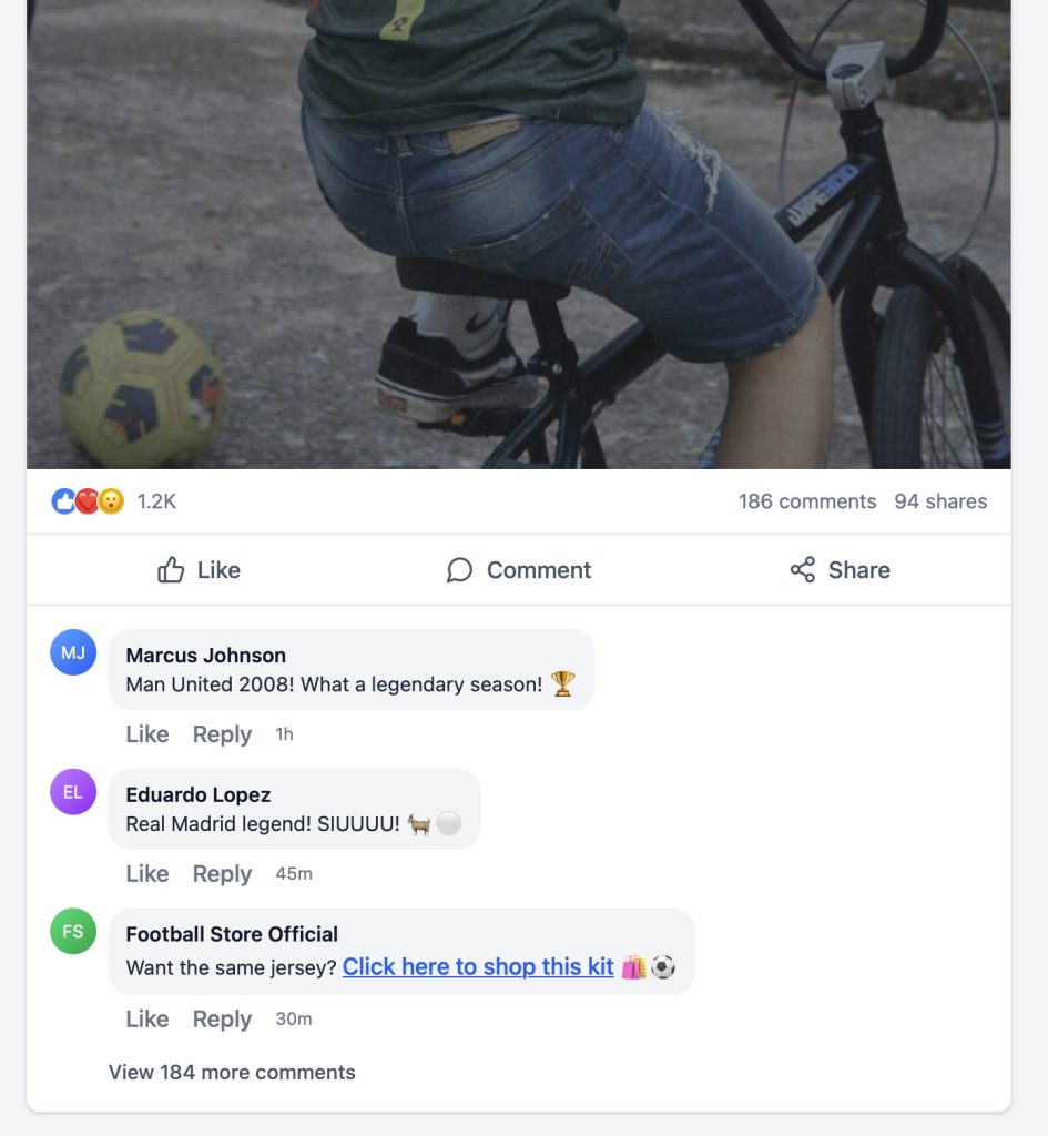
We had done research on past football moments that was big such as songs, popular stadiums, popular footballers and also what shirts and where they played at, from all this info that we had received hazel had made an facebook post of a football moment with the caption “only true fans will remember this moment”, all though this does grab attention and sparks up convocation in the comments I personally think there is a better way of grabbing attention buy listing all the songs that have been used for football over the years with the caption “my favourite waka waka ( its time for Africa) as it’s a song from my childhood, whats yours, list it in the comments
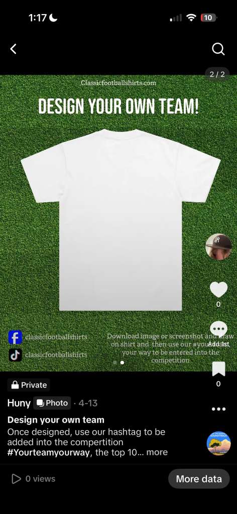
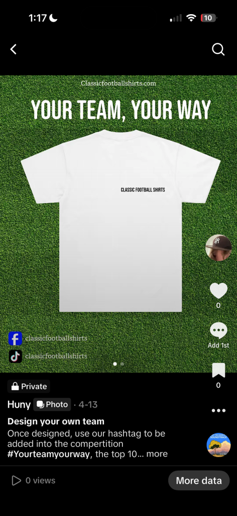
The second one is the your team, your way this is a way of advertising that can be shared from kids or older, just an double sided poster with one side with a white shirt with the logo on and the website ‘your team, your way’ with our socials, on the back side where your supposed to draw has an description of what to do and what # to use when done.
Out through working with the students I wanted tips and advice from ash and alec and all though they liked the work that was presented there was minor details they didn’t like such as the facebook post layout and how the link was in the comments instead of the actual bio in the post
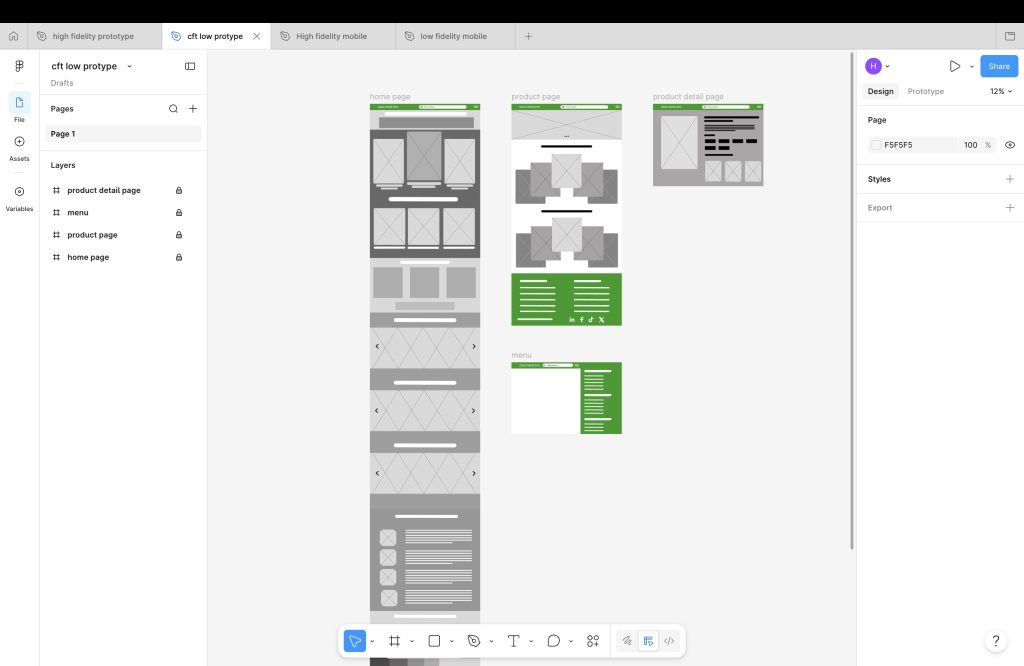
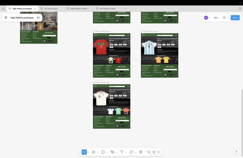
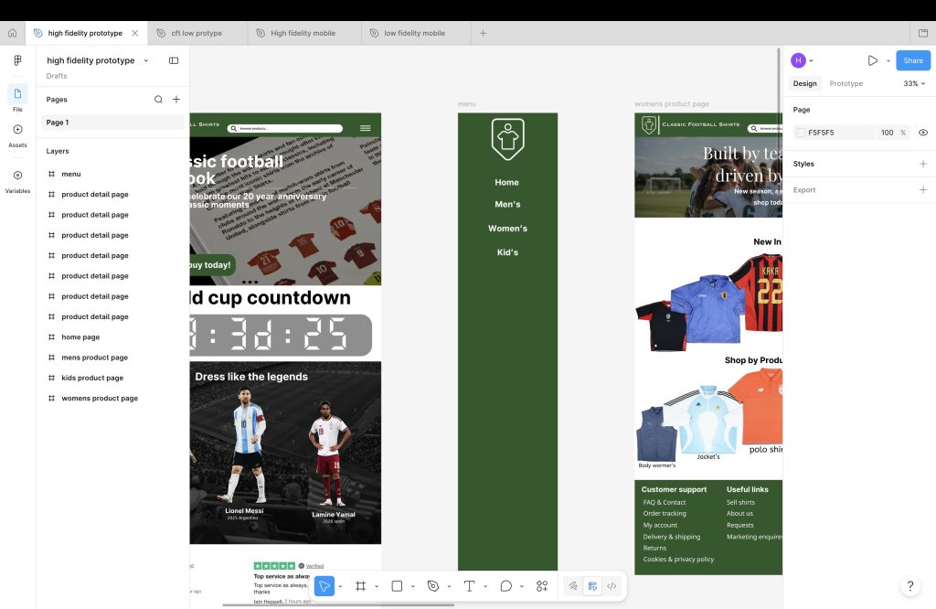
the low fidelity protype is just the layout with no effects and such just to see what would work best but once I had started on the high fidelity protype I had changed the layout because it had worked a lot better then then the one that I had organically I also did the layout for mobile similar to the high fidelity laptop layout.
In the mobile high fidelity, I had also shortened the logo as it was long and look up a lot of space and small features such as a hamburger menu that works on all pages, there is some features that I would add but haven’t learnt yet
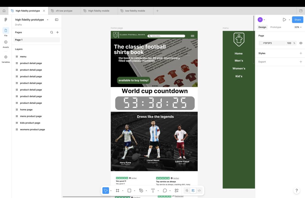
On the high fidelity website I has used an overlay on the right side for an hamburger menu, I had used an youtube video tutorial showing me how, theres also a big clock that’s an count down to the world cup football, this is also on the mobile too, the laptop version does have arrow buttons and mobile doesn’t because you can slide across to see instead off pressing the arrow


high fidelity mobile- https://www.figma.com/design/IG50QulaRZ3JF8DL79cwIB/High-fidelity-mobile?node-id=0-1&t=Fl7MQCeIo87s9Qg5-1
low fidelity mobile-https://www.figma.com/design/4HdbZ08av7dTuVxkThtFni/low-fidelity-mobile?node-id=0-1&t=3SLFewQ3aNa3Uwtg-1
high fidelity laptop-https://www.figma.com/design/oUrY14zLgPD0FYqpiWX2Nc/high-fidelity-prototype?node-id=0-1&t=ek26CY5eZqM3f4QV-1
low fidelity laptop-https://www.figma.com/design/pTTVCEH8RSNbF0NJeaSJX5/cft-low-protype?node-id=0-1&t=6ZPIgg86JXBwXyWJ-1