Ive done two poster adverts and two video adverts as I wanted a selection of ads.
The video ads are simple and relaxed as I didn’t want too much going on and I wanted it to be a thing where it’s a quick glance and carry on with the day and then later on to find more out groove city ,
The first ad is a pink background as bright colours catch peoples attention with a simple drawn face and earphones and make the earphones to shape out an face while also making them waving for it to look like the soundbar when playing music. With the typographic logo and the catchphrase “built on bass and city noise” as it really says that we are a city music shop as its in the name and catch phase and then there is an 10% if you sign up with email, I’ve used this as my atc button as everyone loves a discount their for you would be interested in going to find out what the place is like .
pink and black groove city ad-
On the second video ad is groove city at night, quiet and calm with not much going on at all I thought this would be good to put out in the winters and such, all it has is the drown city and clouds slowly coming in from the sides with the name logo and the catchphase shortly after it also mentions the 10% off when signed up with email and also has an address for those who want to take an photo and save it for when they have time to go see
night groove city ad-
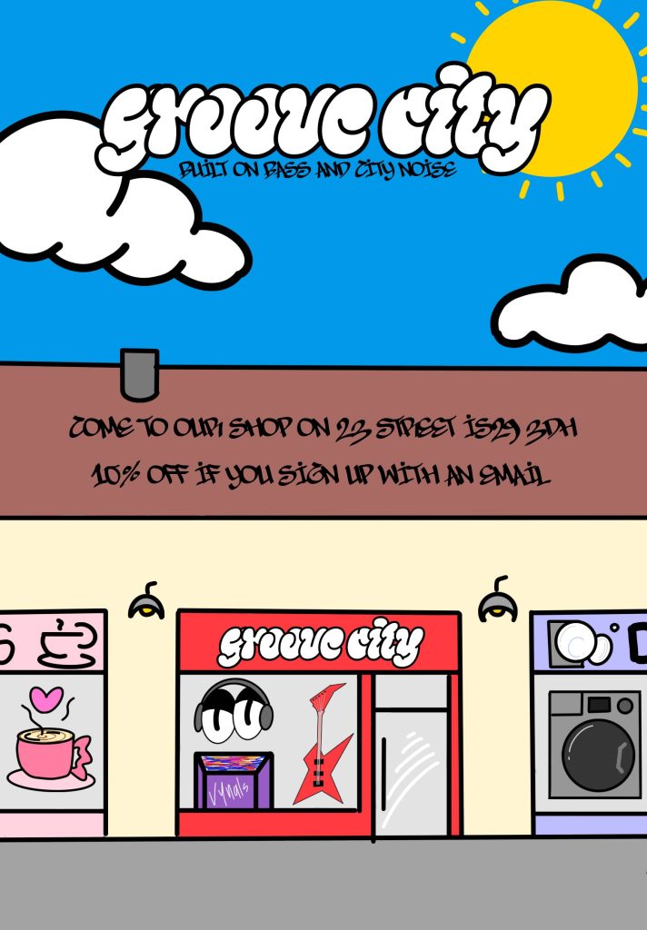
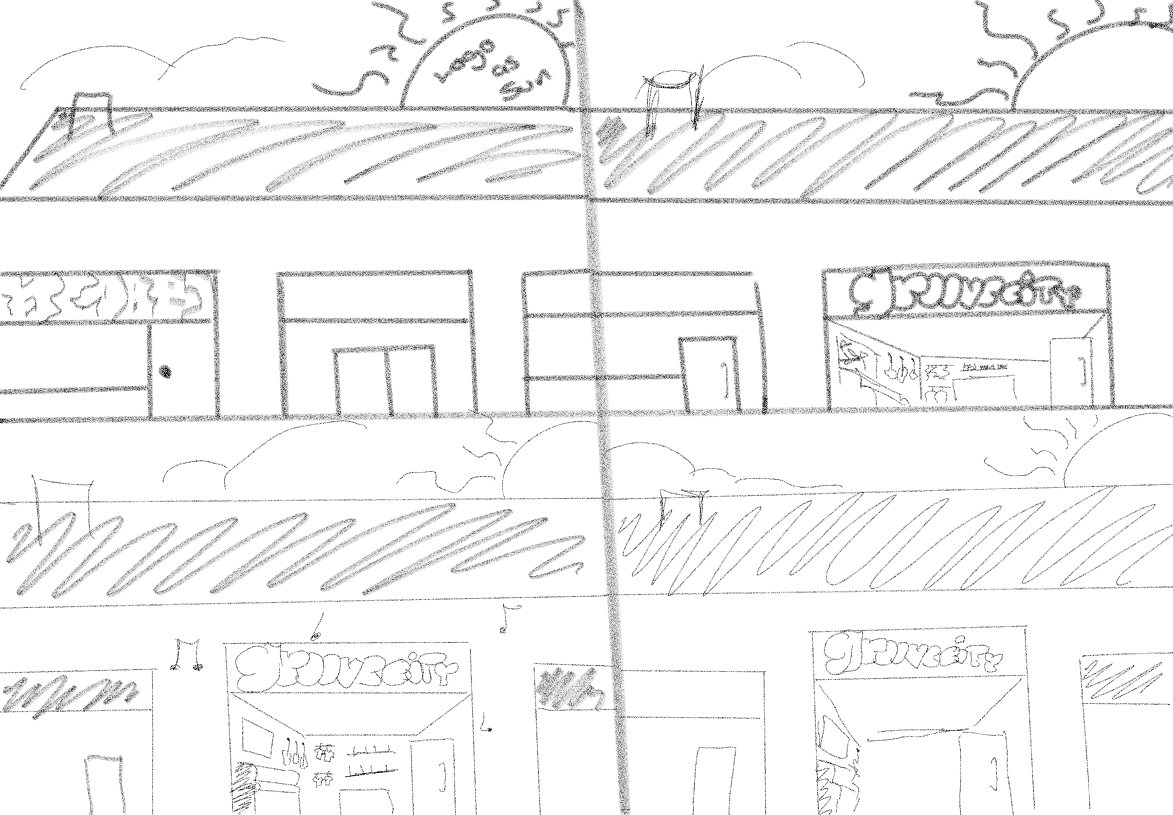
For the photo ads I did an drawn store front in between two shops and the colours are big and bright like how they are in the full screen animation , I felt like this was fun it somewhat reminds me of a kids colouring page and I had also added the cta on the roof to give it some texture as it was empty and bland, this poster could be put anywhere in the city’s because its aimed to such a large age range also I had used the story board sketch in a way to make the design of the poster because it’s the same concept
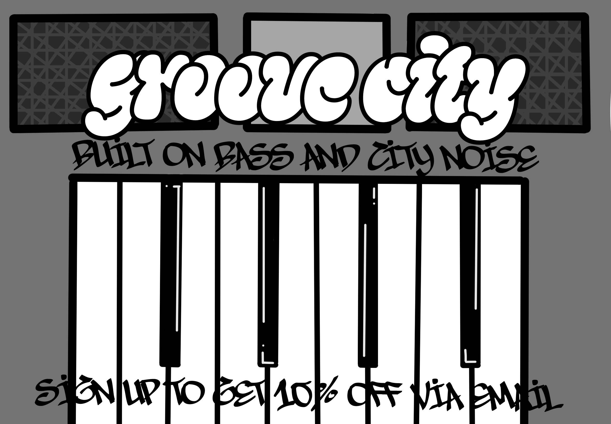
I also did an piano keyboard as an ad that I used the logo as somewhat as a tag or sticker as it’s a music shop it felt right and I feel like its quite trendy and does match with the vibe of the brand, I had used the same fonts on all work that’s been done and I like how every poster and animation suited it, I also had done sketches and a more accurate sketch that I used as an under layer to get the measurements correctly