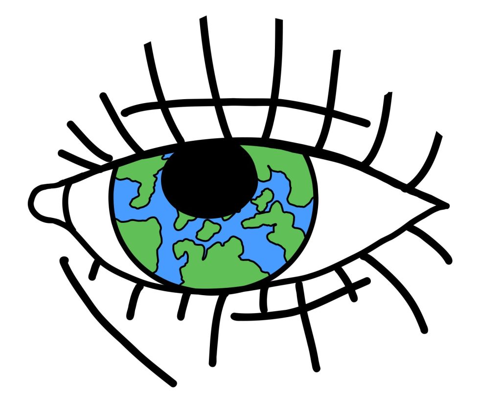
My logo what I will be using for the magazine covers is an eye with the world drawn into the pupil of the eye this logo was used in my last project, but I really love the idea and the design of the logo. the meaning behind this logo is that we see the world as a beautiful place and it is but we also have a lot of problems on this planet what us humans did ourselves and its slowly killing our beautiful home I also did long lashes on the logo what adds a Morden touch to it and it stands out to me I’ve never seen a magazine logo what’s an eye . in a way it reminds me of the evil eye on how its styled and the evil eye is also a great example of this logo the evil eye means to protect from all evil and that’s how we should see our plant and protect it from all evil like pollution and such that we created our-self’s. it really stands out to me I also made a sketch of this logo before making it I made a few different logos sketches to see what I personally thought will make the magazines / posters interesting with the logo and this logo makes it perfect for the public eye as well as that its quite an interesting logo to look at and the meaning behind it as well
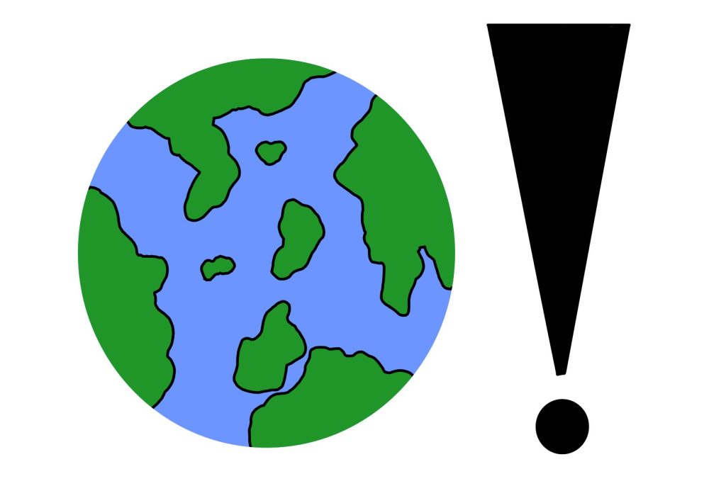
On the second logo design I made tells us what our name logo means but in an actual logo it’s a drawing of the earth and an exclamation mark next to it and if u switch it upside down it sort of looks like a woman with a dress. I feel like it really shows us what we are talking about without saying what we talking about this logo would look great just on its own on a poster because it’s simple and makes people interested in what it means. but also, it will be a great logo for magazines when I did the sketch, I found it simple Morden and fun at the same time. these magazines and all these logos and such are aimed for parents and young adults to be aware of what we are doing to the planet and how we can change it. I did an another one of the same logo and I added more detail like shading on the water and added different shades of greens and such to make it more realistic and I also made the shapes of the country based off a photo of earth its self from google and I also added the white like clouds what we see on all photos of the earth I personally think the second version of the logo is better than the first.
Out both logos I prefer the first one because of the meaning behind it and it will suit my style of magazines and its so colourful and will make it interesting to look at from people in the public.