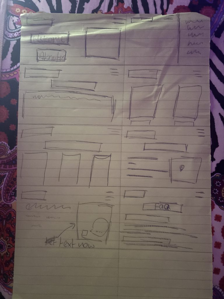
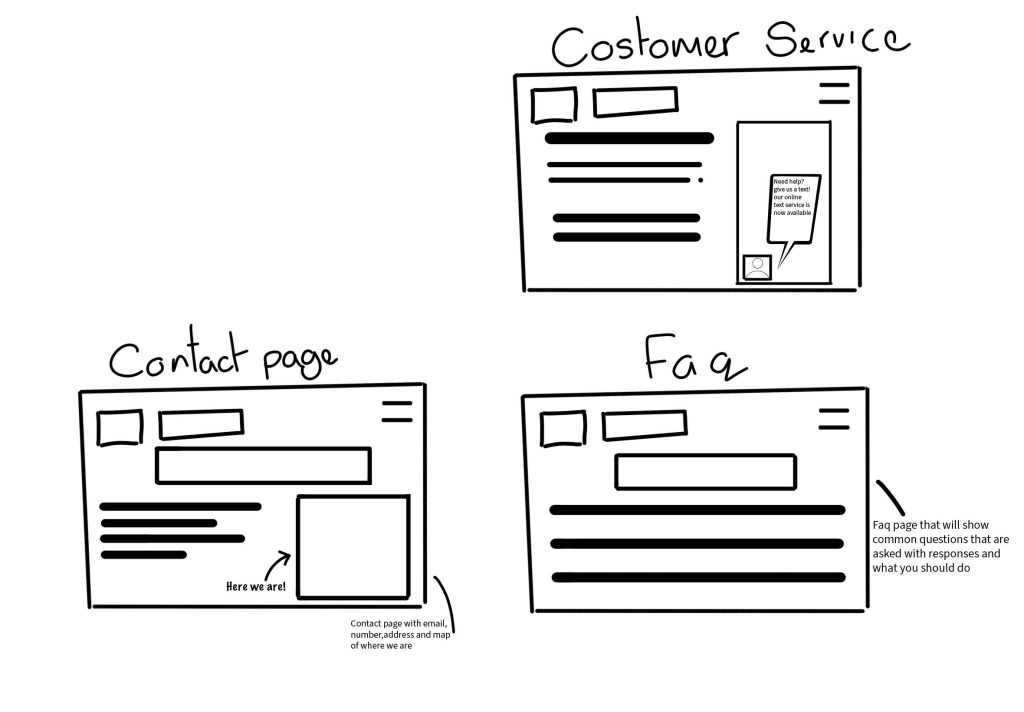
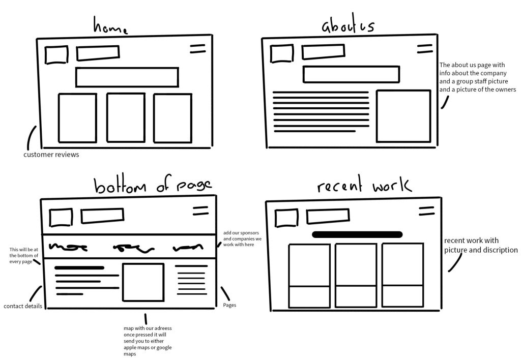
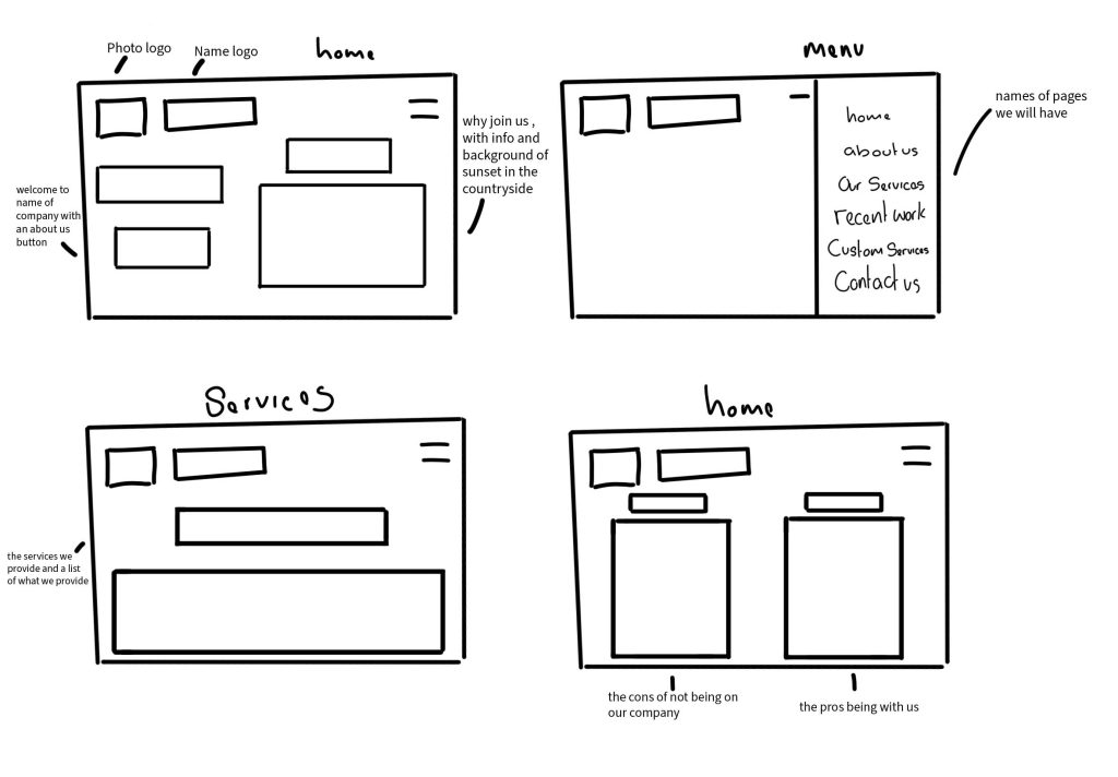
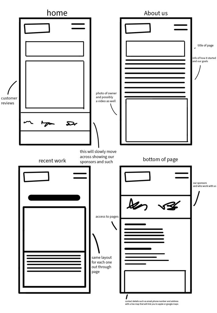
I started with quick draw sketches for layouts on paper for an general idea of what I would like for the website as I had only done the design was for laptop it’s going to be a similar layout for mobile
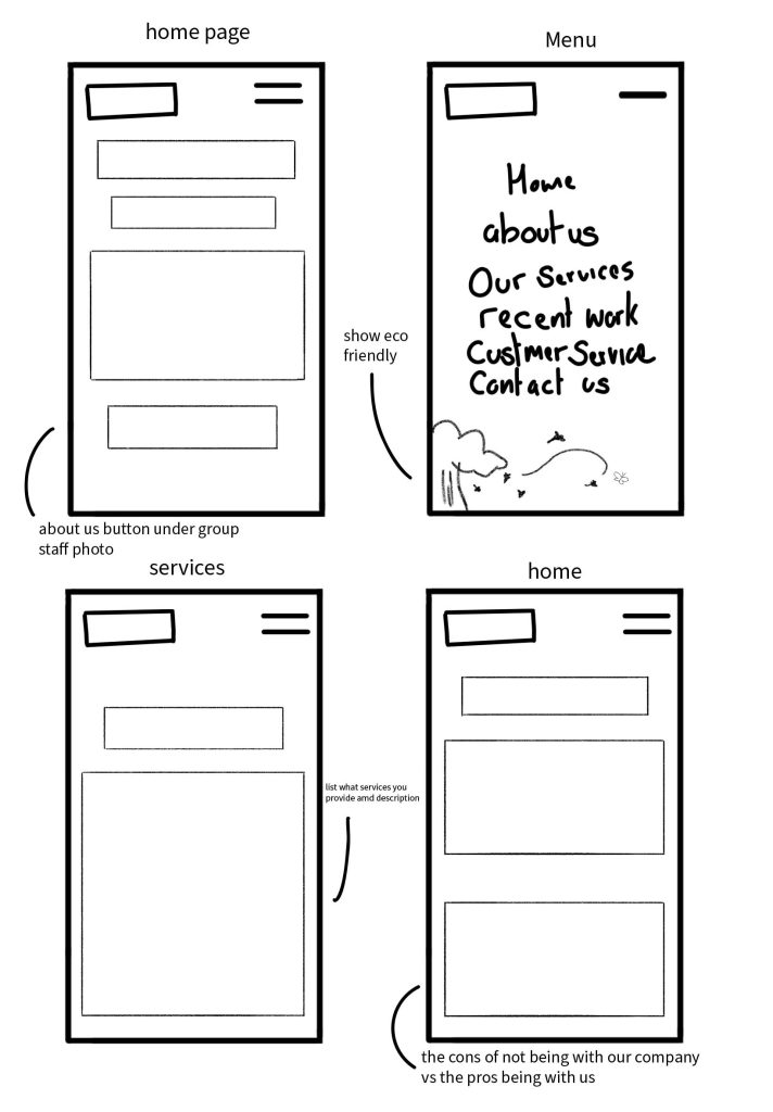
I did the sketches on digital as well for mobile and laptop in better detail with notes and more of where was going to be where with features notes and more
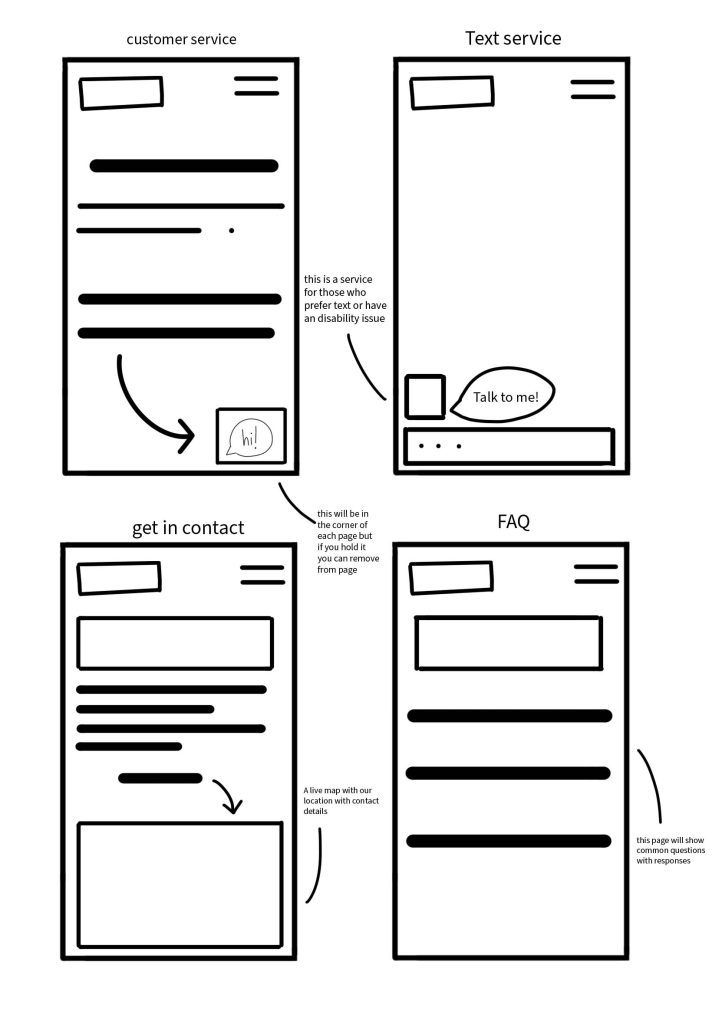
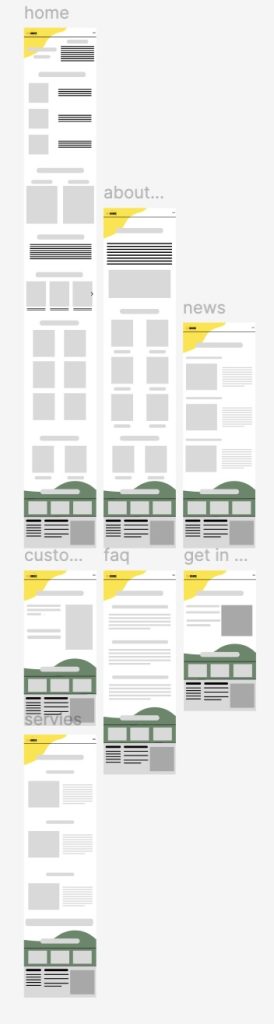
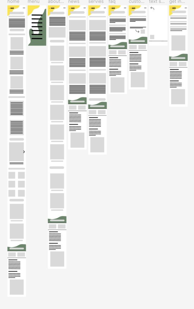
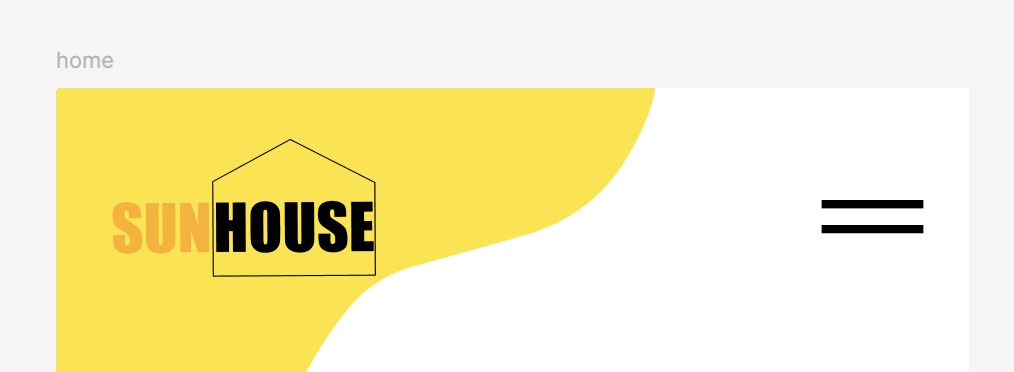
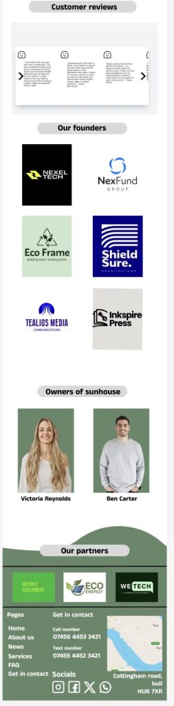
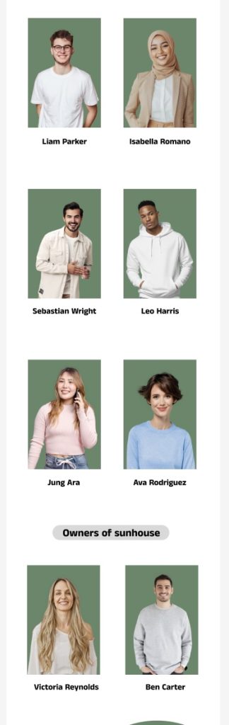
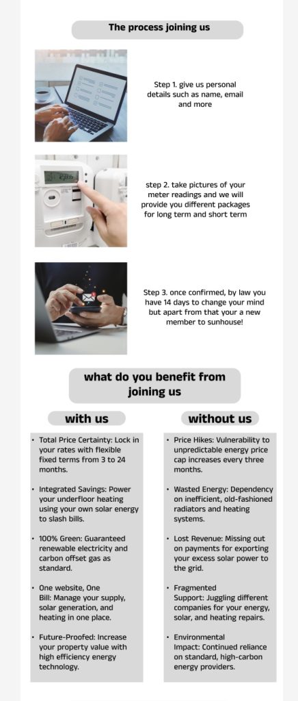
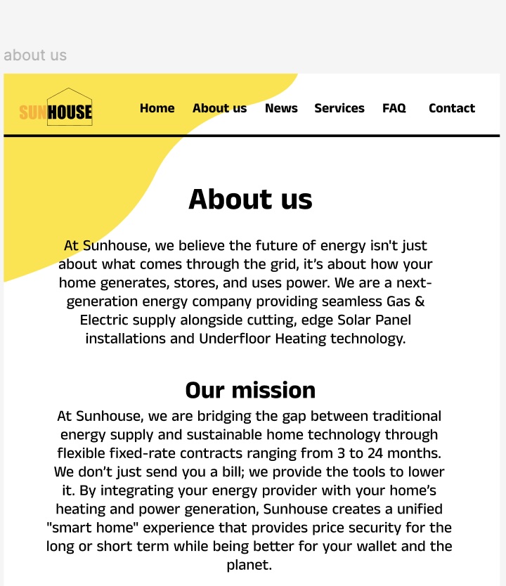
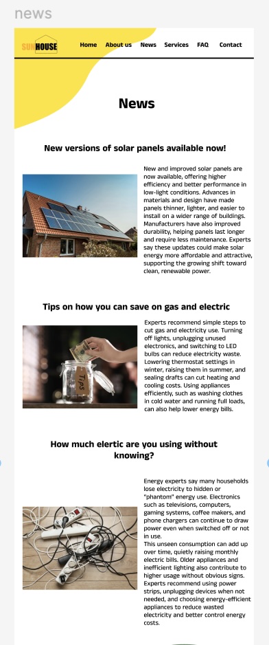
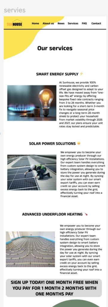
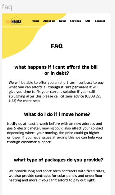
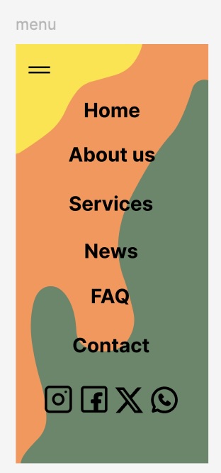
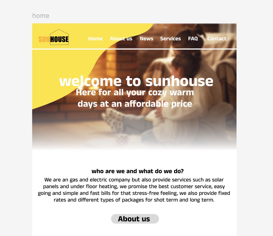
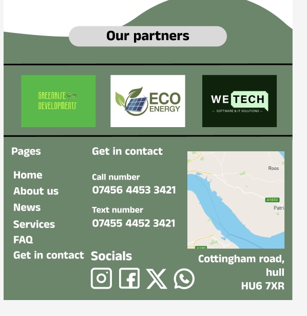
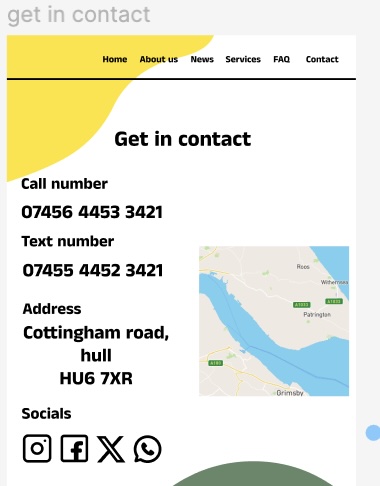
The high fidelity prototype this is where a lot of more important details have been added such as photos , text and more, as some parts do not look like the low fidelity prototype as I prefer the small changes I did and makes the website better looking the home page has an background at the start of a warm home with a gradient effect for it to blend with the rest of the website and the home page provides information such as what we do , sign up process and reviews and more I also show founders and partners on the page, the partners also have a separated page the features such as buttons do not work I had tried multiple ways and I couldn’t get it to work it’s the same for custom reviews and in future projects they will work and be more improved I also show the owners of the company with staff photo and name , there is also a services page and FAQ page for general questions but if want further help there is a call and a text number that will take you straight to a member of staff instead of a bot as a lot of people have complained about how they don’t always understand or struggle to hear what the client is saying. The mobile page is almost identical except it has a menu page and a layout that works well on mobile. I was originally going to do an text service on the website but a lot of people prefer normal message or whatsapp
I did three type of ads three of each some are video and some are photo and they are all smooth and simple with nothing too overstimulating to look at and quite relaxing to look at they have info such as what we do and a website link or a join us today on the ad and also an offer of pay for one month and get another month completely free of charge some of the backgrounds are just colours instead of a video and some of the logos are different because of the colour of the background makes it difficult to see and not everyone can see well or clearly.
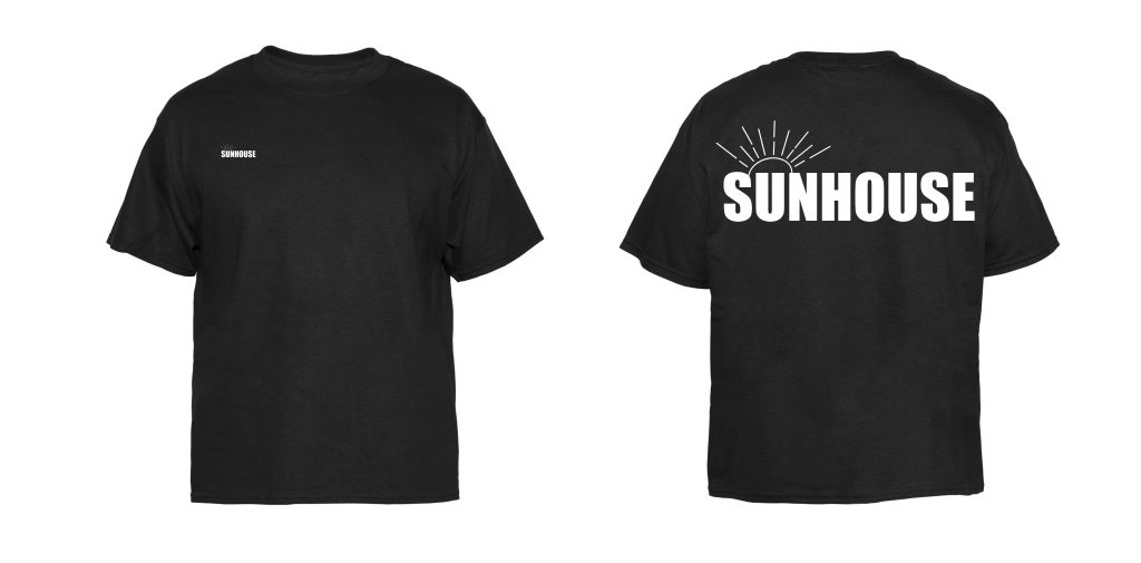
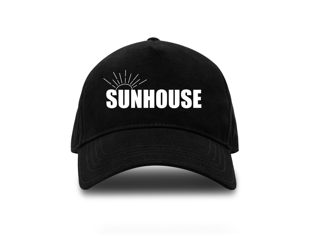
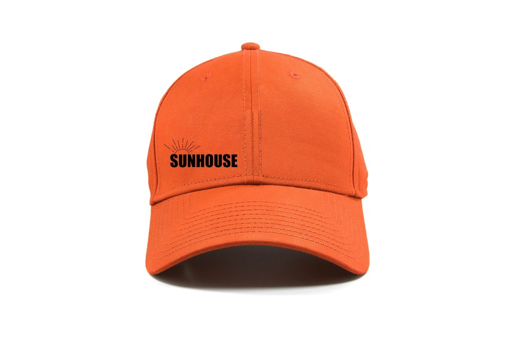
I did some merch as well I did two hats and two shirts in different colours that go with the colours of the website