the good examples of colour
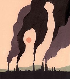
I am using this photo called “aware earth day posters” as a good example for my colour blog. The colours in this photo really go together from the colour of the sky to the colour of the smoke. The sky is in a sunset colour as the sun sets down with the orange sun and the different colours of smoke from darker to lighter from different materials being made or melted down and the light green hills as well in the background to show where it is even though this photo is quite simple it all blends in together really well. I like how the dark brown isn’t black in the smoke and its more of a dark brown to a lighter brown as well. Even though smoke is Gray not all smoke from factory’s is that colour sometimes smoke can be yellow, and all sorts of colours depends on what is being burnt
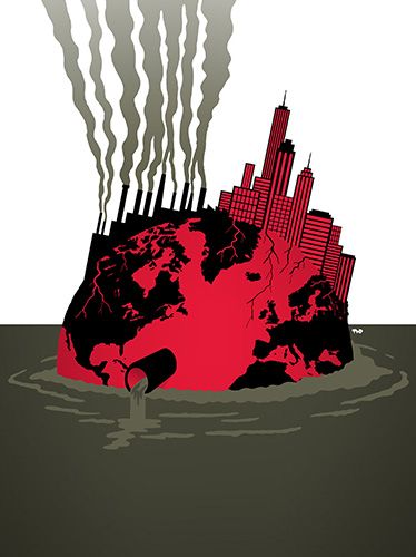
I am using a photo called “cartooning for peace “as my good example for colour. They have made our planet red for a sense in danger as red is used for warnings and alarms in buildings and they have put an city on the planet also in red for sense in danger but they have used black to colour in the countrys and the air pollution factory’s and used an green- ish brown colour almost an camouflage green for the water to also how the water pollution and that our planet is slowly drowning they have used these dark colours for sense in danger and warnings they have also made the smoke into an ombré from the same camouflage green to the colour of the white background. This photo alone shows a lot with its colour from what the colours can mean and how its presented on this poster
the bad examples of colour

I’m using this photo called “NO! Poster” this poster gets straight to the point of what it means but I feel like personally it lacks in colour and doesn’t strike the public eye and doesn’t make people interested. They have used yellow to make it seem like a warning poster what you get in public for alarms and such other things. I can see what they were trying to do to make it look like a hazed poster but I personally think if they added some more colour like red to show warning in the letters and a black out lining on the letters so it shows up more noticeable and I would also make the smoke a lighter colour like a dark-ish grey or a camouflage green \ brow-ish colour.
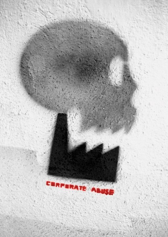
I’m using the photo called “corporate abuse” I’m using this poster as a bad example because it lacks in colour and it’s not interesting at all not showing any warning and genuinely not something someone would walk around and see it. Its all-dull shades of black, white and Gray. The only part of this poster what stands out is the label name. They also made the poster to look like it was spray painted on a wall on just a plain white wall with some gray dots to show shading of the wall. This poster doesn’t stand out to the public eye and wouldn’t want people look at it there needs to be more colour then shades and the tiniest bit of white . To improve this they should of used some more colour. Even though air pollution is dark shades or colours they still could of added some colour to the smoke . And made the back ground a brighter colour to make it more Appealing to the public eye
photo links
aware earth day posters-https://uk.pinterest.com/pin/651896114844592614/
cartooning for peace-https://www.cartooningforpeace.org/en/cartoonotheque/environment/
NO! poster-https://uk.pinterest.com/pin/651896114844878276/
corporate abuse-https://uk.pinterest.com/pin/651896114844878358/