I am using “inspiration” as an example of conceptual design. As you look at the poster, you may wonder why smoke is coming from the fingers, and what does it mean? They have used a hand as a stop sign and used the fingers as the pipes for air pollution factories, and they have also put white lines on the fingers to shape out the top of the factory pipes. This poster is telling you to STOP AIR POLLUTION. It’s a simple yet great concept of conceptual design. It is also something that people could be interested in looking at because it seems like a hazard/warning sign that you see in buildings, which makes it appealing to the public. I love how it is designed and how simple yet understanding it is.

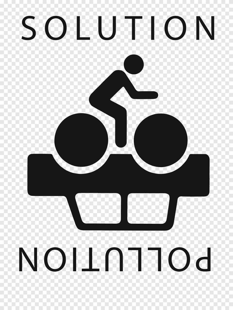
I have used “solution pollution” as an excellent example for this blog post; the first thing I notice in this poster is that the car is upside down, and that shows how cars are bad for the environment and the air around us and the word “pollution” is also upside down, I also see a bike with a person on with the word above it saying “solution”. This poster is an intelligent idea for conceptual design because it means that cars are bad for our air quality, but bikes are the way to fix the solution, and that’s why pollution is upside down. If you turn the poster the other way, the writing will be the right way, but the solution will be the wrong way. This a fantastic poster that should be everywhere because it promotes to stop air pollution but it’s also like a little puzzle to figure out and that’s what makes it attractive to the public eye and it also makes people realise what cars do to our air quality and how us as people can stop it.

I’m using the photo “air pollution cityscape” as my lousy example for conceptual design. I have used it as a bad example because it does not show any awareness of air pollution, but it describes what they are saying in the logo. They have used the bottom half of the logo as the earth and the top half factories of air pollution buildings. They are trying to say that half the earth is full of factories that produce air pollution, but it’s not saying any way of telling how to stop or change the issue. To improve this image they could of said how to improve the situation to prevent air pollution so people would be more interested to look at the picture.

The photo “Earth Day logo” is a bad example of conceptual design. The way its laid out is for a starters a boring non interesting logo, the whole idea of the logo is that the lie represents a hill and the e over the mountain is an setting sun. The logo is to describe Earth Day, but nothing of this logo screams to me anything at all about it. To make a company about Earth Day, they should show more passion and colour in their logo, more meaning than just a hill and sunset. They should be showing the whole world and its issues in a logo so more people can feel more meaning and emotion. There’s more to our planet than just pretty sunsets, and it’s not shown enough. It’s a simple logo, but I think much more could have been done to make people interested in this company and what they do.
photo links
solution pollution-https://www.pngegg.com/en/png-yyylu
inspiration- https://uk.pinterest.com/pin/813673857657763812/
Air pollution cityscape –https://www.vectorstock.com/royalty-free-vector/air-pollution-cityscape-vector-12741989
Earth Day logo –https://x.com/earthdayindia