participatory collective is an community that brings everyone and anyone in hull making it a welcoming space for everyone making hull a better place
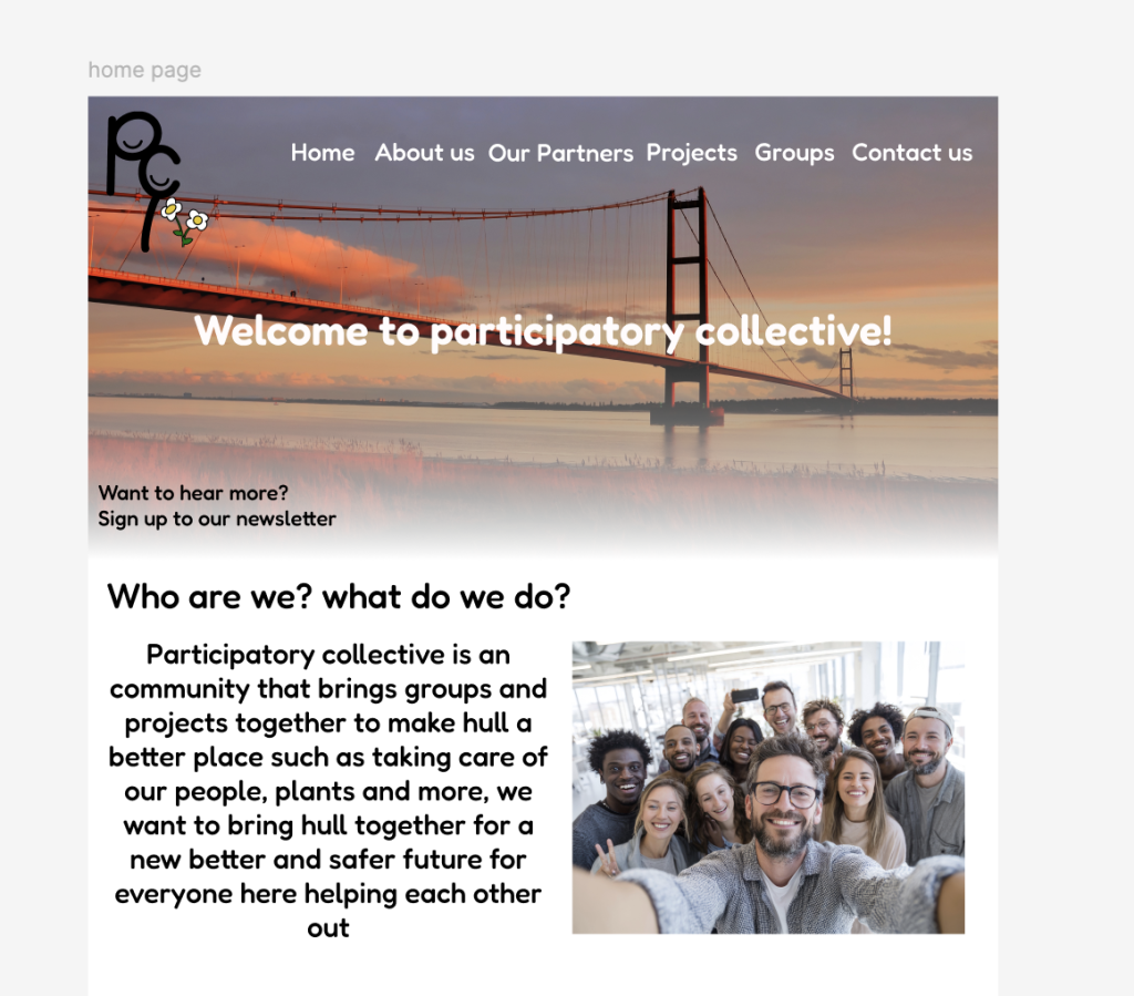
At the start of making this high fidelity prototype I started with the basics such as pictures and text and then went further from there all of the photos such as staff was done and edited on adobe express. The font that has been used out through the whole website and mobile are the same to match the same aesthetic the font that I have used is called Fredoka it’s a simple and easy to read font , I didn’t want to use a font that came across as simple but I also didn’t want a font that was too formal and this font seems to be right in between where its fun for all ages. The background behind the welcome to participatory collective is a picture of the Humber bridge that I had got from adobe express and added an gradient effect over the photo for it to blend with the rest of the website I had also used a staff group photo from adobe to show how we all get along and we are friendly. i had also removed a small detail from the header the grass patch as from the feedback I had received was that it makes it difficult to see the page names and I had also changed them to white because of the background makes it difficult to see. The colour pallet is very bright and positive and simple so its not overstimulating to look at or annoying of green and white and a beautiful picture of the Humber bridge, I like this nice touch it ads to the website its simple but modern and nice to look at. It also shows where we are based (Hull) so people don’t get confused if we are based in another part of the uk
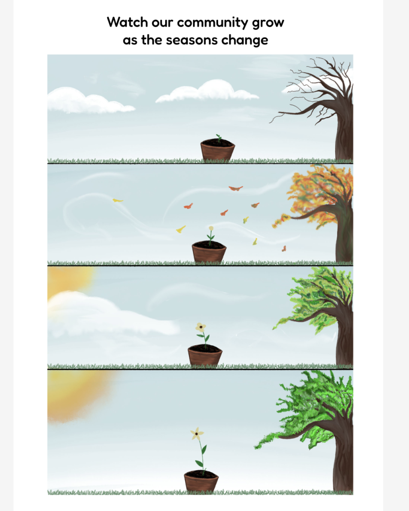
Under this there is an drawing of different seasons from the cold to the summer seeing the flower grow the resemble community growing I did want to add the effect of adding it through the whole home page and it slowly change and move as the page goes and I did watch a few videos and tried a few times and I couldn’t get it to work and I would like to learn this in a next project .
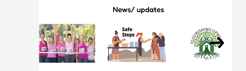
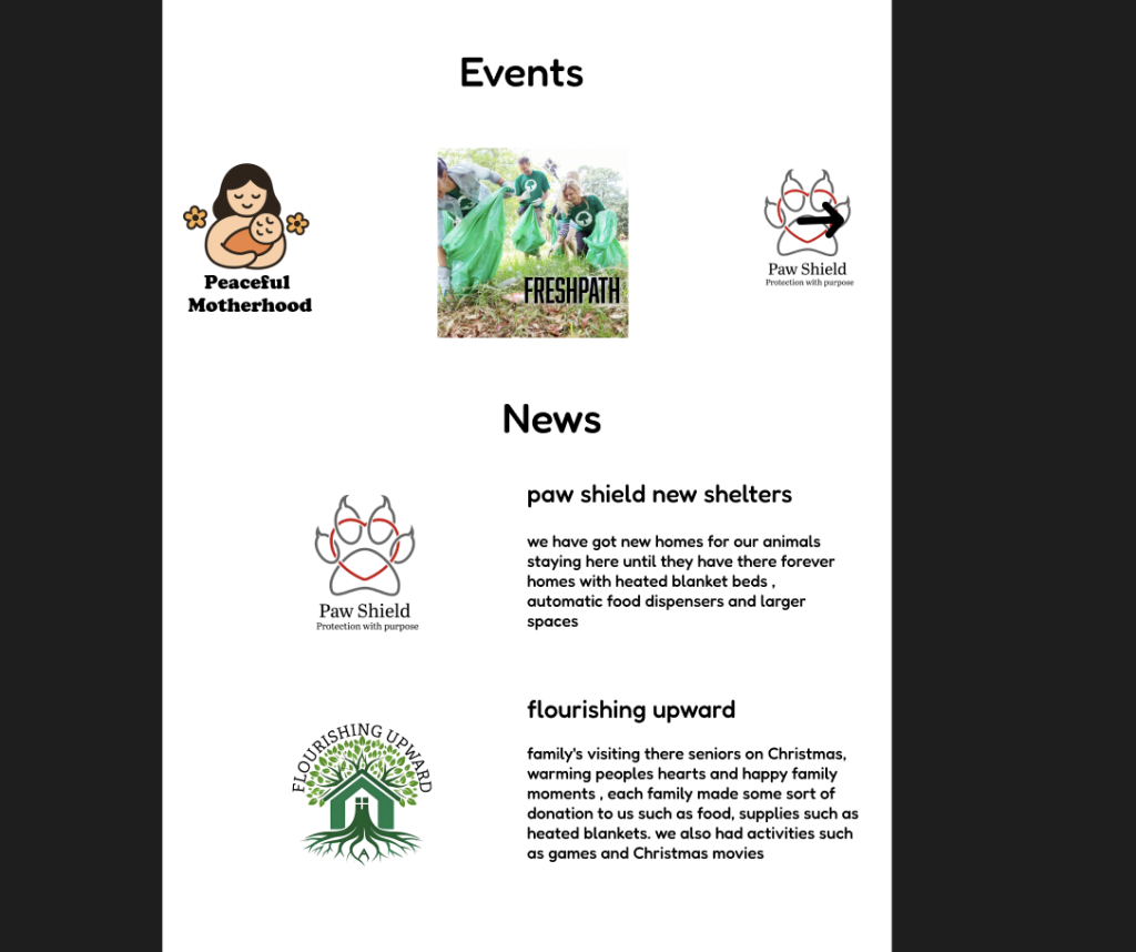
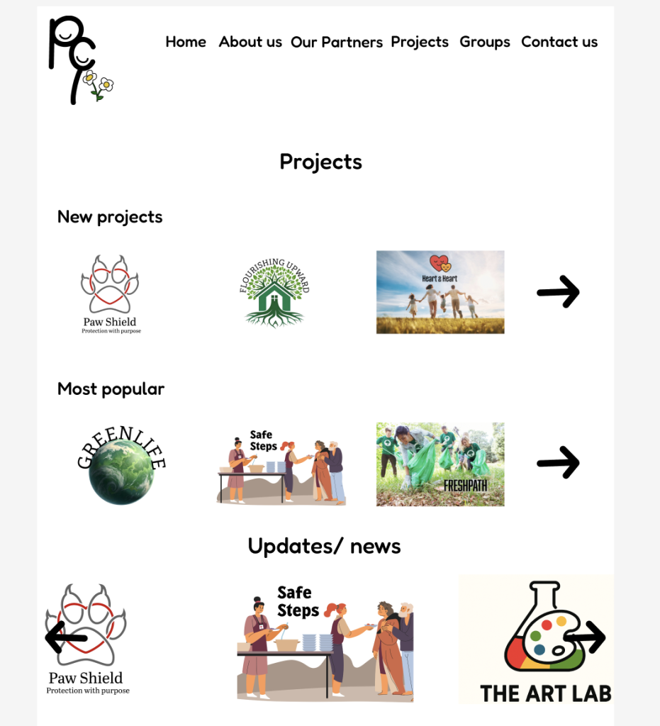
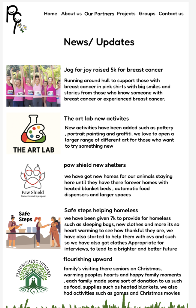
under this I have news and updates this shows updates on groups and projects and improvements and more there is also arrows that do not work but if they did they would stroll and more across to see more and this goes for all the rest of the arrows on the protypes.
on mobile its events then news/ updates but on home page on mobile it will give you an description of the news and if you press the news it will send you to the news page
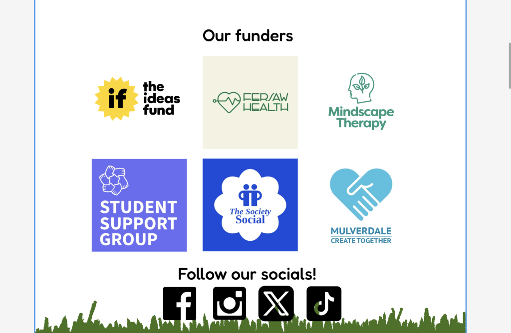
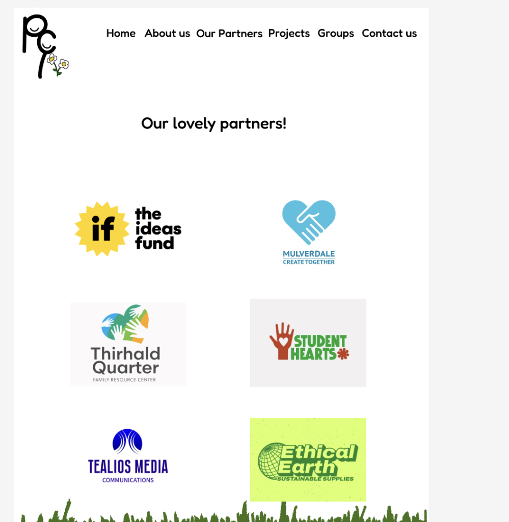
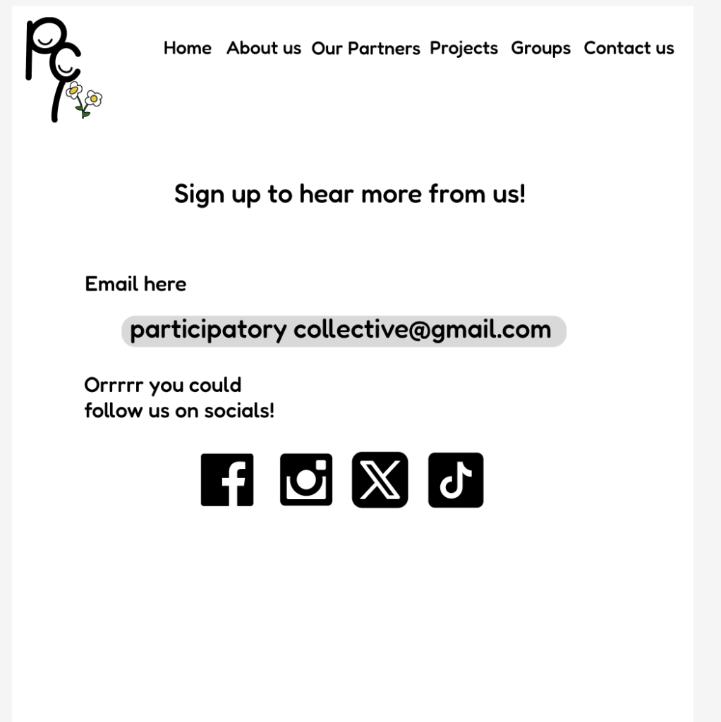
I had also added our funders so companies that have supported our company and help us, when pressed this would take us to there website but I had not added this because some of these companies don’t exist and do not have websites, under this I had also added socials that could take us to participatory collective socials such as Instagram and twitter (X)
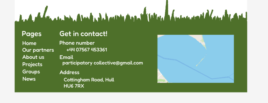
The footer of the website ads so much personality to the website as it matches with part of a logo such as the flower as its nature like theme I thought the grass floorer would go well and I love how its turned out on the floor there is a live map and there is also contact details such as number , email, address and pages that access to every page on the website so you don’t have to go to top of page to view other pages as some pages can be a bit long, this is on every page on the website.
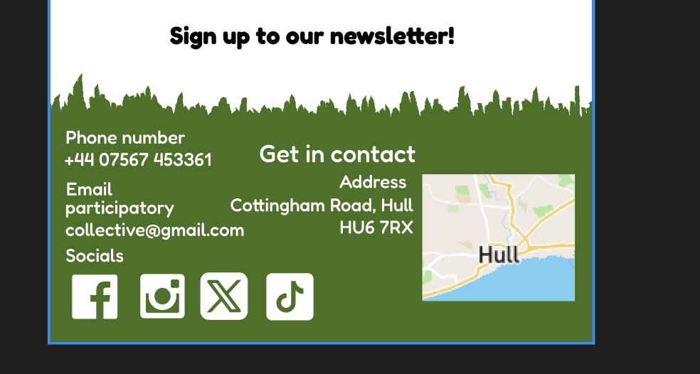
on mobile the sign up to the newsletter as at the Bottom of the page with the footer, it made sense to add it there because if you read through the home page it shows an sign of interest
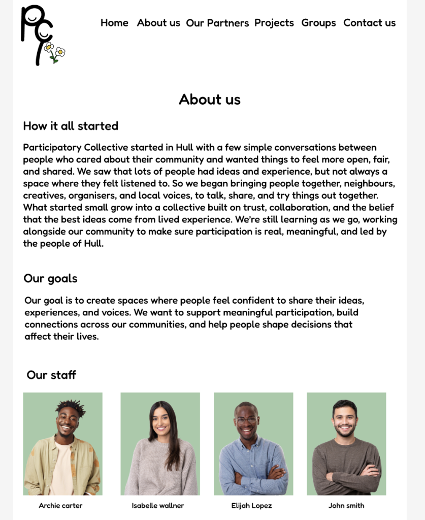
The about us page shows information such of how it all started as what made us want to make this an website and why and what our goals are it also shows staff photos and names I had edited these photos from adobe express and removed the background and made it a light lime green, simple but also ads great detail to the website even though it doesn’t match with the floorer green it still looks good
The projects page is simple all it shows is the logos of the projects and when pressed it will show you info on the project, this page also has the updates/news. If you had noticed on the other pages the header of the page names are in black instead of white because if it was you wouldn’t be able to see the pages. The groups page is also the same layout and such the arrows do not work but in future improvement they will be working
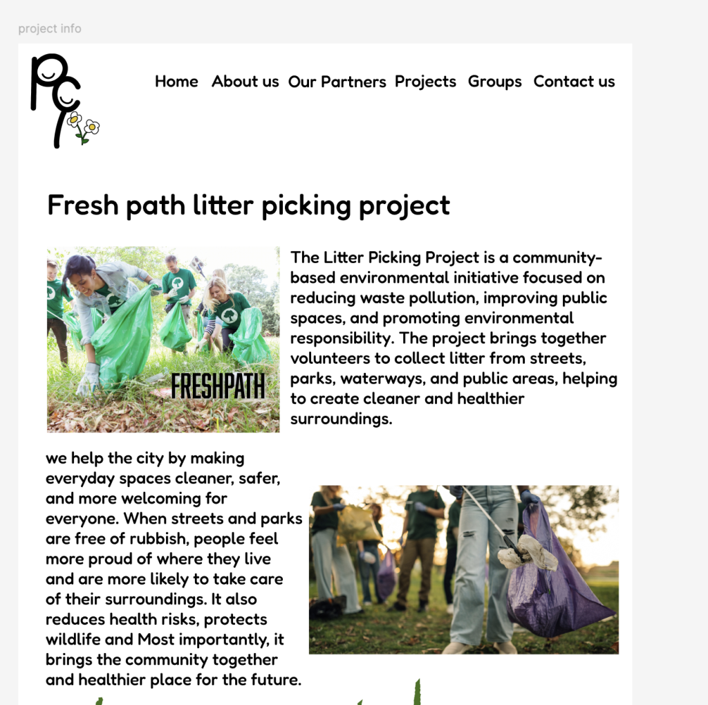
The project info page shows information of what the project is and why it exists and what does it improve or benefit in hull there is also pictures of what they do
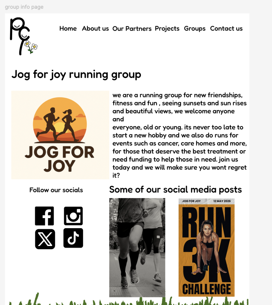
The group info page shows info on the group and why and what they do and why you should join, it also shows social media posts and links to social media for further interest
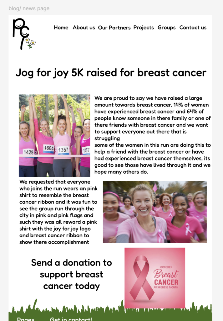
The news layout consists of main title, 2 photos and info just a simple news layout, the news page shows a small description an photo and title of news when pressed anywhere on the news it will send you to read more and you will see the whole page
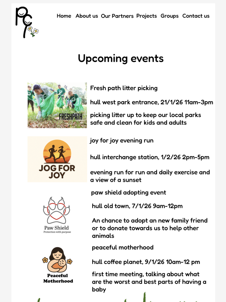
The events page consists of dates, times, descriptions of the event and who its with group/ project and it also has the location all the details you would need to know to attend the event.
The sign up to our newsletter page is simple and easy to understand, if signed up to this newspaper you will receive updates and news and new groups, events and such for those who don’t want to constantly checking the website or socials and it will go straight to your mail. The page also shows our links to socials where you can get notifications from us everytime we post this is for multiple socials for all ages.
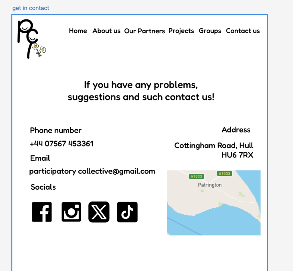
The get in contact page shows a live map , number, email, address and socials you can contact to use from any of these, whatever is more convenient and easy for you to use.
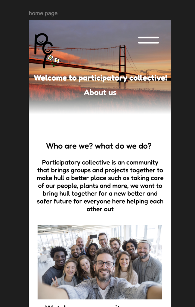
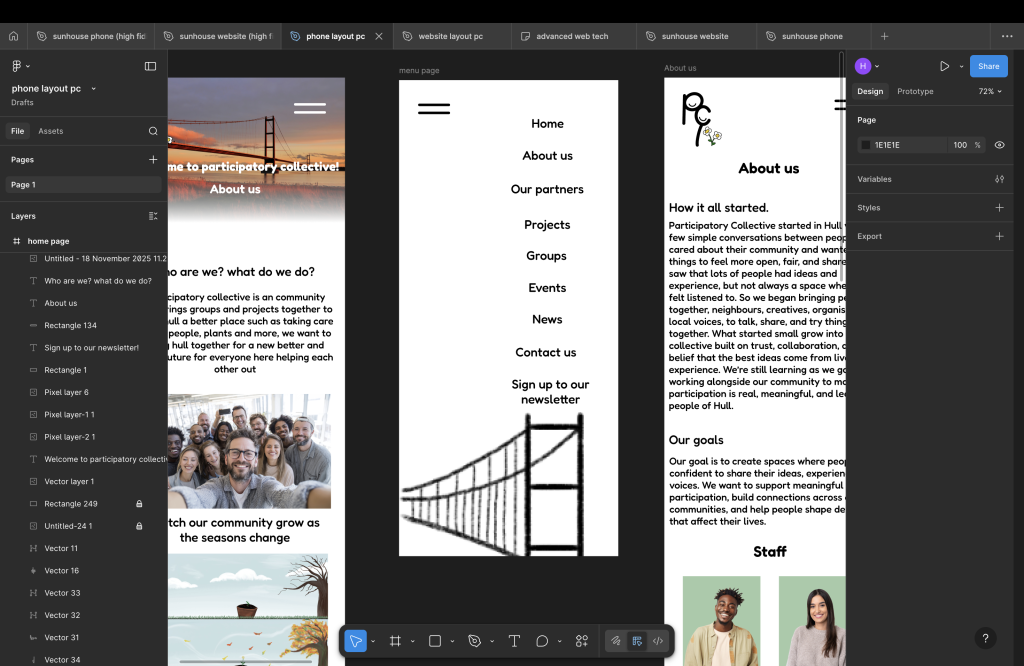
The mobile layout is very similar as I didn’t want to change too much there is an menu page on mobile that has a drawing of humber bridge although it isn’t an massive detail its small and nice and resembles where we are based in the uk (Hull). I made the website accessible for mobile as not every website works well on mobile and I didn’t want people struggling to access it as not everyone has a laptop or access to one or if you want to use the website if your not at home or on public transport, you can use it everywhere without worrying about it not working.
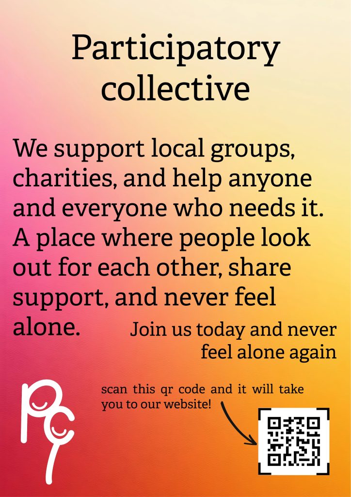
I did three types of ads I have 4 ads all together two for social media ads one for other websites and a poster ad, they are all different two of the ads are videos ad and the other two are picture ads, not everyone likes seeing an video ad as it can be annoying at times, the poster ad is for shops , malls and more even though not many people find them interesting its still good to have them as it still catches people attention at times especially if its something they haven’t seen before or its based in the area, online ads are more popular as nearly everything is done through your phone or social media even when you don’t notice like checking your email or your Facebook or sometimes even text people click on online ads 90% more then people finding interest in poster ads in public as not many people pay attention to them but when people get bored and start looking around hoping time goes faster that’s when people find interest.
The poster ad also consist of a logo , what we do and a website but it also has a qr code that will take you to a link page that shows our socials and website for you to choose from .
The wide skyscraper ad has a big logo at the top and the flower at the bottom tells you what we do and to join us with a plain background.

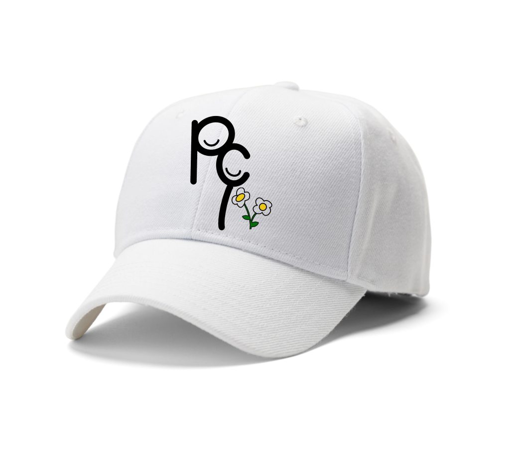
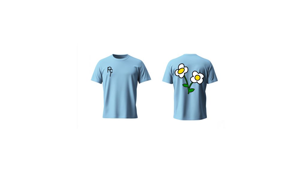
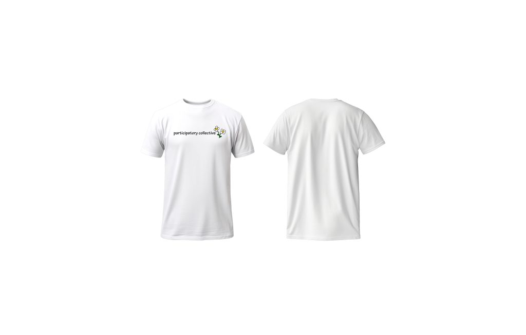
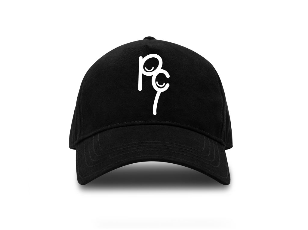
I did two hats and two shirts of merch, simple but modern I didn’t want a design that looked too much, a lot of people go for the more relaxed simple look so that’s what I’ve gone for the colour combinations look good with the logo , I like the blue shirt because it reminds me of sky’s. on the white hat I added the flower because it was a nice touch on the black one I just added the logo because it felt like the one with the flower was a lot more feminine