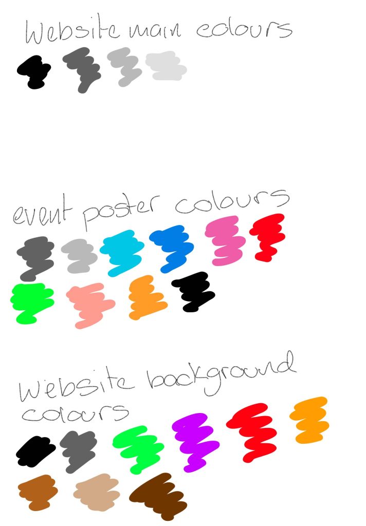
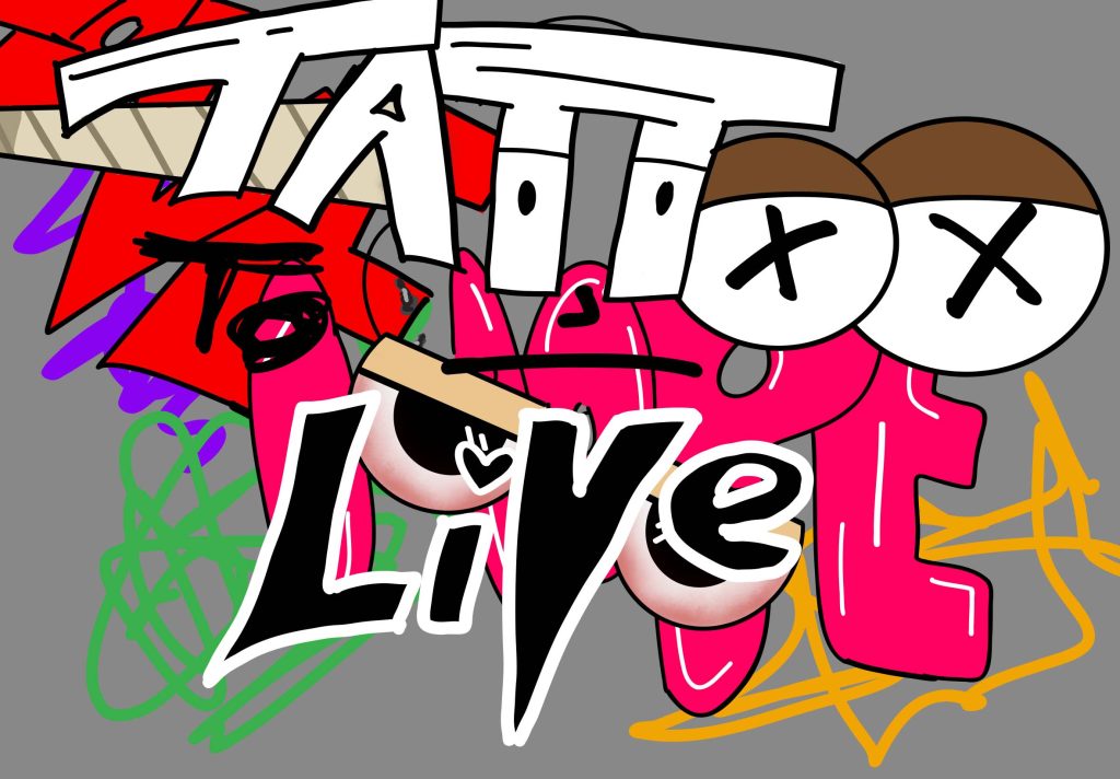
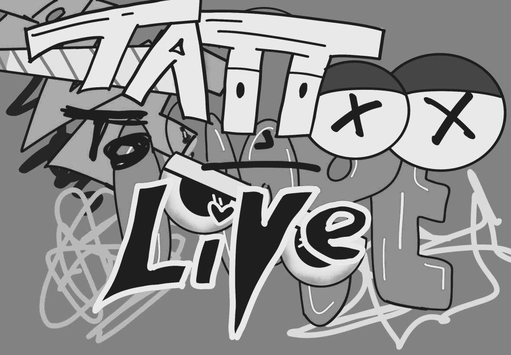
After updating my website and such I find that the colour planning on the poster and such is a mixed pallet because its based of street graffiti and such the colours on walls going with the colours of street work and that could be most of the colours on the pallet on my graffiti style tattoo convention poster I used the colours of Gray , black , white , dark blue , light blue and the list goes on and I love how all the colours stand out from the background of dark Gray on a lot of street work the colours and art overlap as there isn’t much space on the walls with no graffiti and that’s why the event poster has so many colours so does the colours on the website background its I did an massive range of colours to show what street work is like on a lot of dodgy roads or bridges and such there’s graffiti even in abandoned buildings and over the years it overlaps with new work that someone has done I have also added drawings on the posters to see the different range of styles within the colours that I have used on the website I have an new background that organically had a lot of colours but I had put a black and white filter over the top of it for it to go with the rest of the website theme all of the website colours are shades of black Gray and white because I felt like this made it an modern yet edgy effect to those who are interested in going it also makes it look simple and not too overwhelming to look at on the website
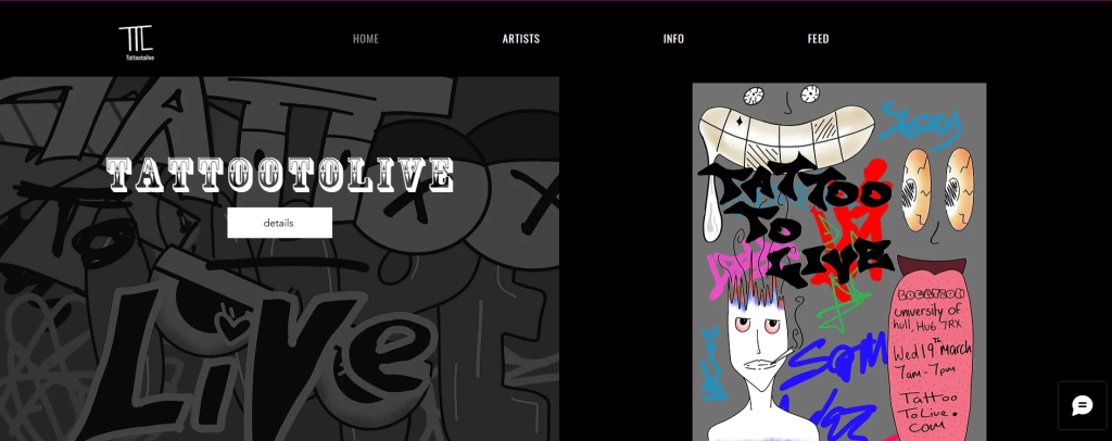
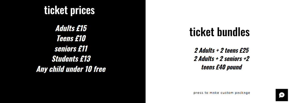
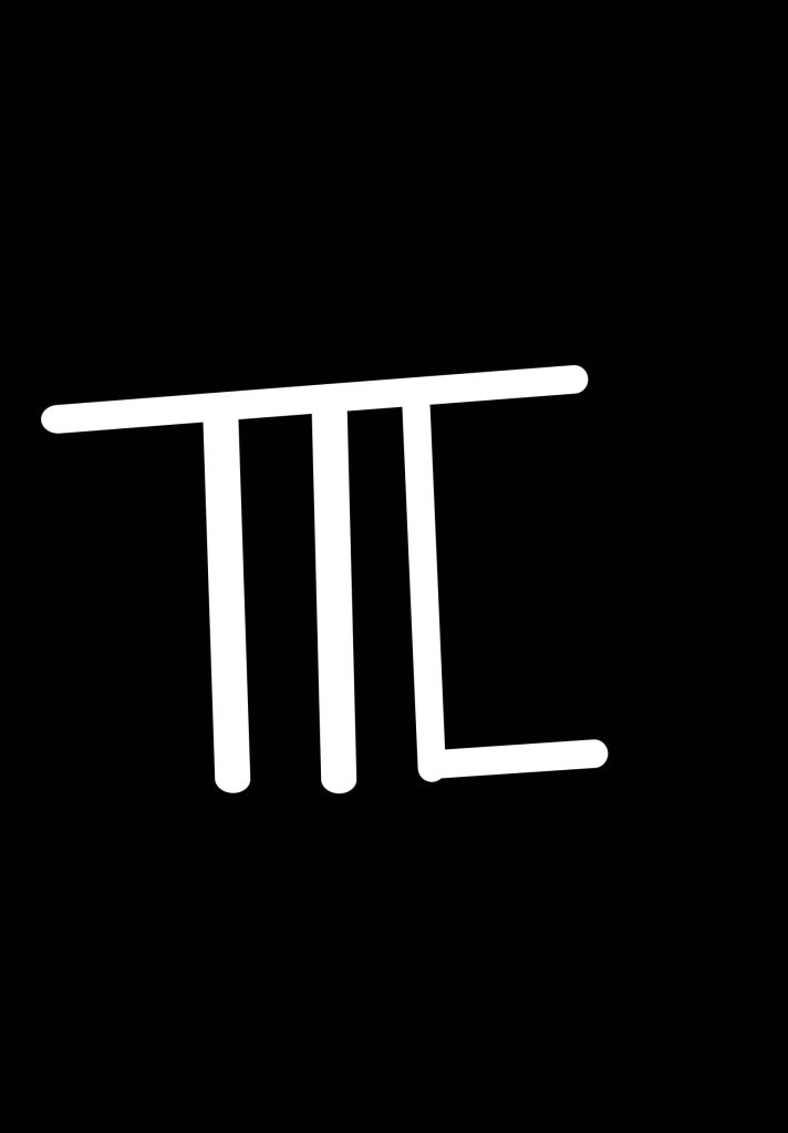
I have change a lot of the layout and small details I have added an logo in the top corner that say ttl short for tattooing to live and although it also means talk to you later I like how the logo fits in perfectly into the brand name I have also changed the group page into a feed page something similar like twitter but its all for the same Hobbie / interest I also change the background like I say earlier in this blog post . I have also added ticket prices and bundles to the info page for some more information on those who need prices or just genuinely want to know. On the home page I had moved the question and what is at this event to the artist page and I had made the hoke page into 2 half’s so you can see the whole event poster without having to go down your screen to see the whole thing and made it look more neat and personable on mobile for those who do not have laptops or such I have added this because I did not have an working mobile site when I sent in the last assignment its simple ,neat and not any issues have happened while I’ve been fixing it and changing it to be more presentable to use