
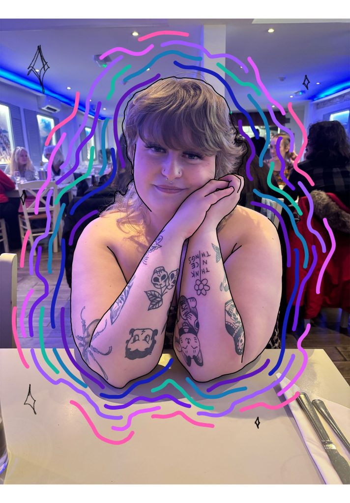
These posters are to show who I am as a person and make people interested in seeing my work. one the style I used was like an teenager poster with all the colour scribbles and small drawings although the colours don’t match the background and it’s not in the colour pallet of the picture I think it stands out a lot and that makes it more eye catching and makes people intrigued also the lighting in these photos are quite strong makes the colours blend in with the photos better there’s also this bubble around my face to make people look at my face first the colour I added around the bubble is to just put some more colour to go with my website colour pallet . used yellow and black writing saying graphic design honey walker it adds colour and its info on what I do and that’s graphic design. on my second poster I used a lot of colours and tones from the colours in the background and such I think it really goes with the chilled out happy vibe of the poster I also like how you can see all the tattoos on my arms and it gives character to the poster I also used an black outline on my body to give it an cartoony feeling to the poster I feel like it makes it stand out more I also added some stars to add some detail to the poster I love how both posters have scribbles and such added to them it makes them stand out and makes people look because of the colours what are used I find that quick sketches on posters and such actually look quite cool and unique especially when it’s a wide range of colours and small details of colour.