From research that I did on websites on the first assignment I also went through reviews on what people had issues with such as errors and what they thought was pointless or what should be added, and this is very useful for those who are making or wanting to improve on their website.
A mix on these reviews complained about the accessibility, buttons not working or pages that don’t have anything on them but could be useful. you want to make sure that the user has an good experience with no issues this would consist a design that isn’t too overwhelming but not a design too boring you want to find a perfect balance , you want buttons that work and make sure its accessible for anyone who uses mobile or laptop and accessible for those with disability’s such as blind or deaf if there is videos , it needs to be accessible for everyone. Also want good customer service and also social media plays a big role in companies and websites because people are more likely to come across to see new things through company’s such as Instagram or Facebook , having an active social media makes people notice you more , you want a welcoming feeling for everyone and to give it a try to see and hear there experiences to see what we can improve on, I used ai to give me boost start on an idea on how an Instagram story should be presented and shown to the public and they turned out quite good , I wouldn’t use ai to make every post buts fun to see what they give you ,you don’t want a website that looks run down and outdated so you want to regularly update and check the website for problems and new news
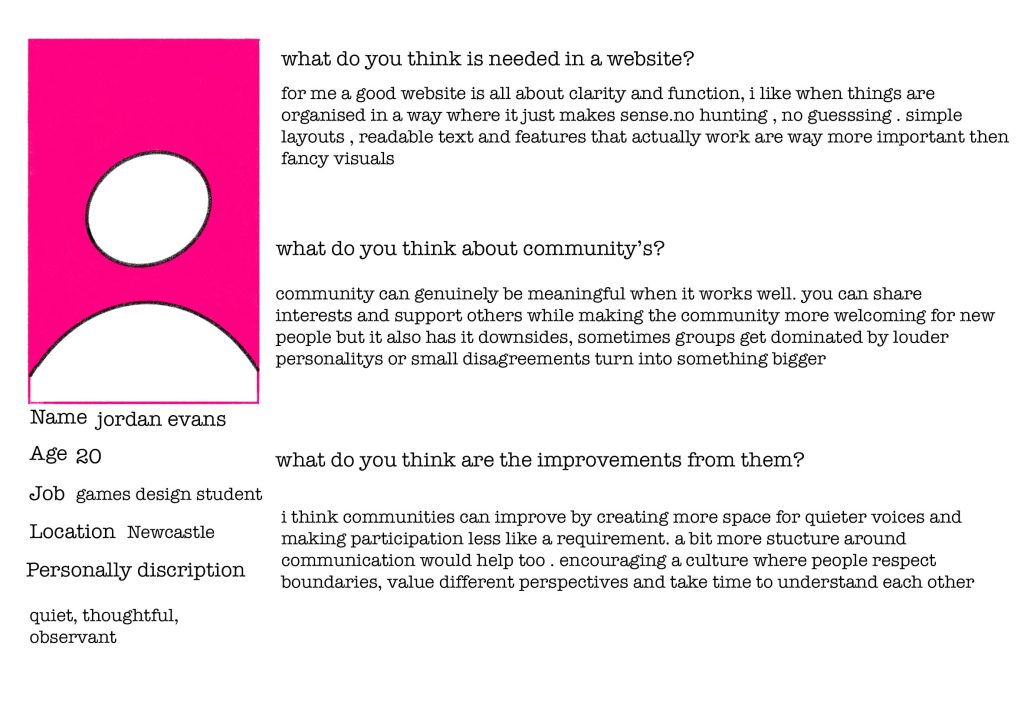
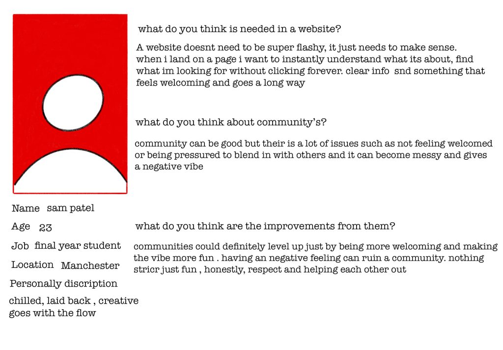
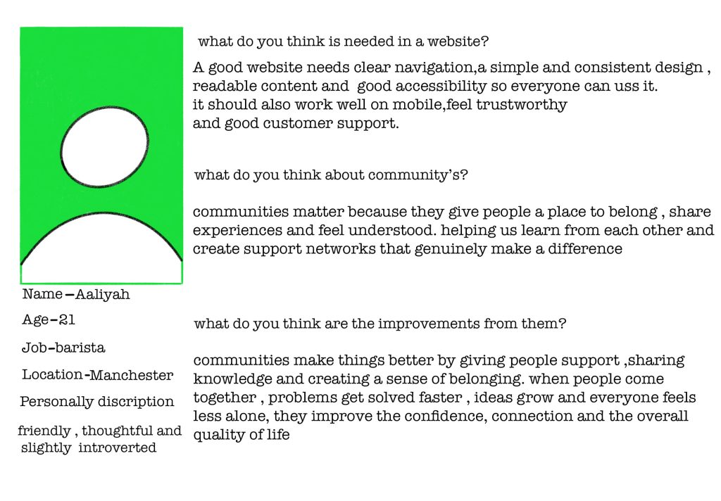
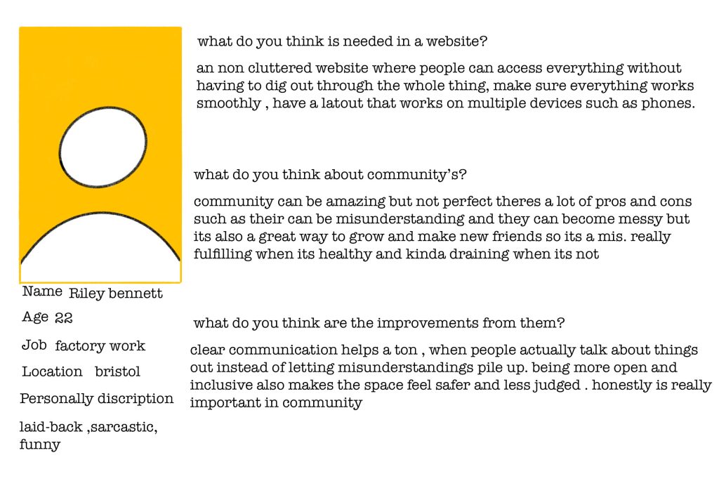
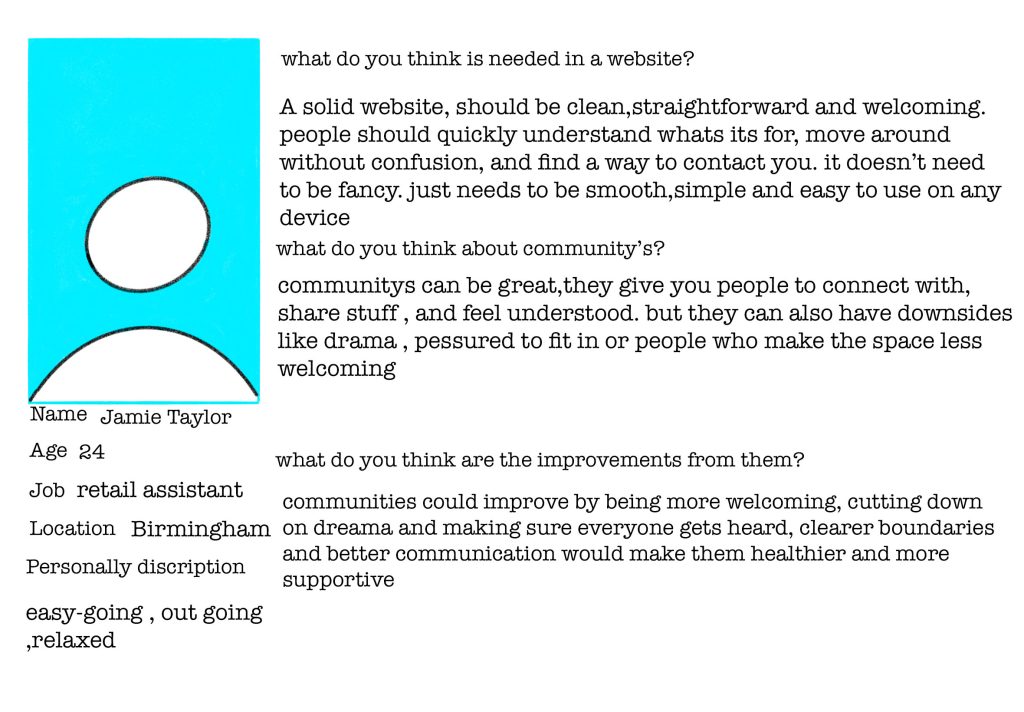
From the user personas they had pointed out good and bad from communities and also spoke about what is needed in a website and from what I have gathered about the website they want a simple and easy navigation website where your able to go on a website find what you need without having to go on a thousand different pages and such to find what you need. its also good have readable text and it doesn’t have to be fancy with loads of visuals to be a good website and having to work on multiple different devices without it being slow or glitchy or parts of the website not working , I had also asked them about their opinions on community’s and they had said communities have a lot of highs and lows and they can be good when people work together understand their differences and boundaries but when theirs loud personality’s it can dominate the group and make it into a not so welcoming area for others who are more shy and not as loud . it can also cause issues such as miscommunication and disagreements and differences can become big things for others communities need to be welcome for everyone without feeling judged or invisible. I also asked what could be improved and what I got was making sure the community is welcoming, making sure everyone gets heard and everyone understands each other. I understand why this is important because if the community isn’t welcoming and such then it will put a lot of people off from joining and building a stronger community and helping each other out and such. From what ive received from these user personas is that community needs to be strong, friendly and everyone needs to be treated equally and the website needs to be simple and understating fast so people don’t go through the whole page trying to find one thing or such and it doesn’t have to be anything crazy
Feedback
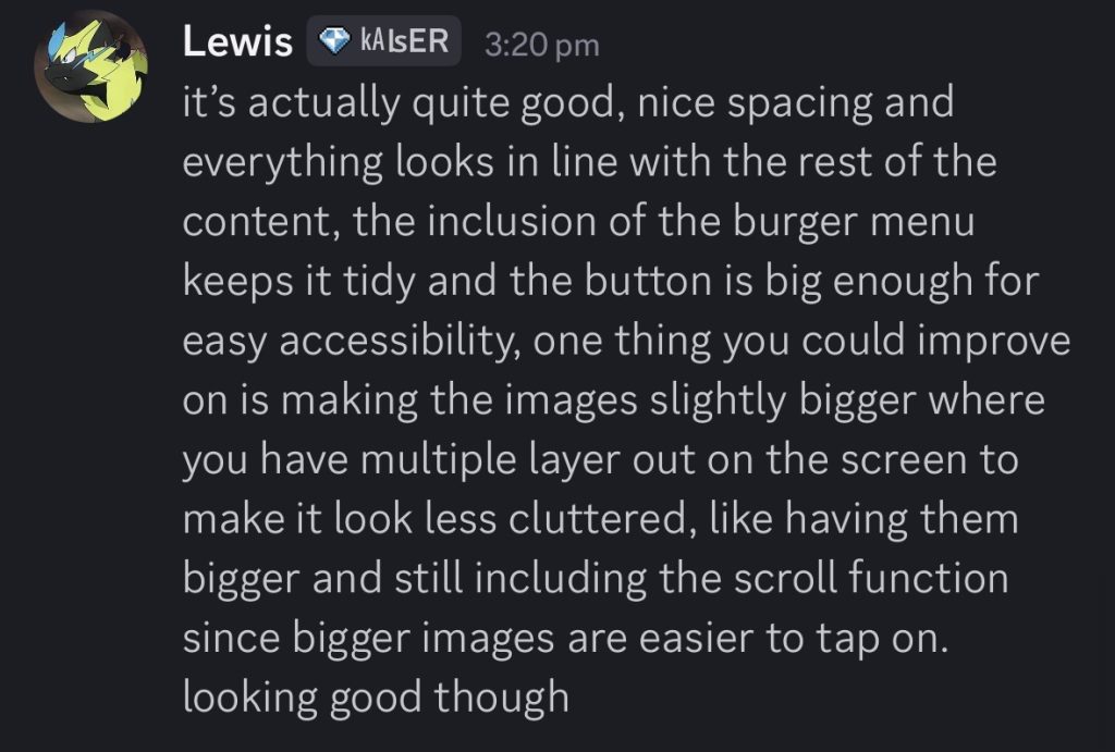
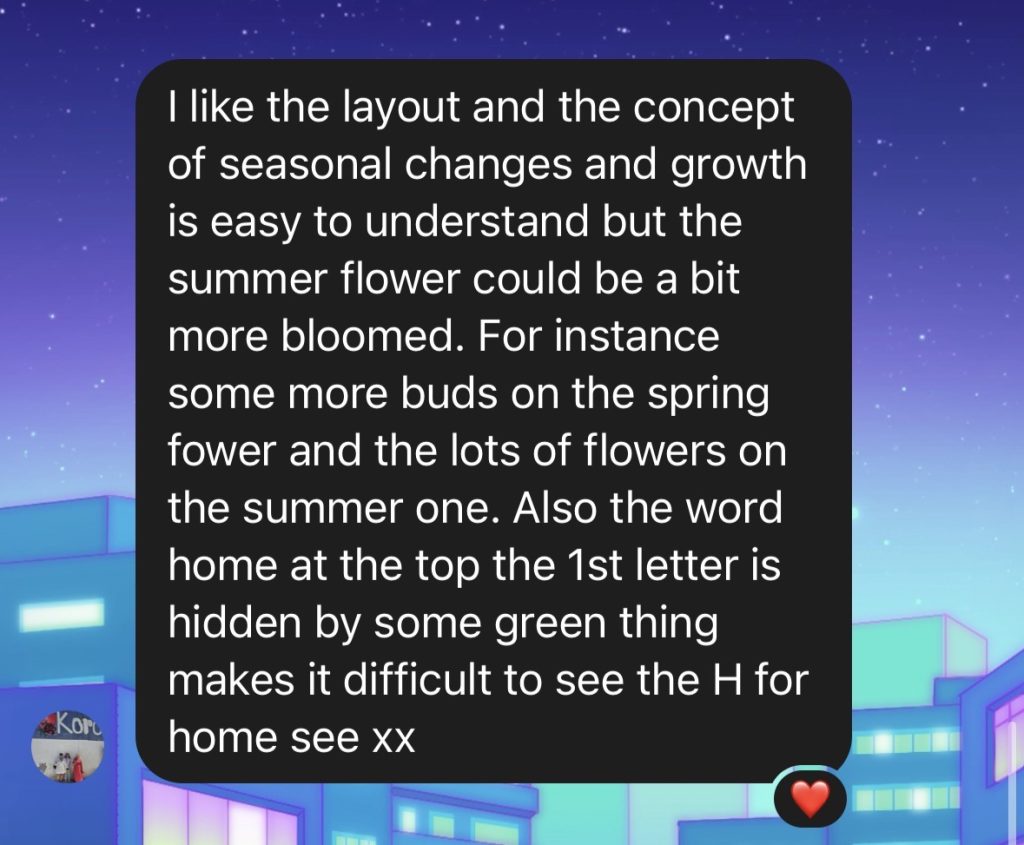
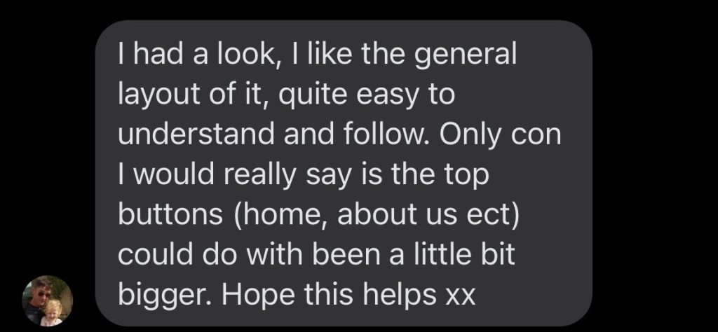
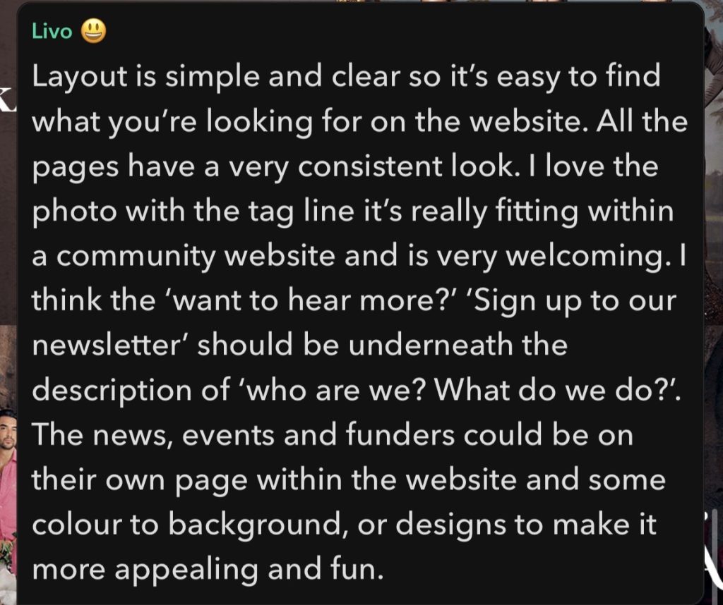
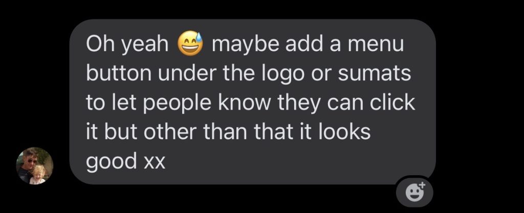
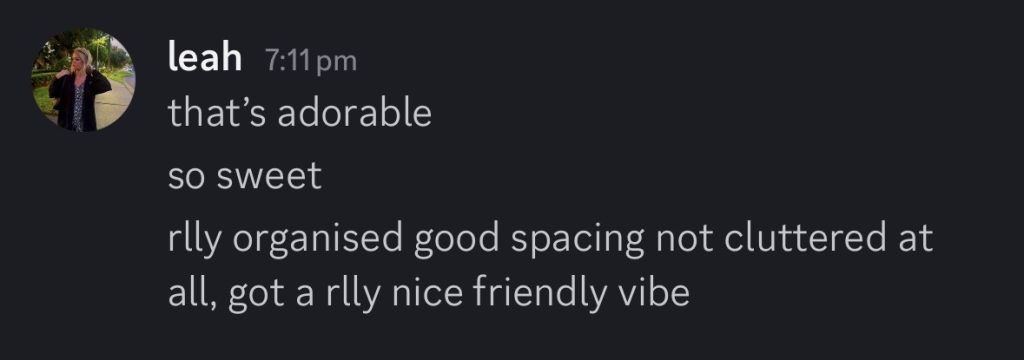
While doing these mid fidelity prototype I asked friends and family to go through these prototypes to see what I can improve on and change for more satisfying experience and such . some have said that the sign up for the newsletter should be under the description of the company and website so I will move that in the next update . I was also told to make images slightly larger for those who struggle to see and I was also told putting outlines on the pages or such is good for those who know what they clicking on and I will also do that and the funders and such could also have their own page so its not as long but I worry that the top bar where it shows all the pages wouldn’t fit anymore their for I would have to create a menu page . I would like to avoid that on the laptop layout because it seems like too much going on the website and from the user personas they want an easy navigation, simple , relaxed website where everything is easy to find . I was told having things such as the fonts a bit bigger and more clear for people to see , also making the grass patch behind the home lighter so the h in home is more clear to see as it messes with peoples eyes but I might remove it in the high fidelity as I think it could look better without . there is a lot of Improvements that are needed from others and personally I think some things do need changing such more colour to make it more welcoming and positive and making images larger and fonts more easy to see . I want to focus on navigation and accessibility so people don’t have issues with seeing what’s on the page or getting confused on where they are on the website I would also like to add an colourful background or photograph of hull behind the welcome