Laptop/ pc website prototype
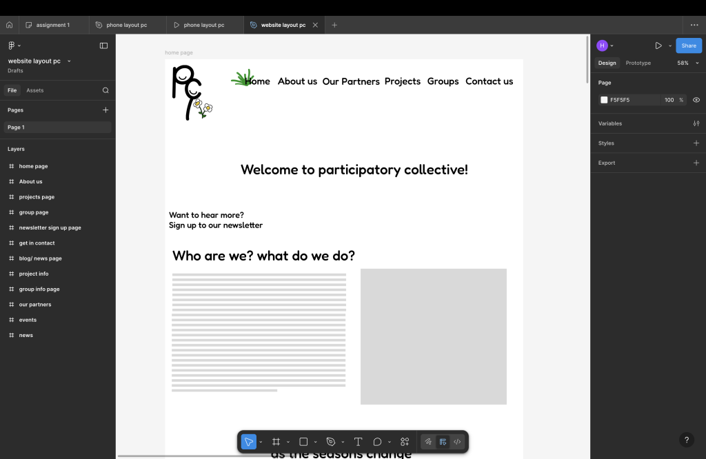
Out through doing this prototype I found more things that I thought that needed to be added and such as my original layout in my opinion seemed a bit too empty and basic. The original layout was supposed to only be six pages but there has ended up being 12 pages and the home page ended up being a lot longer as I kept finding things that I thought should be on the website and is also seen on a lot of websites. At the top of the page, you will see the logo and the different pages shown at the top, the logo says pc but within that logo there is two smiles to show happiness with a flower next to it and on the home, there is a grass patch next to it. The colours out through the website currently are plain and calming but hopefully on the final prototype there will be more colour added.
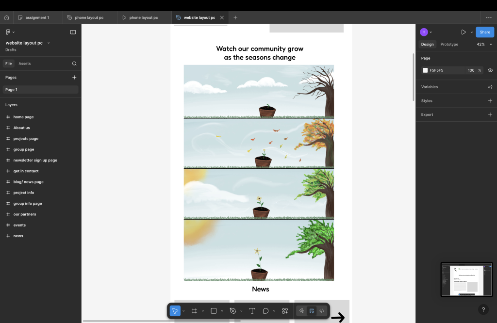
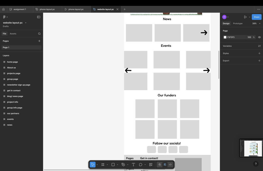
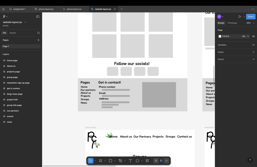
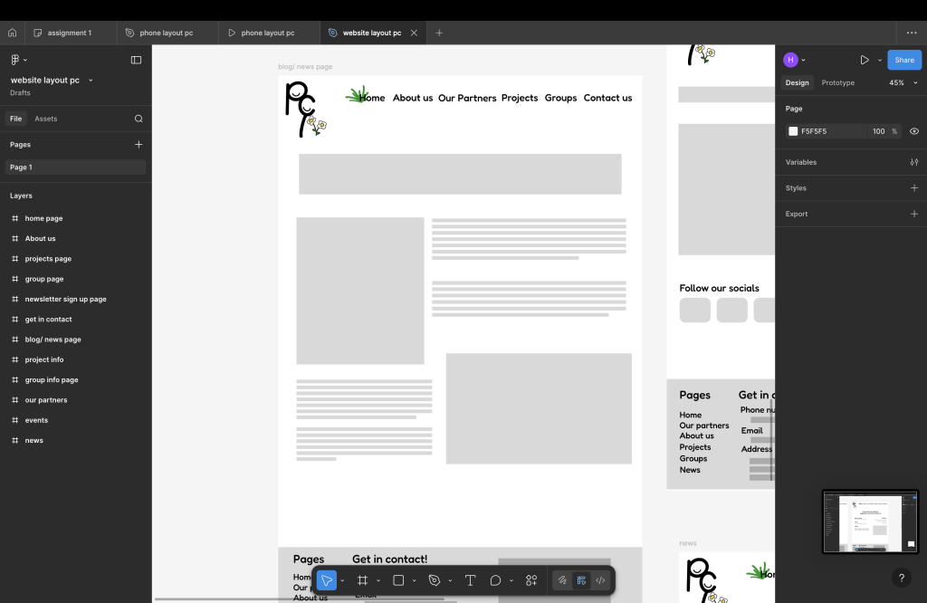
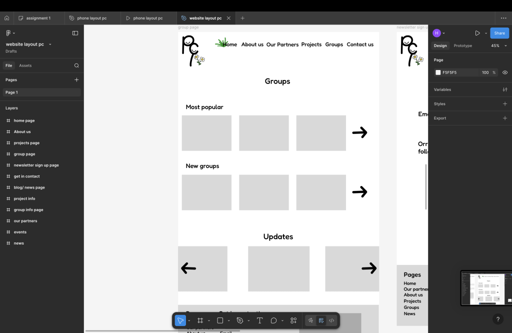
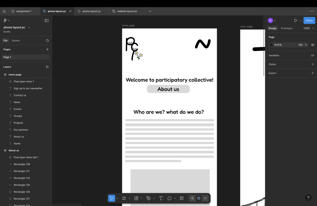
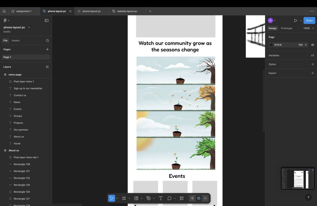
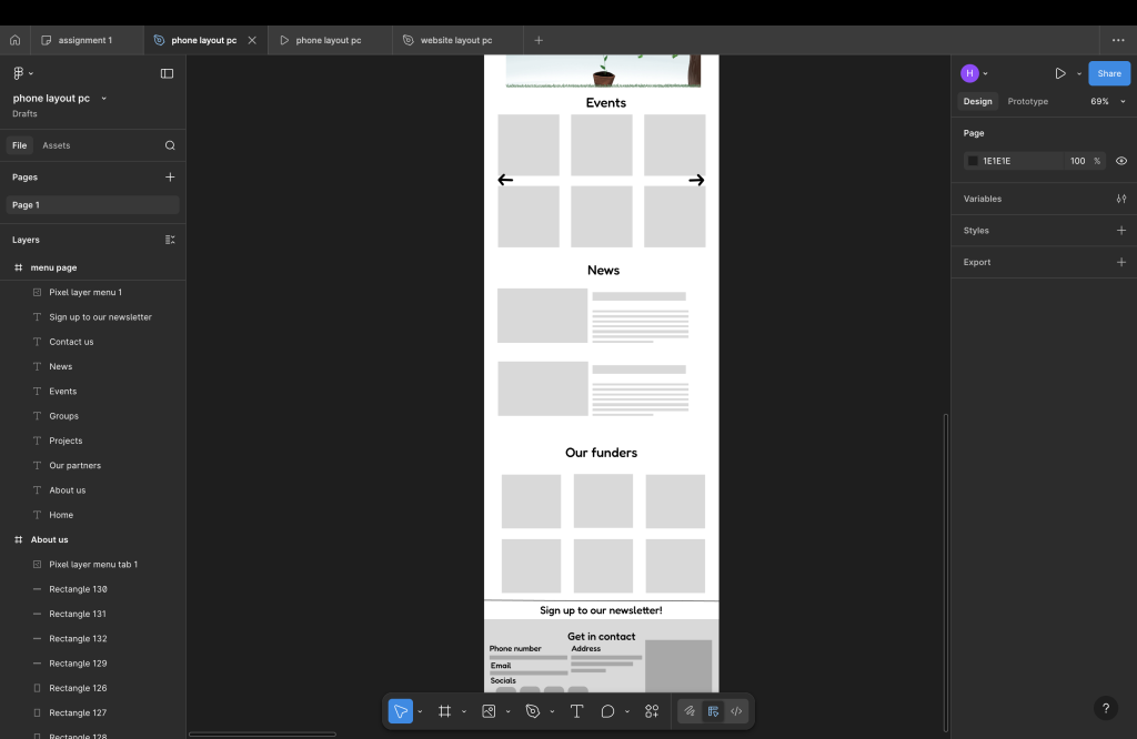
The home page shows an range of different things but when you first come on the website you will see the welcome / home page and under the welcome you will see sign up to newsletter and a description of who we are, under that there is an story telling of a flower growing as the seasons change , this symbolises growth and change and that’s also why there is a flower in the logo. There is also news and events shown at the moment the arrow buttons do not work and only for show but the whole point of them is to show more , there is also a news layout and it’s just a simple layout and funders , this is for stakeholders and to show how important they are to us , socials underneath and a floorer this is on every page and it shows a map of where we are , contacts and pages but one you press get in contact it will show you socials .
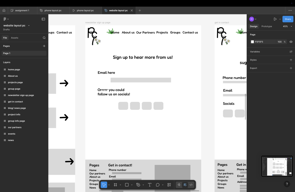
The newsletter sign up page just links you to signing up with email or social media following there isn’t much I could think of to add to this page
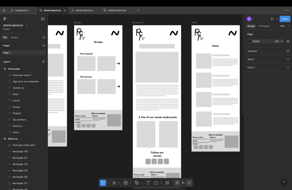
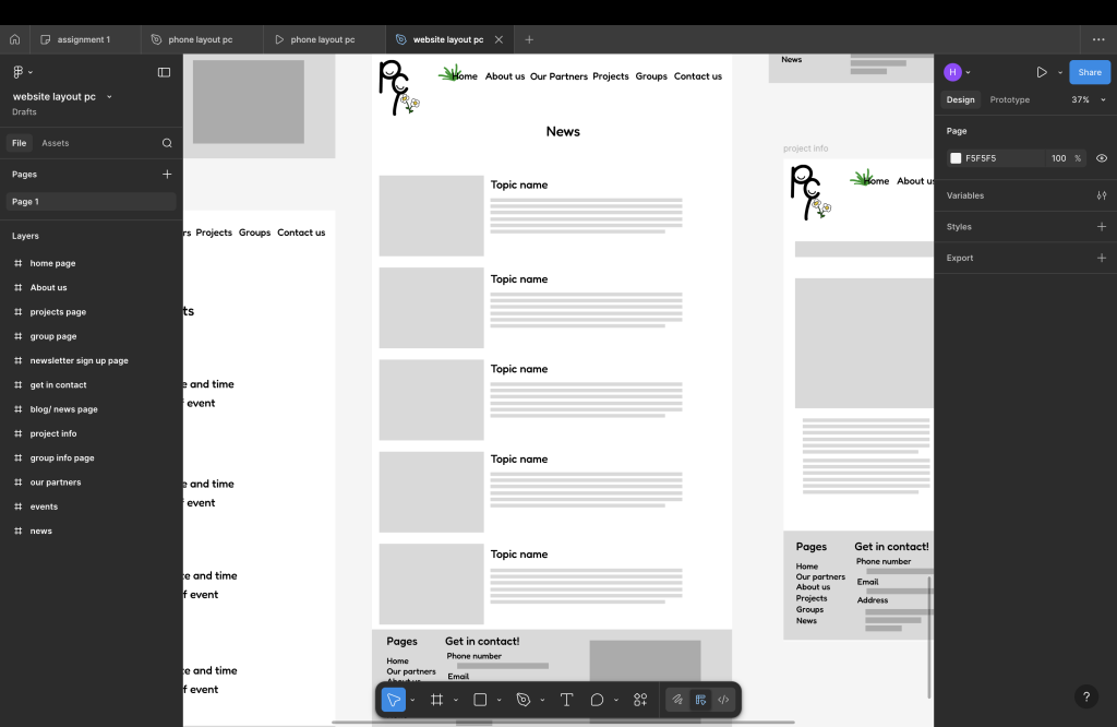
The news page will show a range of different news with the title and short description of the news with a picture and if you want to read more you can press the image and it will show you the whole article on the website, the news layout is very similar and its very much like the project info page but with a bigger title
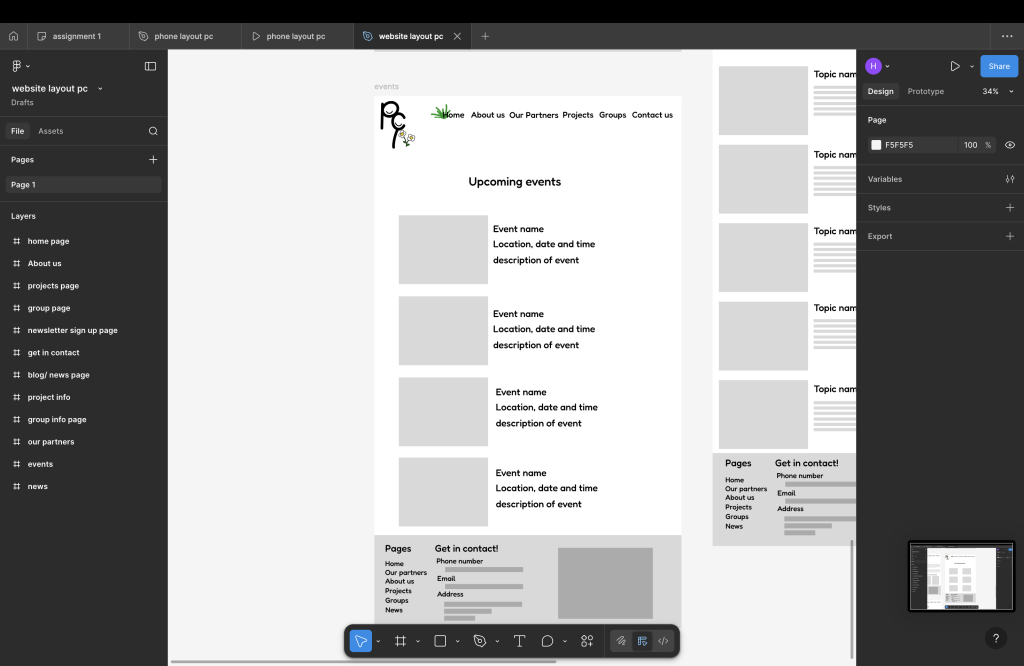
The events page shows a picture or poster of the event with a date, time, location and once pressed on image you can add to your Calander or it can send you to our socials with the upload of the event with more details
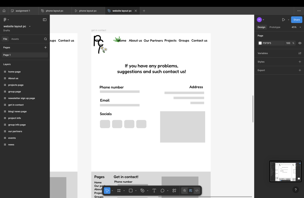
The get in contact page has phone number, email, socials, address and a live map this will help people with reporting a problem or suggestion
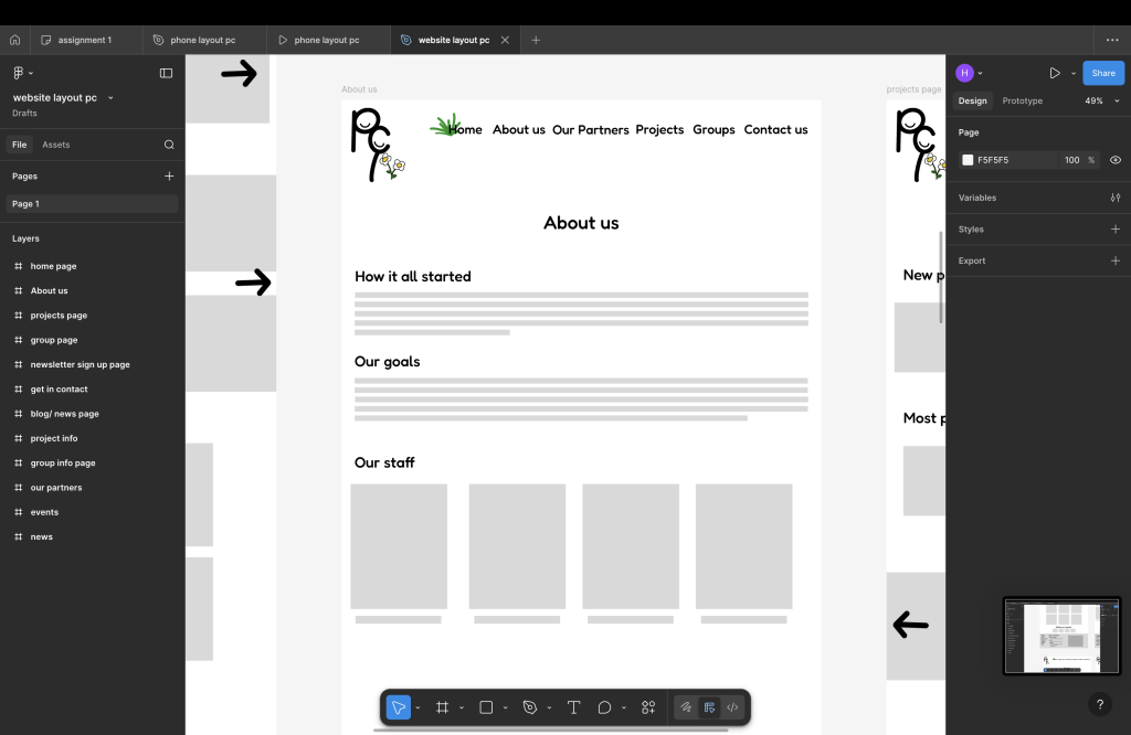
The about is page doesn’t show much but it gives a description of how it started, our goals and then staff this will show staff picture and name and job label, nothing personal will be exposed such as socials or contact just name and job
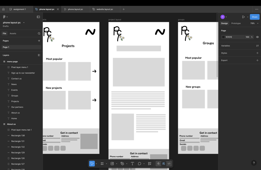
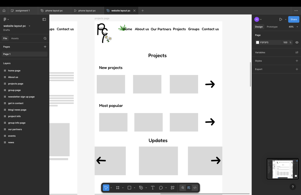
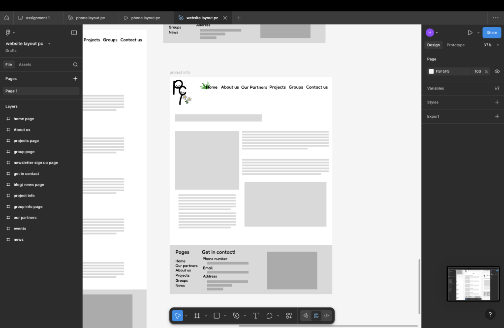
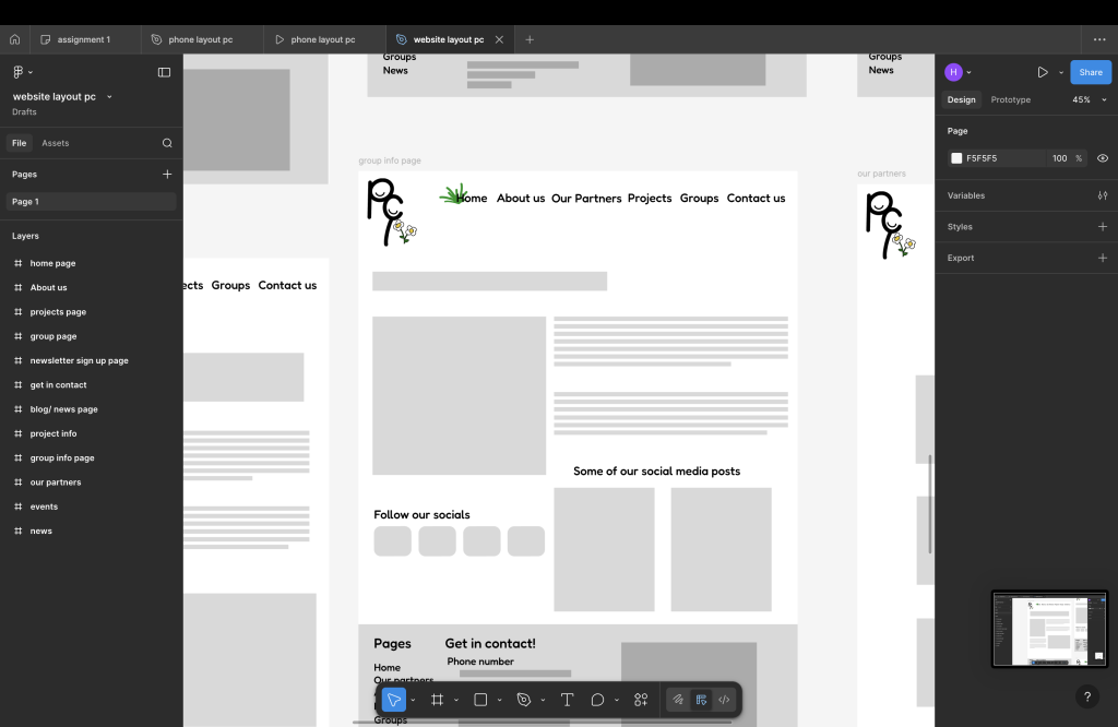
The groups and projects page is also very similar to each other they both show what’s popular and what’s new and arrows are only for looks and don’t do anything this will change in the high-fidelity prototype. there is also a page for each group info and project info they are also similar; except the group one has links to social media and social posts and the project layout doesn’t.
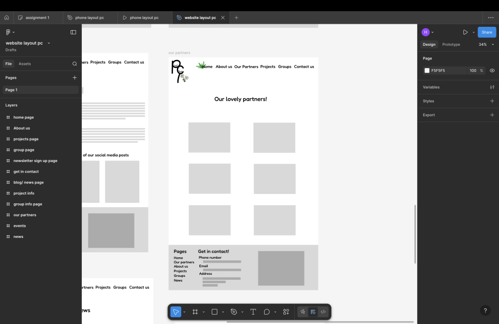
Our partners is a page that shows who works along with us this will show a picture of them and a name and link to website or socials
Phone website prototype
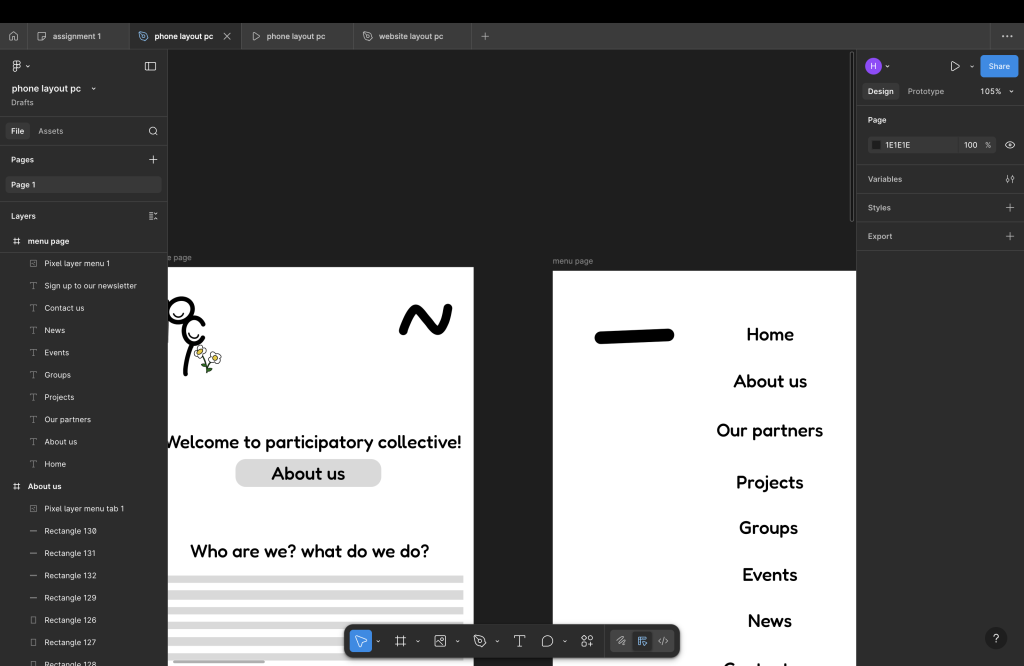
The phone layout is very similar but it’s good to have layouts made for different devices as not every layout works on every device, there is a lot of issues from different websites on different devices as some features don’t work, can’t see the whole page and more there is a few differences out through the website on this layout. There is a lot of improvements that need to be done such as more colour , arrows and features that need to work and needs a more professional look to the website in general but for a mid-fidelity prototype I think it’s a good start to higher and better quality website
the home page is a bit different as you don’t see sign up to the newsletter at the top as you do on the laptop, but you do see an about us after your welcome into the website on this will take you to the about us page with info about us and staff. Under that is the same stuff you see on the home page on the laptop at the bottom of that page is where you will see sign up to our newsletter and the socials are put on the footer of the page and is shown on every page there is.
The menu page on this page you will see at the bottom of the page there is a drawing that I did myself of the Humber bridge, I think this is a nice touch to show its based in hull and it also shows all the pages and the straight arrow and it will go back to the page your original on
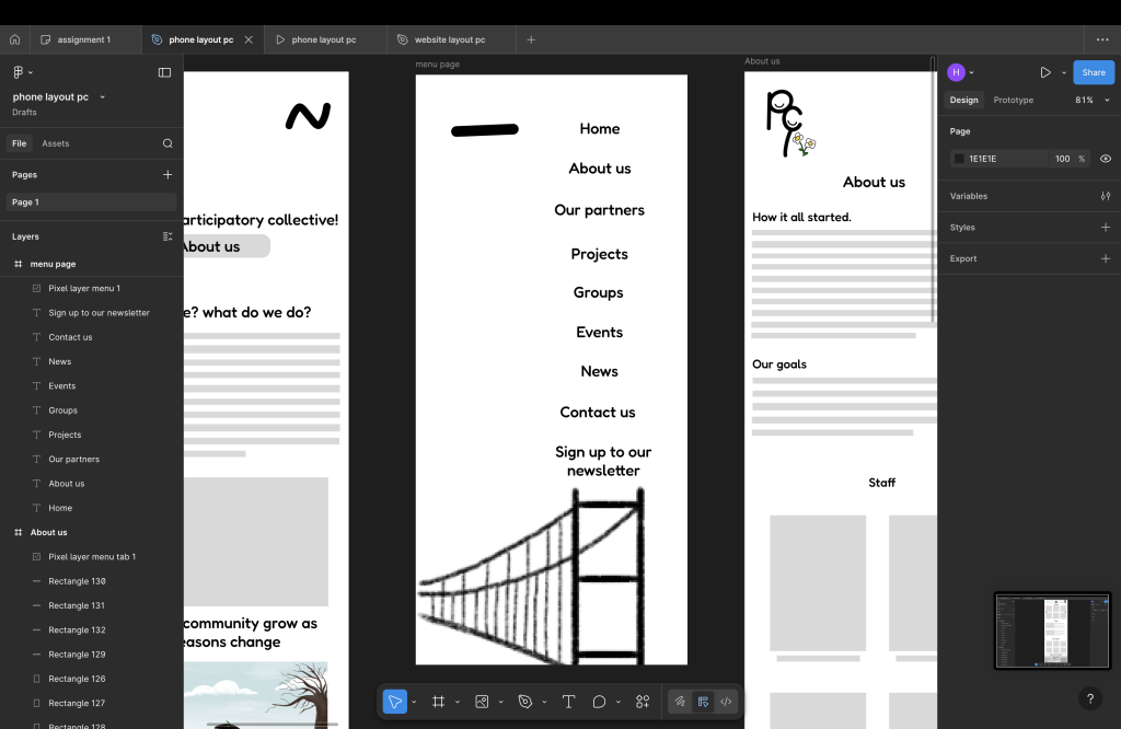
On the top of the page, you can use the logo as a way to get to the home page, and the hamburger menu design will be like string on the high-fidelity prototype where it stretches into a long piece of string
The big differences is the layouts for blogs / news, group info and project info where the image will be bigger and clearer for those who struggle to see the layouts will also have bigger titles.