logos
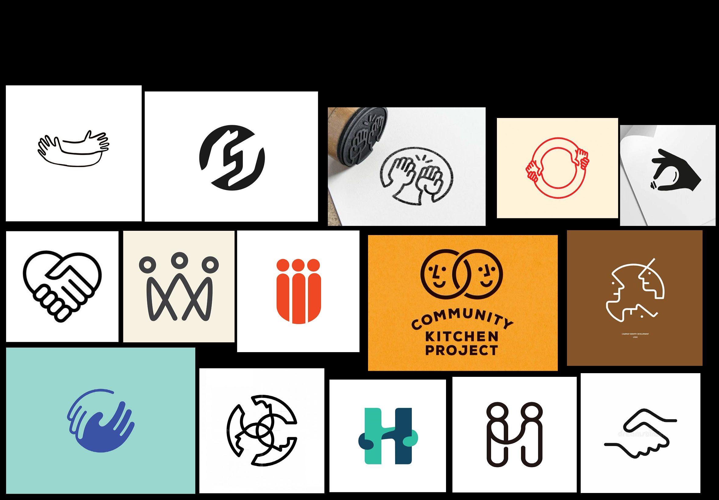
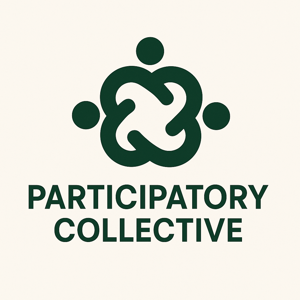
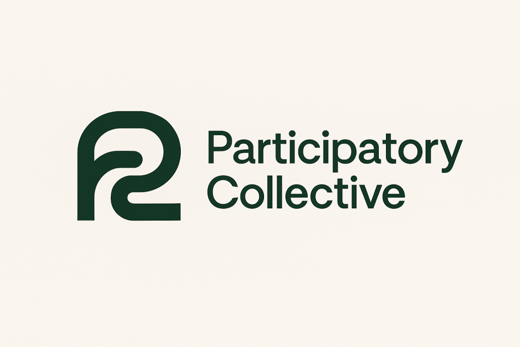
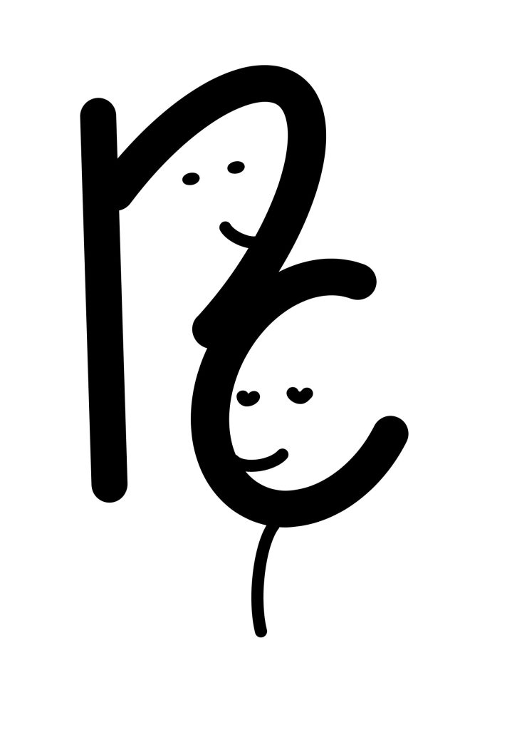
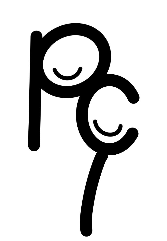
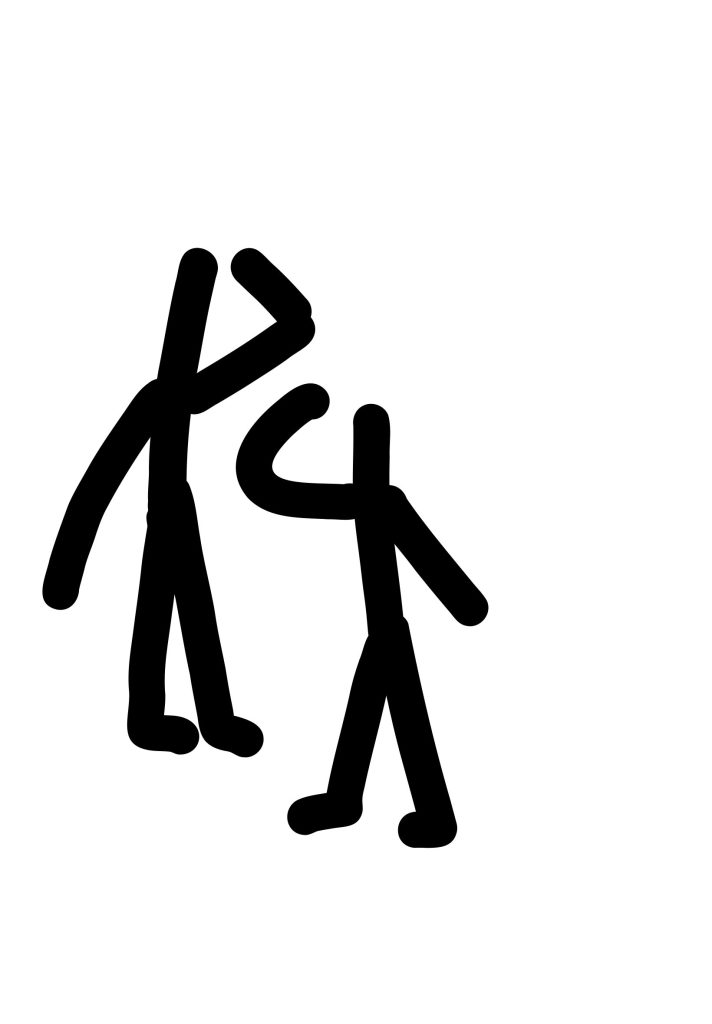
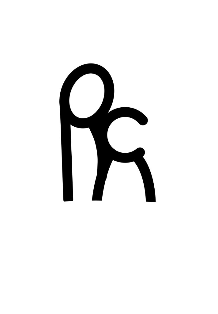
I started with the mouldboards on Pinterest for inspiration on logos and I also used ai to give me some ideas on where to start I did try doing some logos before this but I didn’t like how they turned out I wanted a logo to symbolise people but I also wanted a logo that stranded for the company participatory collective also as cp as I did in my logo design. I want the logo to give a warmth welcoming feeling that will not only look good as a website logo but a logo for posters and merch. I like the look of a thick logo but with some designs it doesn’t always look good. The designs I’ve done are to shape like people being close together to show how participatory collective want the community to be like for everyone who joins. I also did some simple logos just as the two simple letters pc in a thick font and I also experimented from some inspiration I saw on Pinterest and all though I like the idea of how they have an whole body and the arms are what have been used to shape them into pc I have mixed feelings on how it turned out but it was fun to experiment
moodboard
AI logos
logos
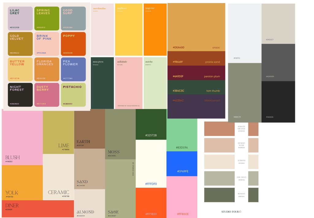
colour
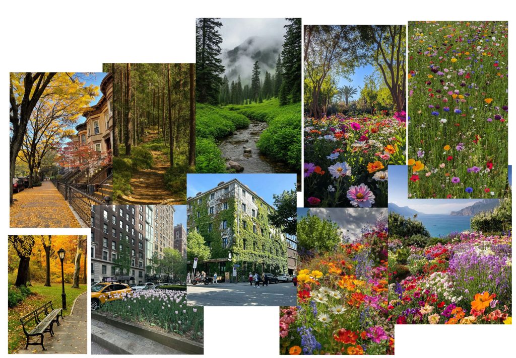
I did explore on Pinterest and the colour pallet app to find inspiration and to see how some colours go with others and could it match with the website and what participatory collative is about I wanted an warm but bright and nature like pallet as I find that nature colours in the summer and out through the year can give a lot of positive emotions I like the tones of the greens but with bright colour as pinks and floral like colours to remind people of flowers I also tried the logos in different colours to see what would look best . I also looked into photos of city’s and nature and sunsets from all different city’s to get a colour pallet as I thought this was good to give me ideas on themes and colour
moodboards
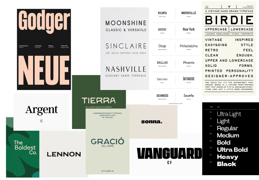
typography
I did research on Pinterest for font styles and I wanted something easy to read for all people and an calm , relaxing feel , I like thicker fonts yet wide but I also like the very basic fonts you can get on all platforms or the same font you see on your keyboard , you don’t want a font that can come across as overwhelming or hard to read. All though they look pretty they aren’t for appropriate websites maybe they could be appropriate for a poster depending on the event but even then it can come across as overstimulating. I like the look of a modern but simple font, the fonts for paragraphs and such should be simple for those with disability’s who find it hard to read and the title and the company name could have a more unique fun font
moodboard