Expand on prior research of similar/relevant companies, which parts of their website do you consider successful? why?
-Butterflies
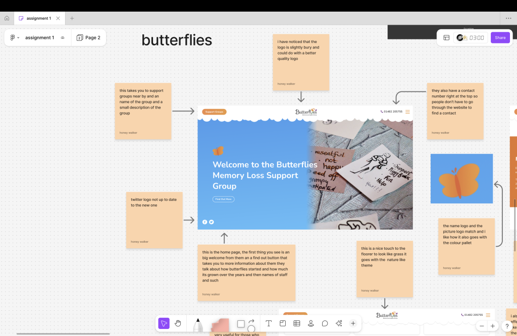
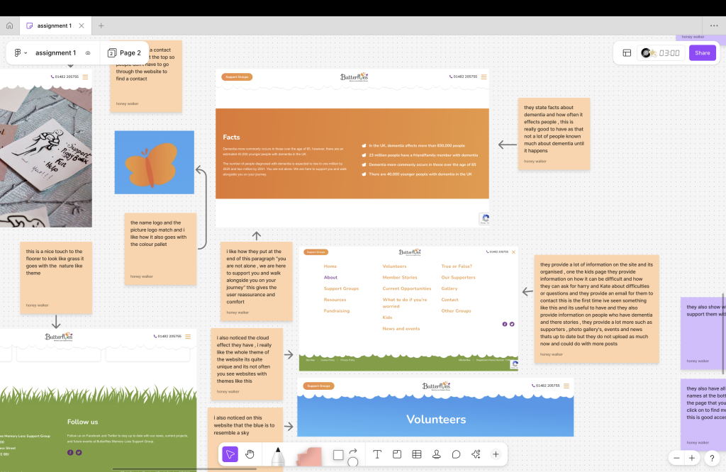
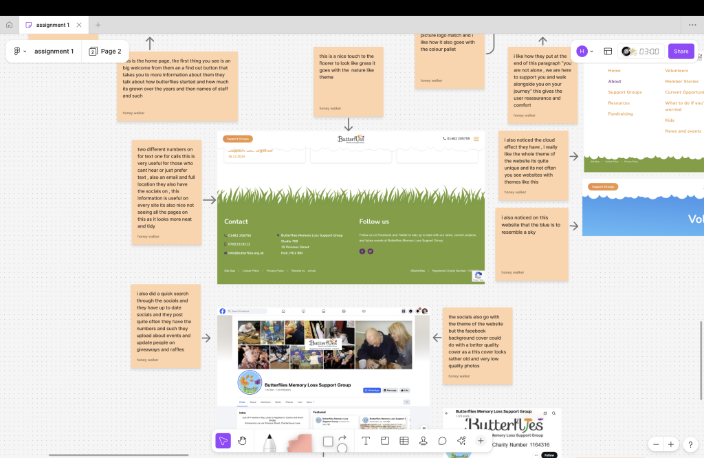
The website is a nature themed website and at first not a lot of people would notice but the green glass floorer the bright blue sky and the navigation bored is in a cloud shape at the bottom they also have a butterfly logo that goes with the theme of the website and fits in perfectly with the name too. The style is well is sort of like the style of a kid’s book. The very simple yet bright and nostalgia like of blue, white, green ,orange and a tiny bit of purple , the layout of the website is very clean and organised , useful information and a lot on the topic the website is about , the home page is simple and not too much going and it’s not extremely long it just tells us about the basics and such. It’s easy for people to manage and you can’t get lost the website isn’t overwhelming and it has a nostalgic and calm yet happy feeling out through the whole website.
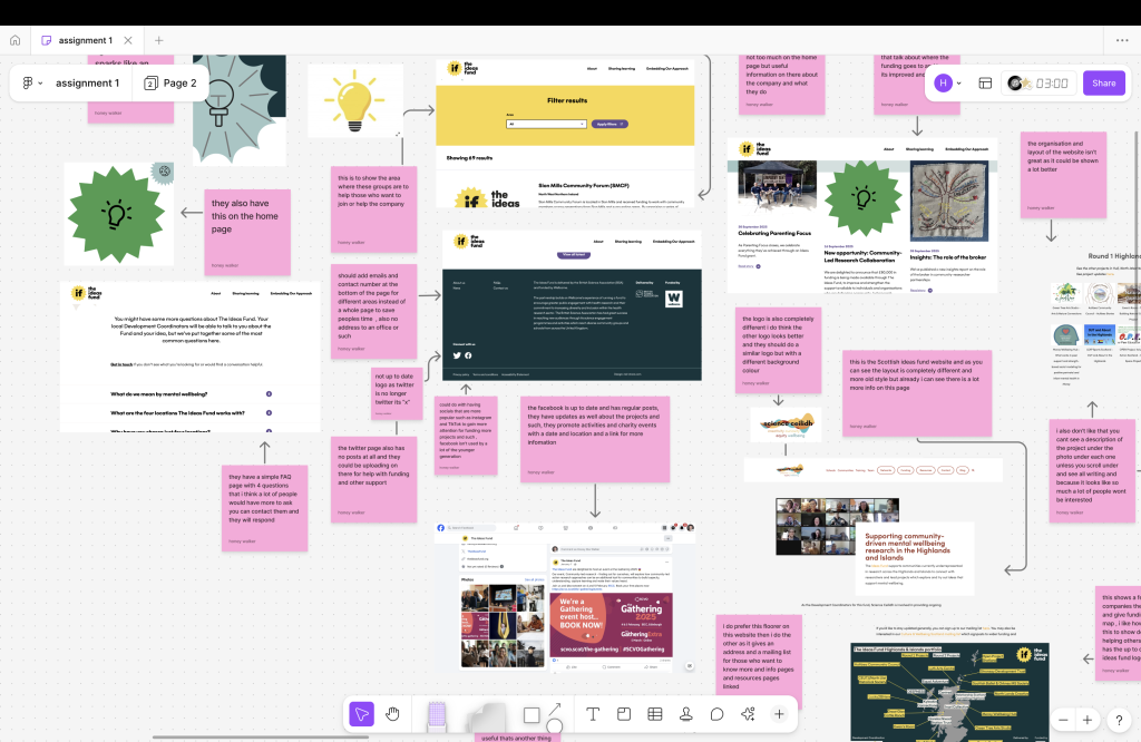
-The ideas fund
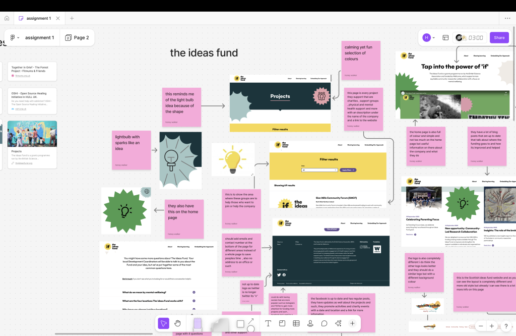
The website is full of shapes with dark yet bright colours and different shapes I mixed on of the shapes to look like a light bulb idea logo and the sparks point out in the same shape and logo also hints the same thing they provide a lot on the website but they seem to be lacking in info such as where the funding goes and not used or up to date socials but I do like how the website gives like a child yet adult like colours because it seems to focus on a large range of ages, the navigation bar is simple and easy to understand but some of the videos and such they have on the website are years old and could do with an update.
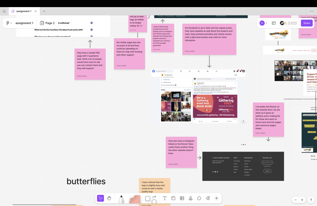
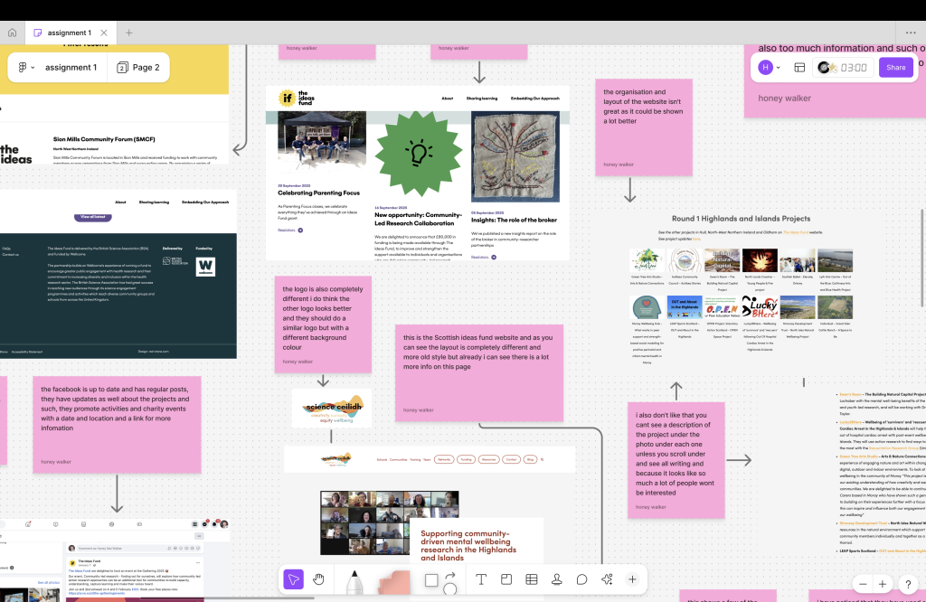
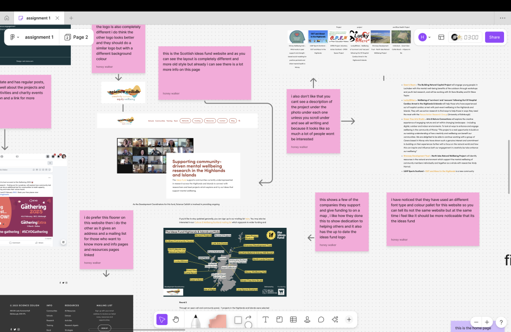
They also have a Scottish version of the website that is very behind has too much going on the home page and so much information that everyone isn’t willing to read , they should put a small description on the project and if they want to read more there should be a read more button , also the layout is very outdated and could be presented a lot better as it shows all the photos of the projects but no description until you scroll down and see them all it should be a photo of the project and then a small description . I also don’t like how the Scottish website is a completely different style. It should be a similar style with different colours.

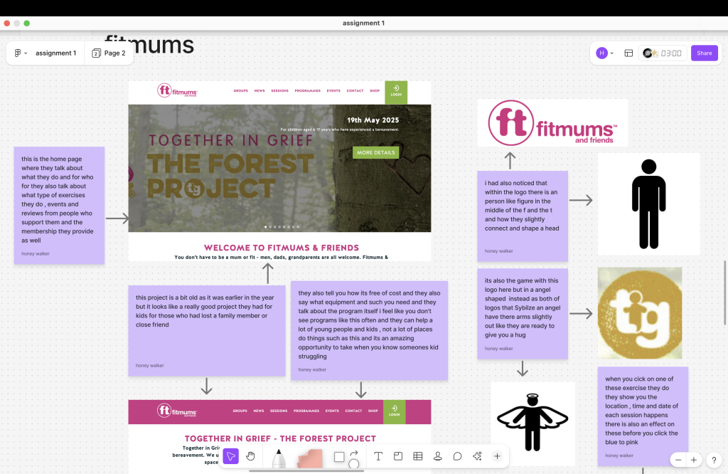
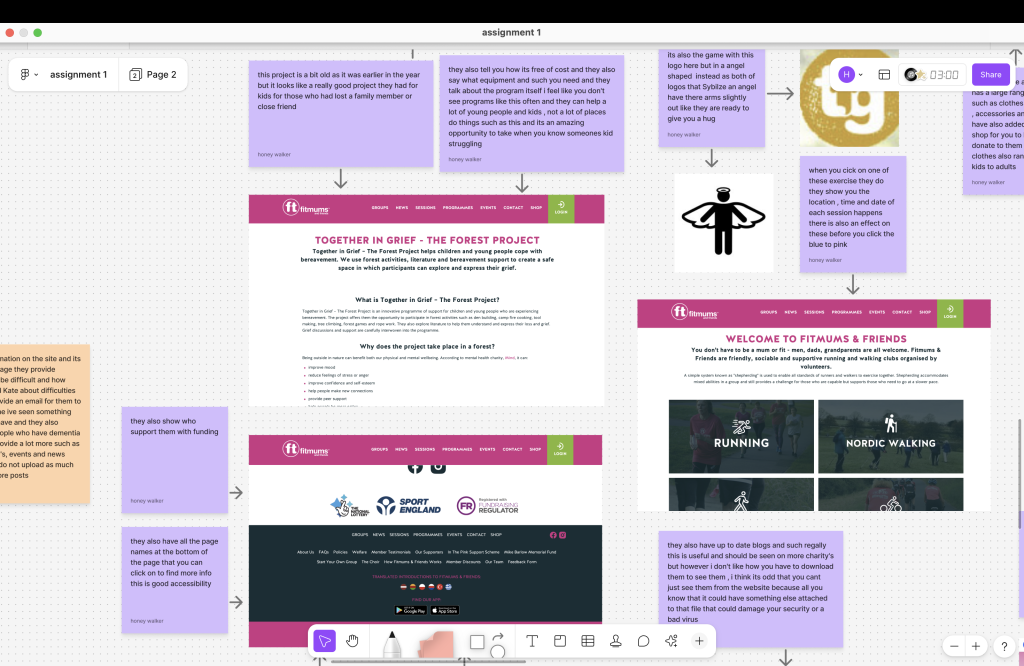
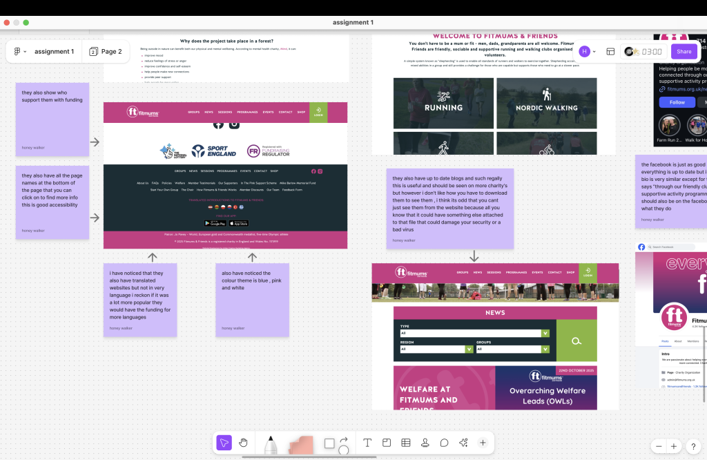
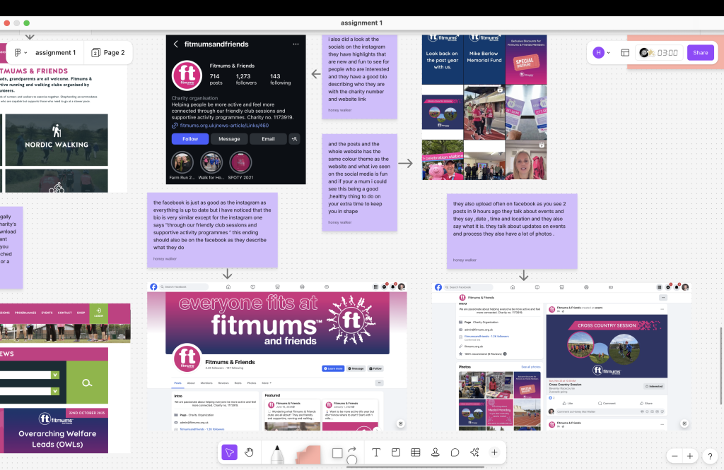
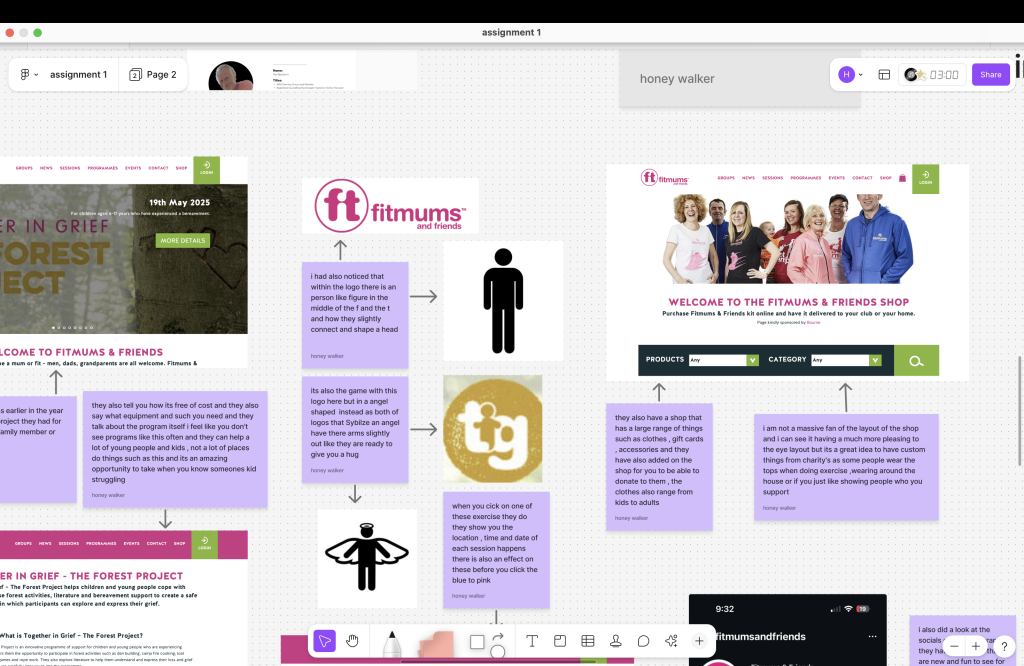
-Fitmums
The website is very simple and nice the layout is clean and organised they provide information on what they do , events , they talk about support and they also have a shop that provide a lot of things such as clothes and accessories and you can also get a gift card or donate to them the website is very girly as the website is called fit mums that goes with the purple , pink and green theme to the website they also have good accessibility for those who can’t understand English as they have a few websites in a few different languages but would be useful to have more like Chinese as that’s a very popular language , but they could do having help for those who are deaf or blind on the website such as deaf people can’t hear the videos and would be good to have a feature for parts of the website to be read out if wanted but I am not a massive fan of the layout on the shop as I find it a bit outdated I also feel like there could be better quality pictures of the items on the all the same background
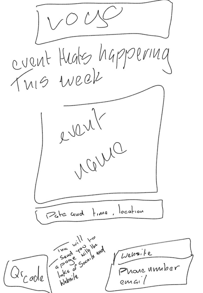
Poster and layout sketches
I drew three poster layout sketches that I think organised and not too much information on the page and have the information someone would need to know basic information and how they could see more about this
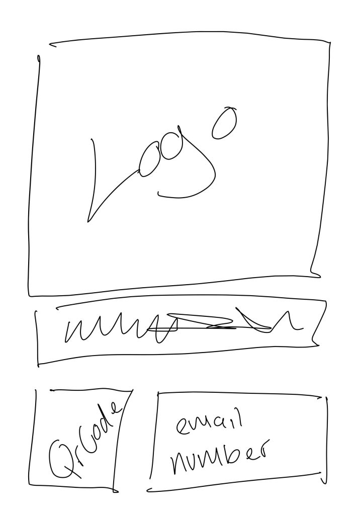

1. I like how big and simple this is , if we had an photo on the background that shows an event or a picture of hull, also only basic information but out of the three layouts I personally think the last two are better
2.this one is for those who are willing to look for more than a few minutes, but I find this one to be the most overwhelming depending how much info you put down about the company but the whole qr code is useful to have on all posters now because everything is done with a phone
3.having the event in the background then a big title I think catches people’s eyes with the logo picture at the top but not the company name also basic and necessary info on poster