Out through the app making I wanted an relaxed atmosphere and I wanted a simple colour palette not something too much but also not too bland I used the colours of a pastel green, white, light Gray and black for a simple and minimalist look.
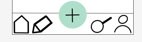
The navigation bar at the bottom of the page is the most useful part of the app because it takes you to all different parts of the app in just a press of a button , the designs on the navigation bar are simple an house for home an pen for writing as typing or talking , an pan for cooking and a person for profile.
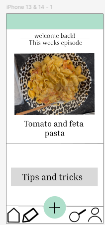
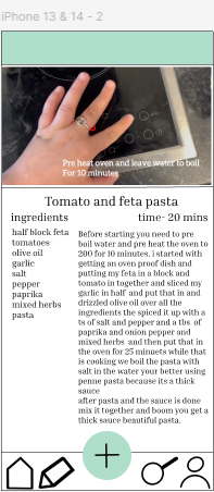
the home page shows your weekly episode when you press the photo it will send you to the video version with written out ingredient list, how long it takes to cook and step to step written out instructions there is also captions on the videos to show what is going on due to having no sound.
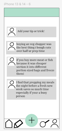
The tips and tricks and the feed page are for everyone to use to talk about the recipes , problems on the app, improvements that could be done and tricks and tips to make life easier while cooking this is for the owner of the app to go through and see if anyone has an problem with the app or future features that could be made .
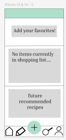
The shopping list an big feature of the app its used for favouriting your most used recipes , adding items to the list that will remind you every few hours and recommended recipes what will go based other recipes that you have looked at and seemed interested in trying, there is three different sections on the shopping list for trying and re using recipes.
https://www.figma.com/design/27PDY2nxYKHj9bDCk54RCu/Untitled?t=dIYsZzfB7QO2sTxX-0