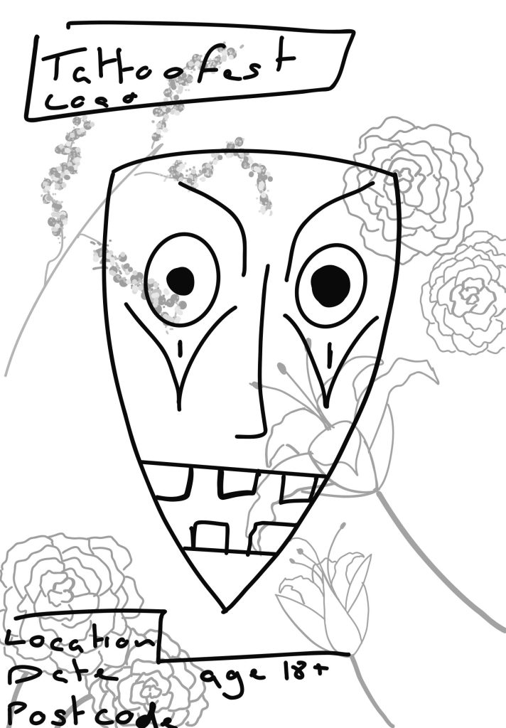
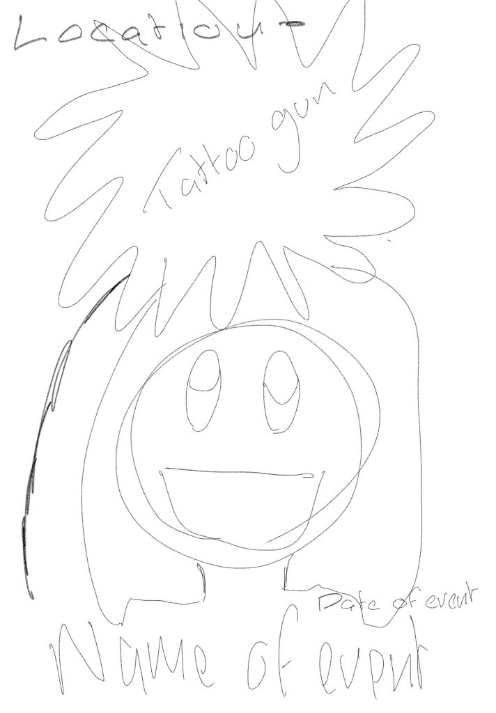
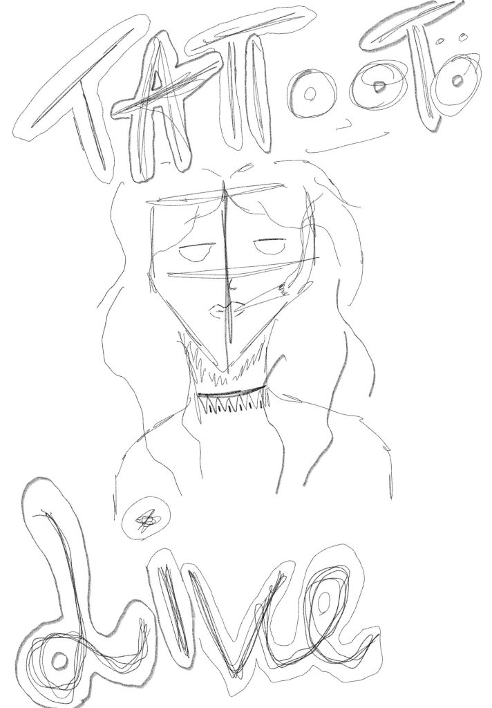
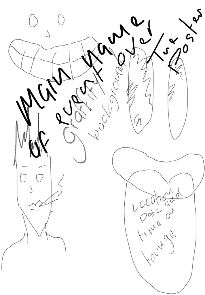
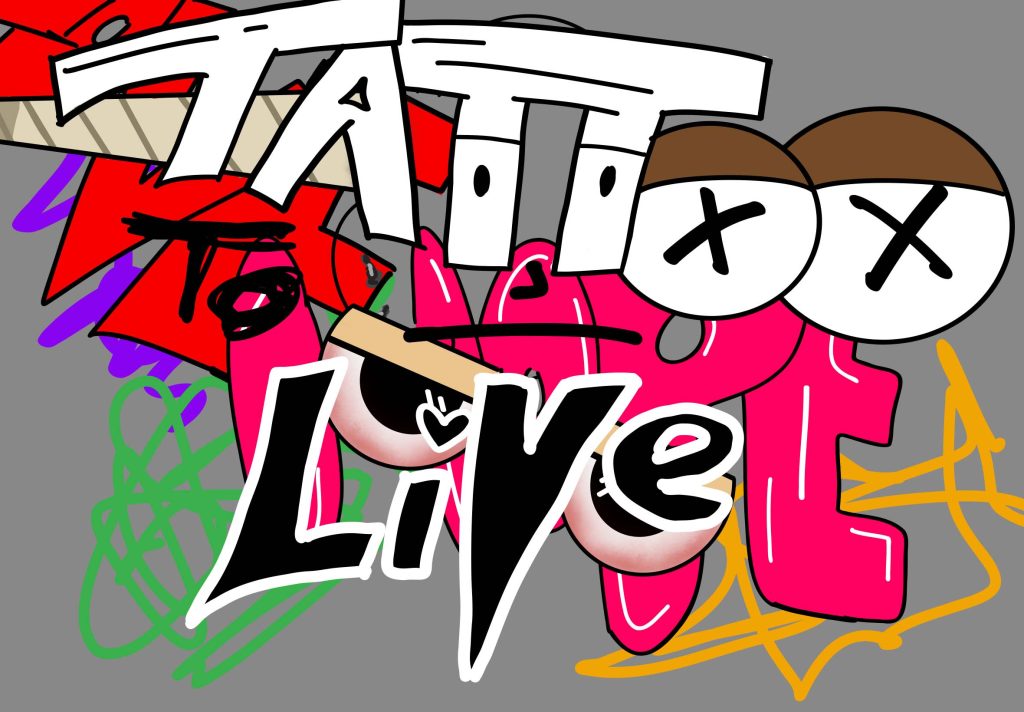
At the start of this assignment, I started with sketches on ideas for different styles on posters for the event I did a few just to try out different ideas on one of them I did a tattooed women but cartoony like sketch. I didn’t use this because I thought it didn’t fit in with the sort of feeling and welcome I was going for. I also did a floral like background with a tribal mask for a background on the festival, but this event poster didn’t make much sense to me, and it didn’t go with the theme I choose. the third poster sketch I did was meant to be an cartoon theme of a yellow man holding a tattoo gun in the air like some sort of god although I liked this idea, I wasn’t completely sure on using it because the same sort of style is used quite often in a lot of cartoons and such and it doesn’t feel unique because of that. I also have the sketch of the result poster I felt like it had uniqueness to it, and it went with my theme and style of the event.
I did two logo sketches I did one of an ink cartilage what is used for tattoos and although this was simple and Morden I didn’t like how it looked on the website I also did an logo ketch of a woman holding an tattoo gun with ink coming out but I thought this looked too much to be a logo and would more look like a poster . I want something simple and Morden and easy to understand I did the logo ttl and although this means talk to you later it also is the three starting points of the logo name tattoo to live stands for ttl and I liked how the two ts connected in the logo.
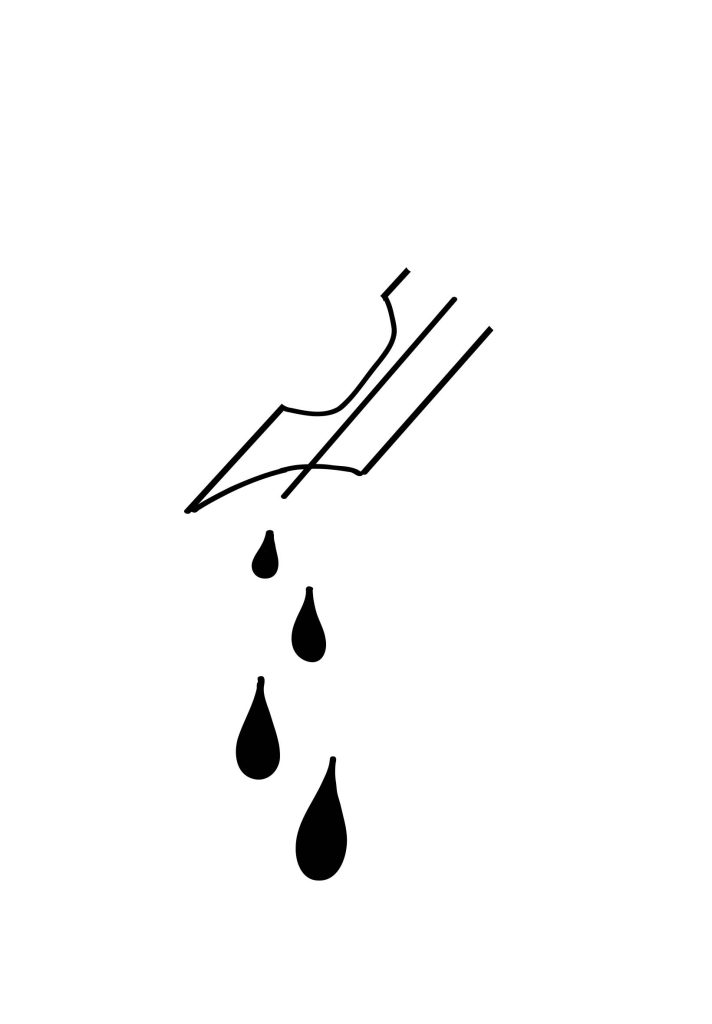
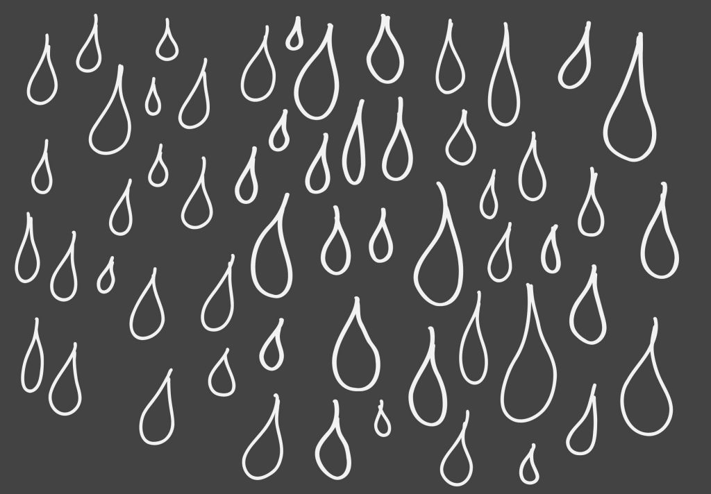
I also did a few website backgrounds and all though I do like these but I feel like the one with more colour fits in more with the style of poster and such I explored loads of different fonts and such while doing this and messing around a bit but I like how it turned out , the dark Gray background with the white drops are supposed to be ink drops . although this a simple background I wasn’t a massive fan on how it looked because I felt like it looked rushed and not taken any time its also the same with the other one without colour looked rushed and messy, but I can see making these backgrounds again with more improvement and detail.
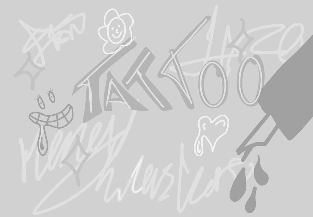
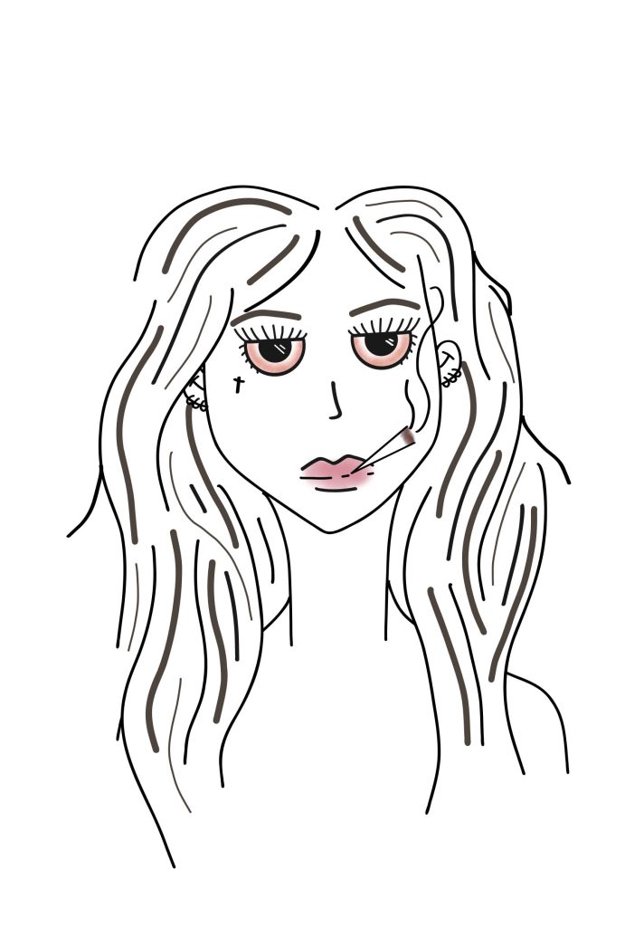
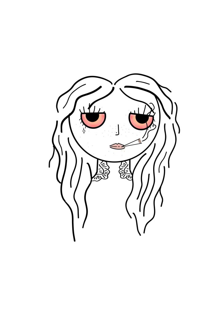
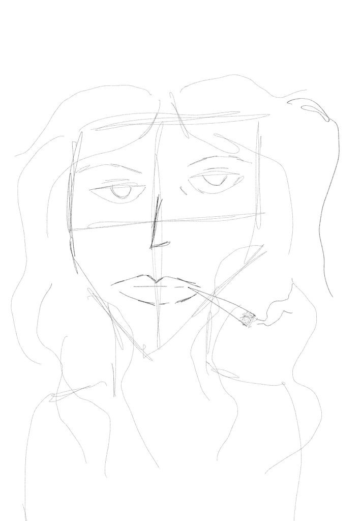
also some sketches i did out through my assigment.