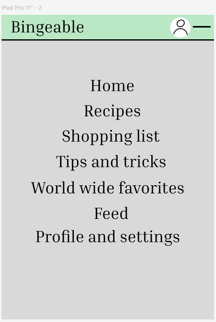
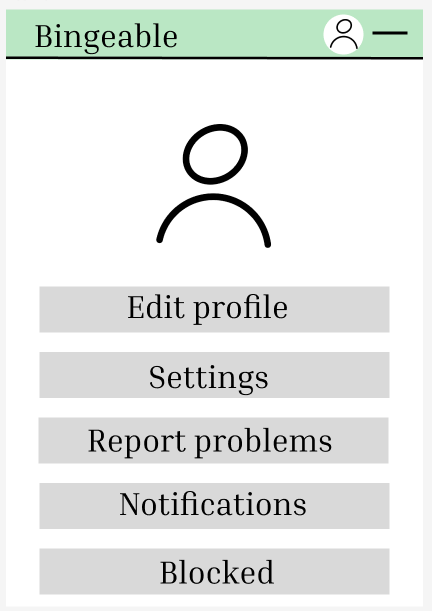
When I started the ipad version of the app there is an similar layout to the mobile one but also different for starters the name of the app is on the top left of the screen and the profile icon is next to the button that leads you to other parts of the app instead of the navigation bar I feel like it makes the app more clean and minimalist because it’s a bigger screen as well I thought it would make sense to make a new page with buttons to link other pages such as the home page , recipes , feed page , tips and tricks , world wide favourites and more
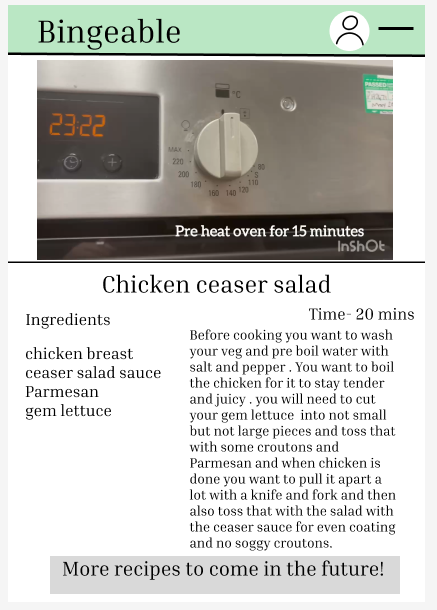
The recipes are also in a bigger font and so is everything else on the app for those who cannot read small fonts are struggle with eye sight.
On the home page I did not add the tips and tricks on the home page and moved it to the navigation page with where all the other links to the other pages are I did this because I felt like it makes the home page look a bit cluttered and unorganized and I was going for an neat , organised and relaxing vibe to the app.
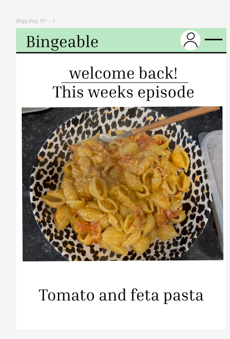
I think the best thing I have changed on the iPad version of the app is an navigation page instead of the bar because an iPad is a lot larger then a phone and wouldn’t be as convenient and easy and there isn’t links from the recipe page to go on to the world wide recipe page because its already on the navigation page
https://www.figma.com/design/Vk9ZOC682XJJ3cCDaKO9Xy/Untitled?node-id=0-1&p=f&t=kqwg3Xm67zHoGnZL-0