subject – air pollution
audience- awareness to air pollution dangers
audience- parents with children
the good examples
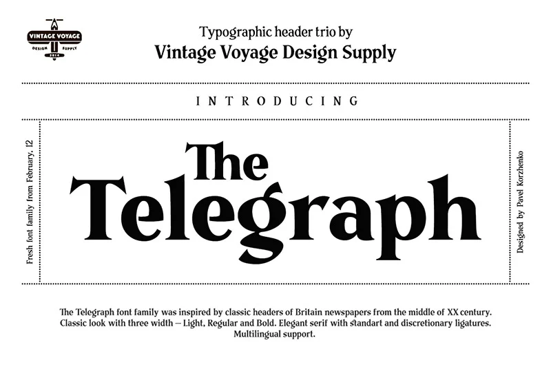
I have decided to use “the telegraph font” as my good example for typography this font makes people interested looking at it when its in big letters showing the news to everyone, even if its bad or good news people are interested what others do . They also put minor points in the newspaper about other topics and use images to show what they talk about in the news. They have 100s of different fonts they use in newspapers, from joint up words to fragile simple words . one of the most classic newspaper fonts is called “Times New Roman” It an font that has been used since 1932 , and it’s a trendy font what has been used by hundreds of different newspaper and magazines companies
the bad examples
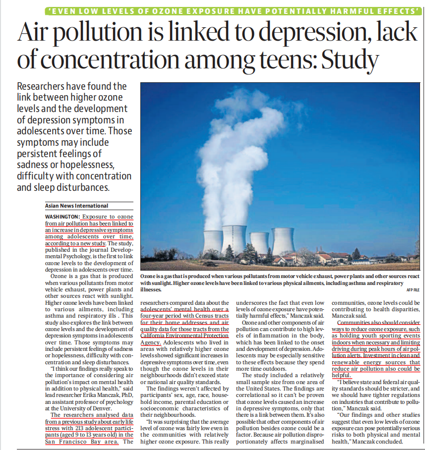
this is one of the best examples I have seen of typography related to my topic . they have used an big caption what makes it noticeable to the public eye and they have highlighted main points in the artical and they have used the classic newspaper font what everyone has seen , its one of the most popular used fonts in this inderstry . they have also used an caption under the picture discribing what type of factory it is and what its doing to us . the highlighted points are important because it explains the research what has been used in this post and all though it doesn’t have the normal thick worded font as the main headline its still appealing to the public eye because of how they worded the caption and it makes it interesting to parents and older generations
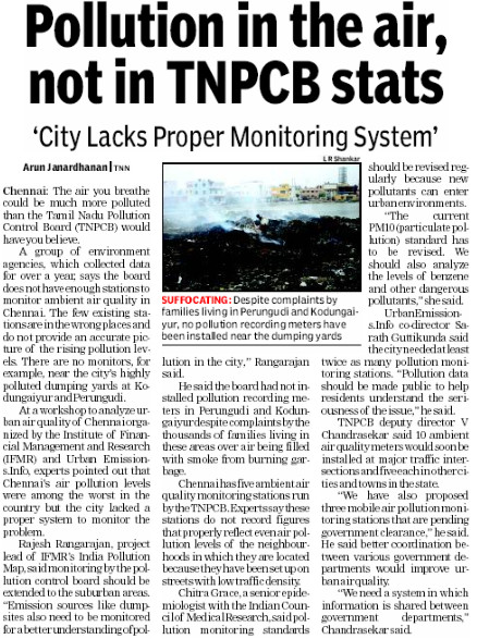
this is a bad example of typography as it is quite plain; they don’t have points of the topics they talk about, and it is straight to the point and is quite crowded. It doesn’t strike and stand out to make people of the public interested and see what it’s doing to us and the world, and because of that, it won’t be stopped because people wouldn’t be interested in reading something so plain and boring to look at the only part of this article what is slightly interesting is the picture and the part highlighted in red because that is the first thing they will look at because it stands out. also the font is classic used in most newspapers . I think personally they could make it stand out and make it more noticeable to the public eye if they had used an big caption at the front and use main points of what its doing to the world and us as well. they also should of used a more creative picture to make it more appealing yet scary to people so they see what’s going on and they hadn’t done any of that and I find it quite boring to look at .
the layout I made for an example of what could be a great example of typography