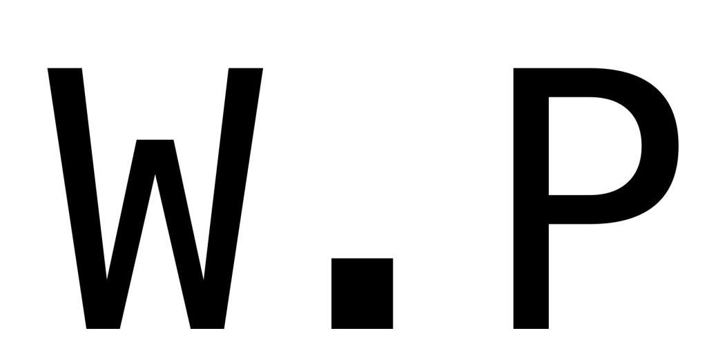
For my name logos on the topics, I have so far talked about on my website I have decided to call my magazines world problems, and I have made a few different styles of my named magazines in this I have done 3 different types of typographical graphic standards. I have done an shortened version of world problems and it says w.p but I feel like it’s boring and doesn’t make people interested in this magazine but also it Morden and simple and that’s really trendy a lot of people in the public eye find that Morden style things match with there homes or such so having an Morden logo isn’t a bad thing to have although I feel like it doesn’t scream important information that we all should know because not everyone will know what w.p meant unless I used a different style logo for different magazines.
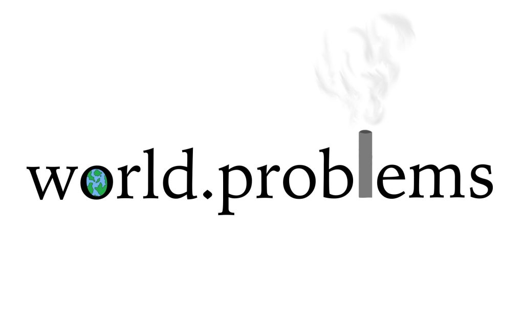
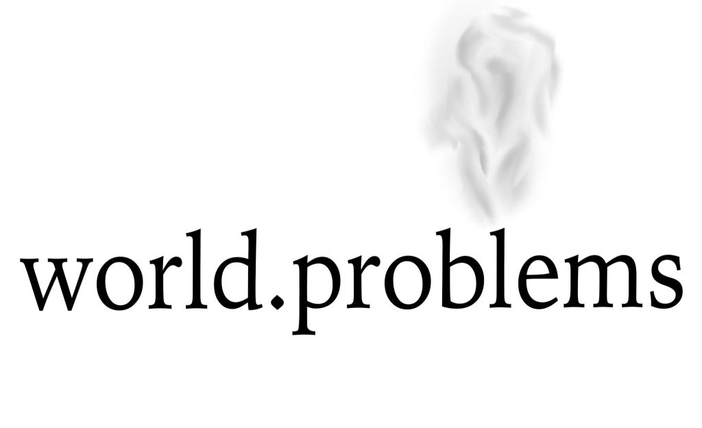
On my second type of logo I did the full name of the magazine and I made the ‘o’ as a earth for world and on problems I made the ‘l’ into a pollution pipe with smoke coming out this is to show one of the problems on world problems I really loved how this word logo turned out its Morden and colourful and I feel that really makes the logo stand out and makes people interested in what it’s about but world problems isn’t a colourful and cheerful topic so I can understand why it could be seen as too much but my professor Robert recommended that I just put the smoke on top of the ‘l’ to show pollution instead of adding what I did because the logo tells us what it’s about and at first I wasn’t so sure about it but its really grown on me because he was right the name tells us all already so just from that alone it tells people what the magazine is about I love both equally but out of them both I do prefer the first one out of the two because I will be using a lot of colour in my magazines.
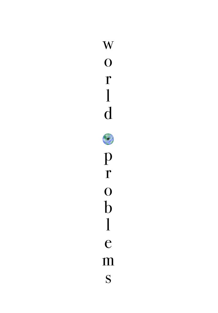
On my third name logo I did a vertical typography logo it still says world problems but downwards and I made the dot into an earth and I also added the clouds what it around the earth to make it look more realistic and then I added the dot back in middle what makes it sort of look like an eye this name logo would look really good on posters and such to put up in shops or around the streets all these logos all have their own personality and vibes and they will all go well in certain topics and situations in all these logos I used a font called Sylfaen regular and I feel like it’s an serious font and that its taken seriously I did mess with a few different fonts in the past but none of them gave the same feeling like this one did .