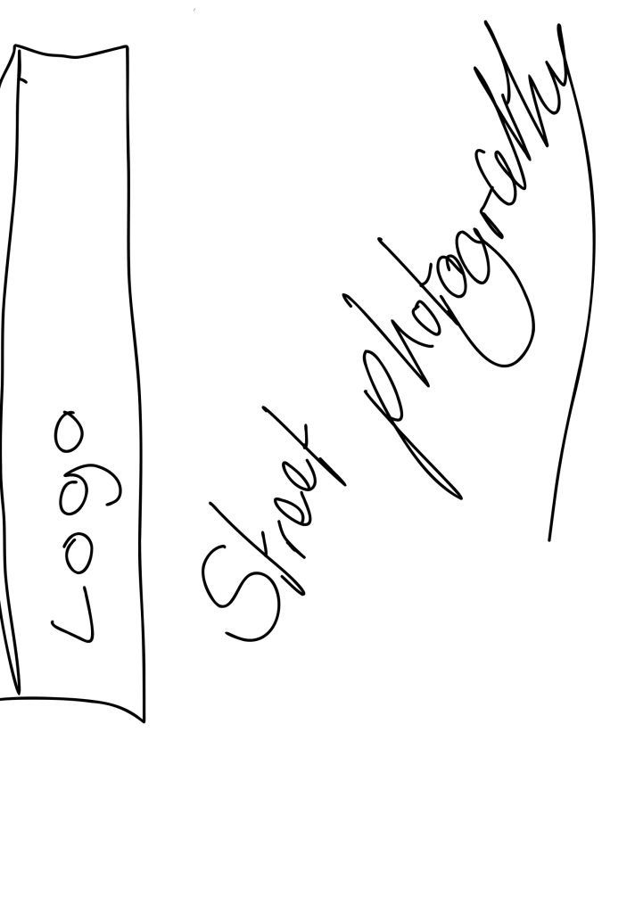
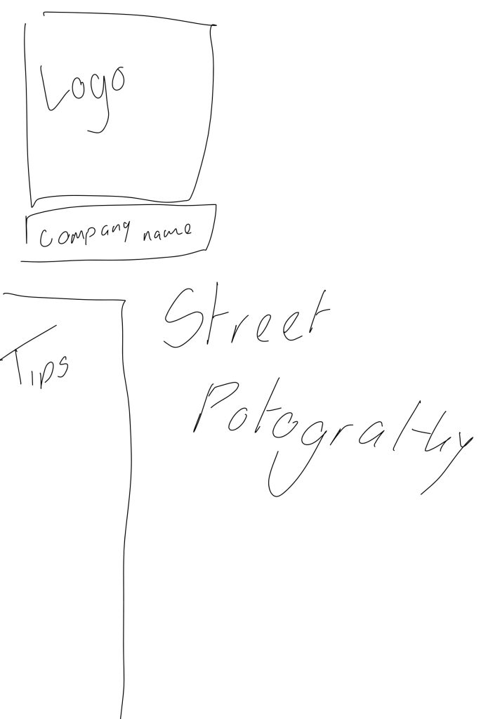
On my topic of overpopulation I made 6 different sketches for these three to see what I would feel like would suit better with my topic the sketches showed what the layout on the cover be with moving the logos I made typographical logos I made as well and where the points and facts go and even the style of cover or photography and I chose these 3 covers out of my 6 ones because I find that using photography in covers makes the topic more interesting and I used a drawing ones to add colour and positivity to the topic of convocation out of all three I prefer the first one because its more my style and I love the cartoon effect .
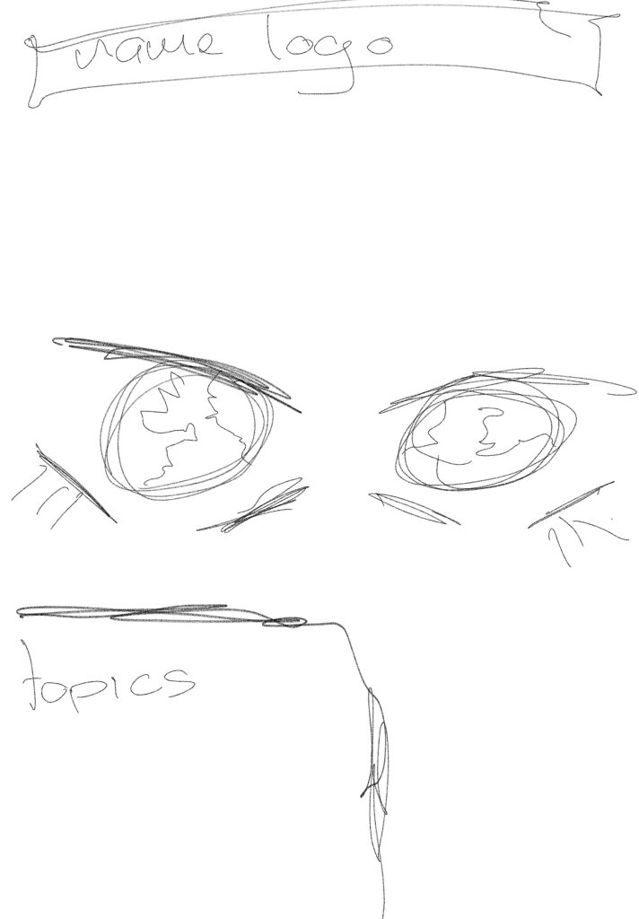
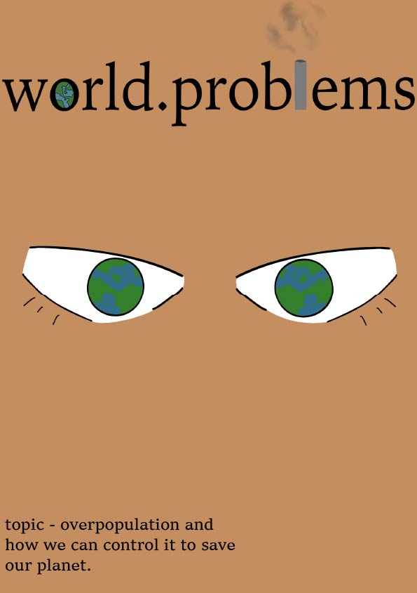
On the first cover I decided to do an cartoony feeling to the cover and I drew eyes with an world inside the eye like one of my logos have and I feel like this gives off an good positive vibe even though it isn’t a positive topic and I also added an skin colour to make it seem its from a person perspective and I added the topic of convocation the logo I used was my longer logo and it says world problems with the o as an earth and the l as an chimney where the air pollution comes from. I personally think the logo really suits this cover because of the style of the small decorations added to the logo.
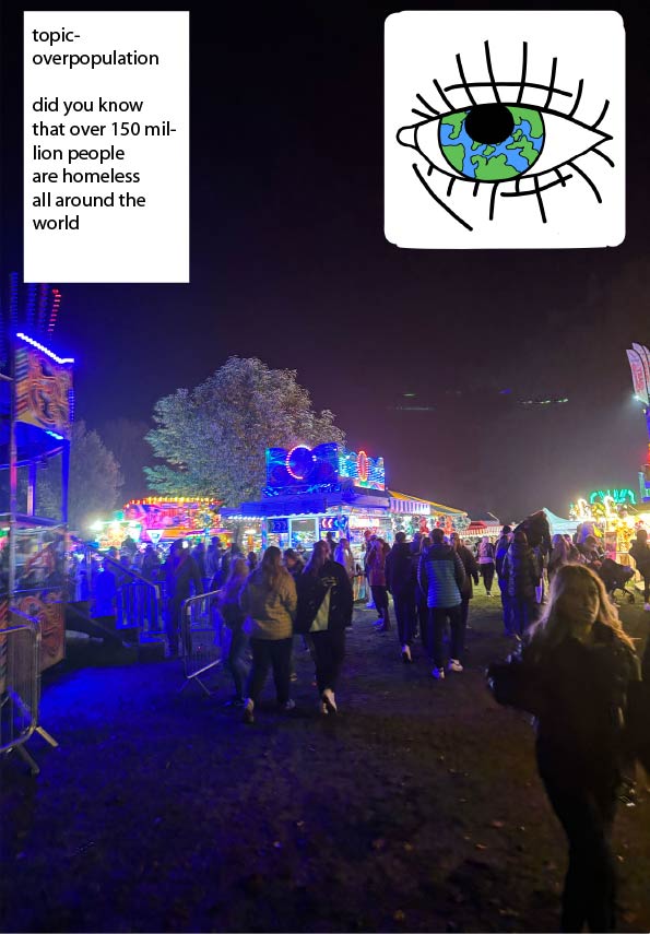
On the second I did a fun fair that’s full of colours and excitement what’s crowded with people and a lot of overcrowded places can cause danger this means we should also be careful about over crowded places and have an limit on how many people can enter to make it an safe environment I also used my eye as a logo and put a fact about overpopulation and homelessness because it was such a dark background you couldn’t see what I was putting so I had to make white boxes to see what I was putting down although it wasn’t ideal it was the only way I could figure out how to do . the photo I used I took myself at Winterton bonfire night I found it so overwhelming with the massive ques to get on rides and such
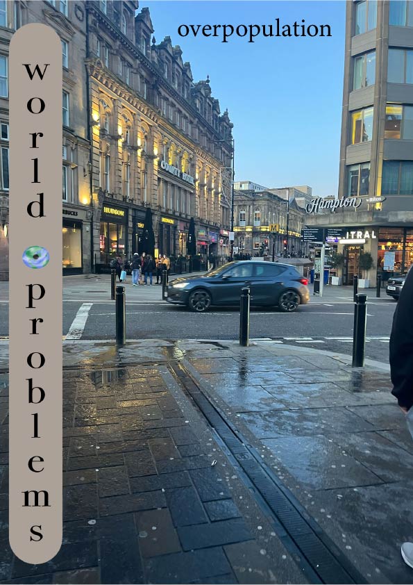
The third cover I also had to do the same thing behind the logo, but I used an beige colour to go with the background and I used the vertical logo what gives an Morden feeling to the cover I also added the topic of convocation and the picture I took myself In Newcastle in the city centre although it might not be busy its certainly full of people pushing and getting past most days .in this logo it says world . problems and I used the ‘.’ As an earth in between the logo to add some character I find that the font I used is very popular in newspapers and such .