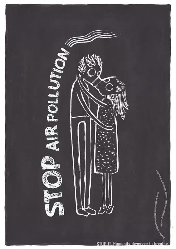
I’m using this poster as a good example for conceptual design the reason why is because of the design of this poster makes people feel concerned for the public and want to change as air pollution does a lot of damage to our bodies and the world. the poster itself is beautiful. They used a couple hugging and two gas masks and put them together as they kissed. they have used gas masks to resemble how bad air pollution really is for our bodies. Really do love this design because of how simple and understanding it is. there isn’t too much going on, and they describe the main problem/topic, i personally love that they have put at the bottom of the poster saying, “stop it. Humanity deserves to breathe” if you look closer it’s in the shape of a cigarette with some smoke coming out from the end, this also shows what smoking does to our world and our bodies. there is a lot of shape from the bodies the smoke and shape from the cigarette and the bubble like font .
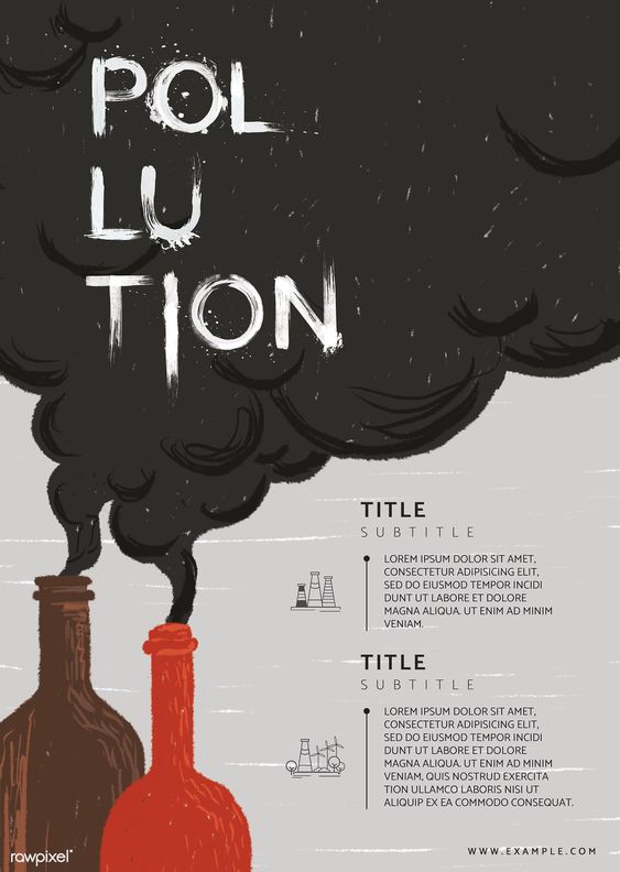
I’m also using this poster as another example of composition design. The design on this poster is a great example of how bad it is they have used alcohol bottles to make the shape of the factories. but they have used alcohol bottles because that’s also bad for our bodies just like how air pollution is and they have used the smoke coming out from the bottles to make a box for the title “air pollution “. the bottles have lots of shape to them to look like the pike of a smoke factory and the lines to see the shape of the smoke as well in the title.
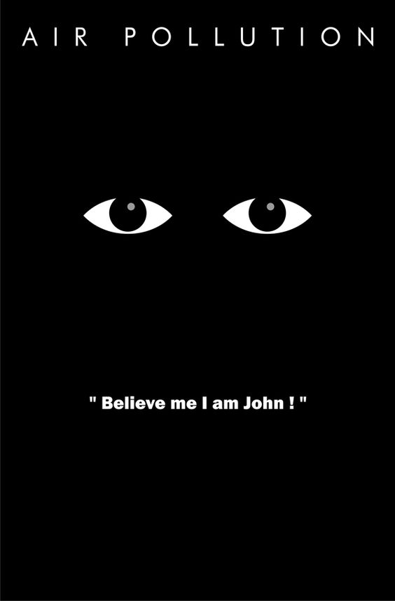
I’m using this photo from “ ego poster ‘ as my bad example for composition , the idea of the poster is a cool concept but it doesn’t really make people concerned for the public its not appealing to the public eye and that means no one will care to look at it , the idea of the poster is that there is so much smoke from the factory’s what have created the air to be so black and damaging that you can’t see people that’s why it says on the poster “ believe me I am john” even though it’s a cool idea it just doesn’t give any warning to the public about air pollution . to fix this poster I would put points on what air pollution does to us and made the top of the poster “ air pollution “ more noticeable to the public eye .It also doesn’t have any shape what’s so ever to the poster apart from the eyes, but I would also make the person more clear with clouds of smoke.
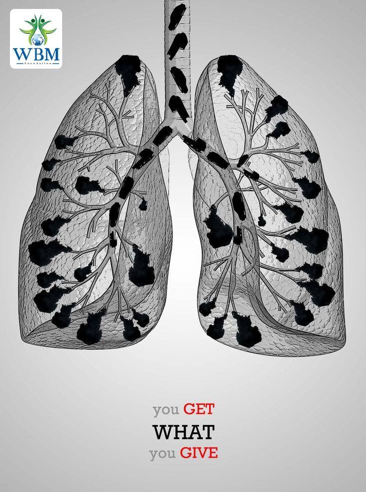
I’m also using this photo called “save the planet “as another bad example for composition it’s just very poorly explained and not that much of a great drawing the whole idea of the poster is smoke from the factory’s or from smoking cigarettes gone into the lungs and damaging them but it just looks like black scribbles on a copied photo of lungs. both of what the possibilities of what this photo means are both damaging to our planet and our bodies although there is a lot of shape to the poster it isn’t easy to understand what it is and they should make it more clear to the public
photo links
stop air pollution – https://uk.pinterest.com/pin/651896114844592438/
air pollution industrial chimney poster- https://www.rawpixel.com/image/2260408/free-illustration-psd-illustration-poster-recycle
ego poster stop air pollution – https://www.behance.net/gallery/3140582/Eco-Poster-Stop-Air-Pollution
save the planet – https://uk.pinterest.com/pin/651896114844709598/
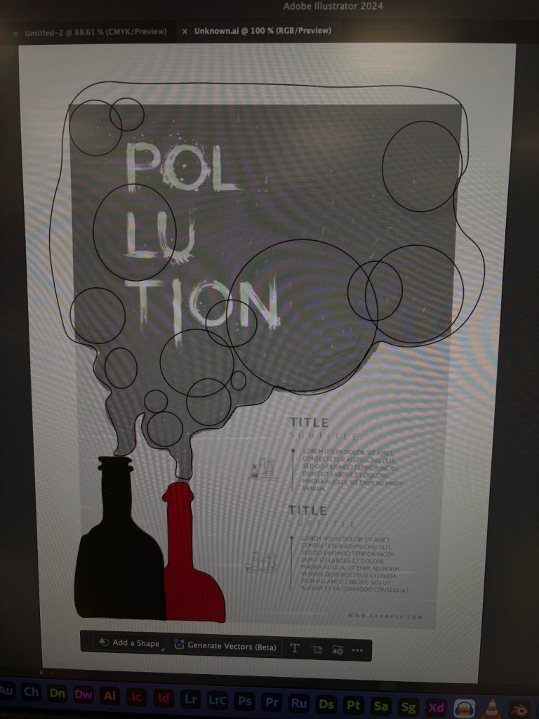
my edited photo to show the shapes