Over the last few months, I have really explored in graphic design such as typography, colour, style, and it is all around us its in posters its all over the world and you see it everywhere everyday without even knowing it.
On my first assignment we explored typography, conceptual design , colour and composition just so we understand what it means and such and I found this assignment really fun it really got me understanding what it means and such and how colours go with other colours and we talked about good and bad examples on these topics
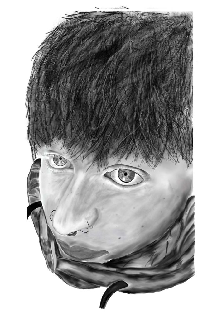
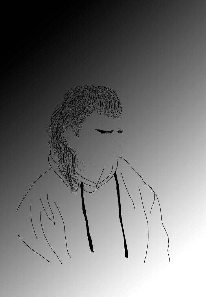
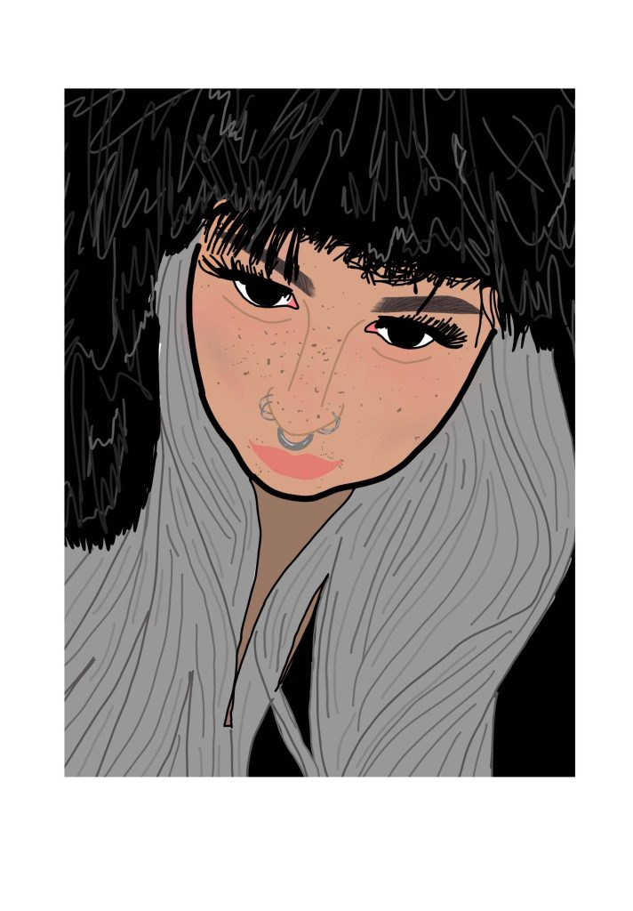
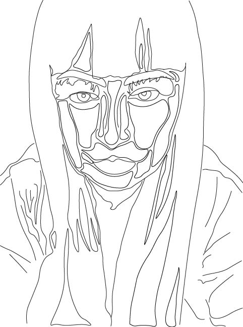
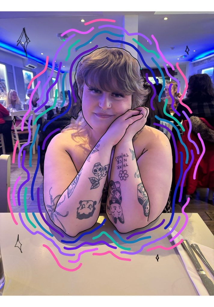
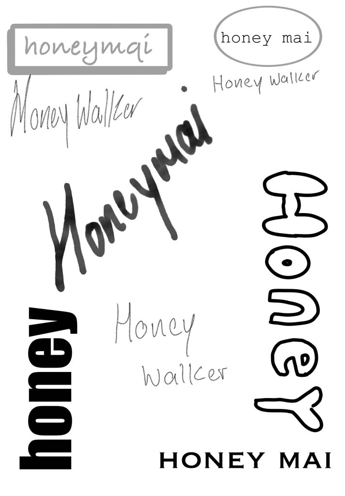
On my second assignment I actually got start working and I got to work on illustrator and such I started on name logos and I really enjoyed messing with the colours and such and I explored a lot of different fonts and I find how different fonts give certain feelings and vibes my favourite part of this assignment was the photoshop self-portraits they show so much detail in my face and I love how they turned out they took me a long time to do I feel like I’m looking though a mirror of myself when I see it I also love how they all in black and white , for the logos I made my magazine logos but I also saw myself in them and I loved how they turned out they are so empowering and confident I also did an outline portrait of myself in illustrator and its so Morden and complete different feeling to what I had in the others its so calming and freeing to look at and my other one makes me feel happy and positive I used a lot of dull colours in this portrait and I think it gives off an very positive feeling . in my self – promotional posters I used two very bright happy photos of myself and added a lot of colour and such I also did an outline of myself on one of them as well to give it an cartoony effect and on the other it’s an massive bubble around my face to show I’m the main person in this poster . I really loved and enjoyed how everything turned out on my first project.


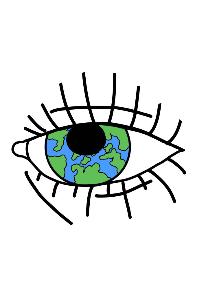
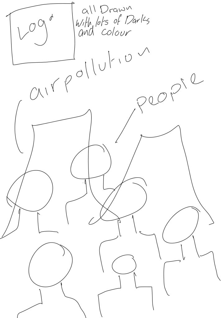
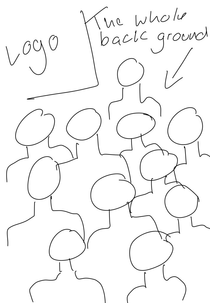
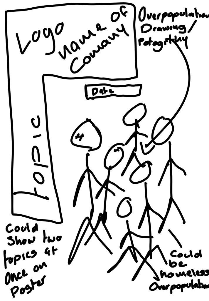
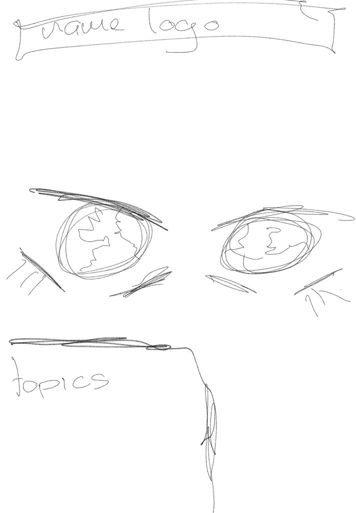
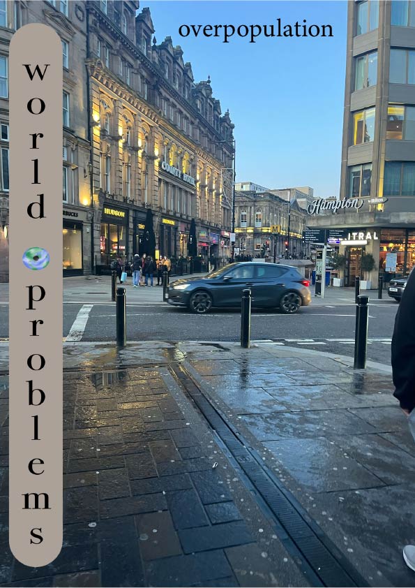
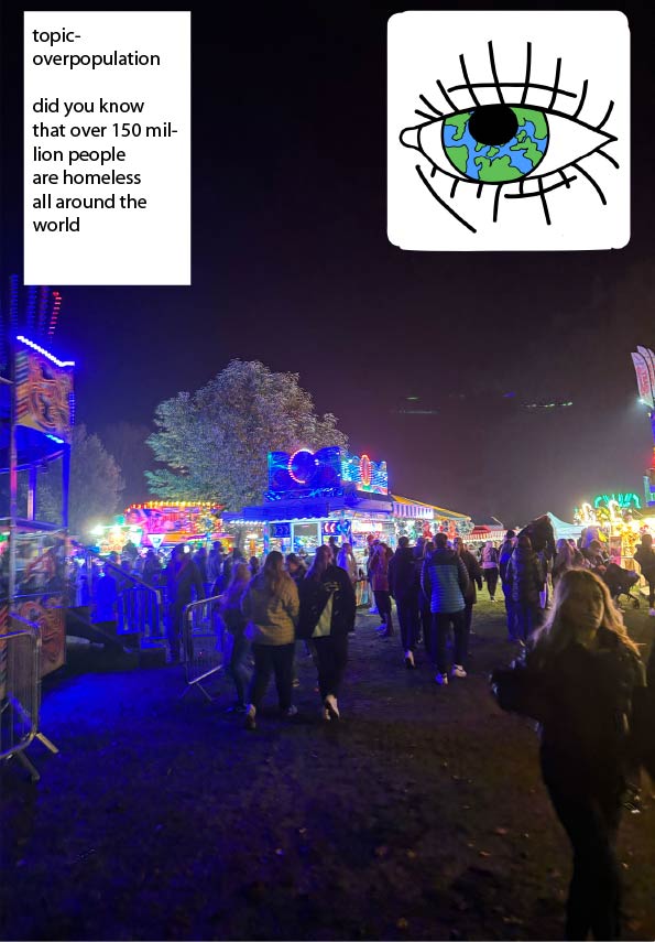
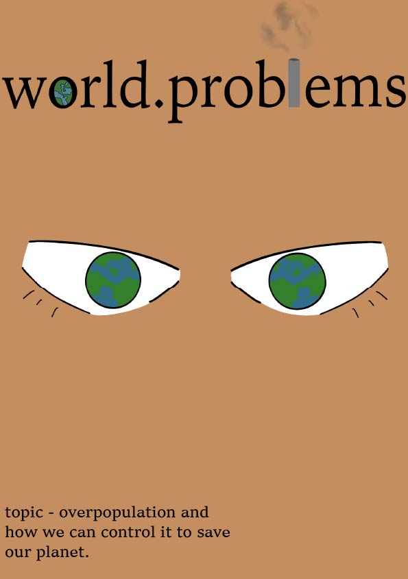
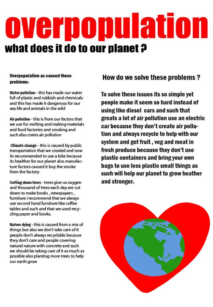
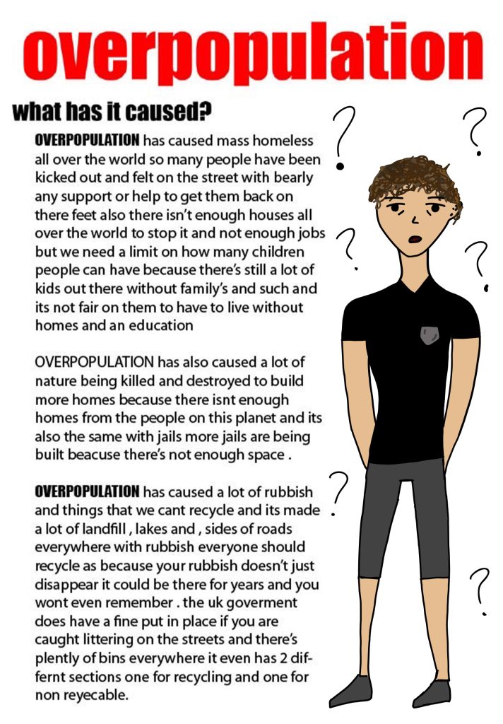
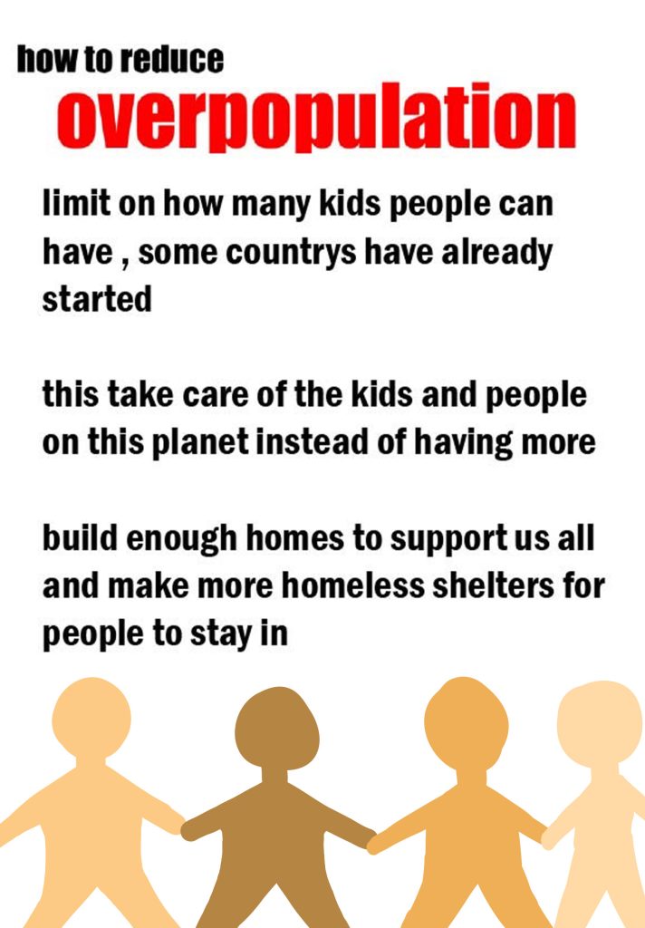
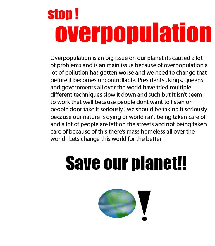
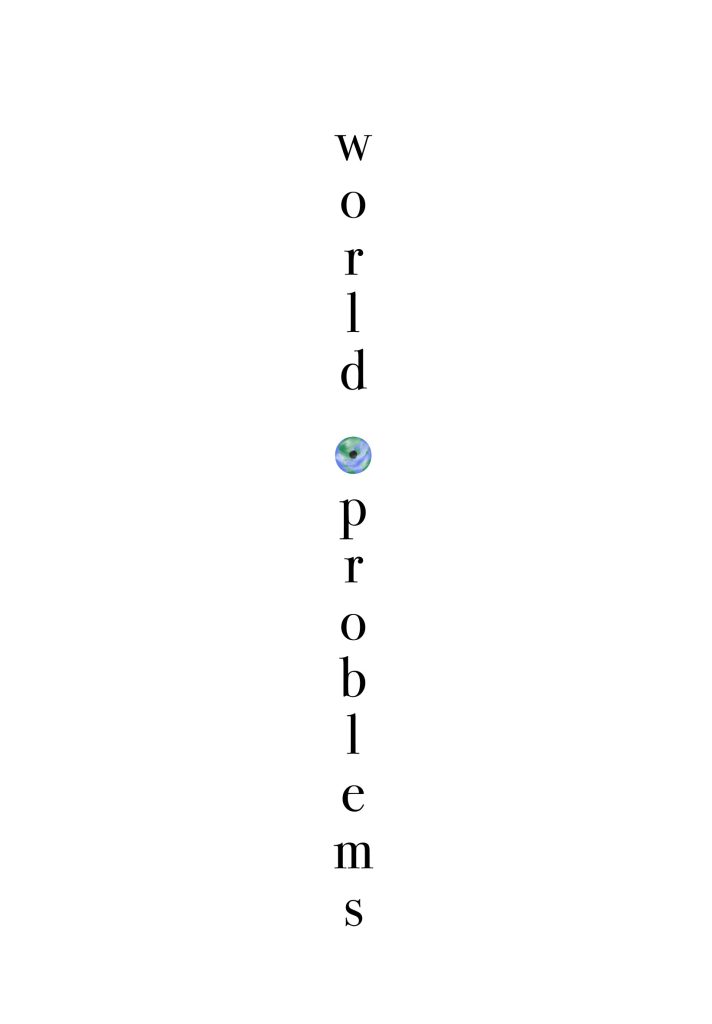
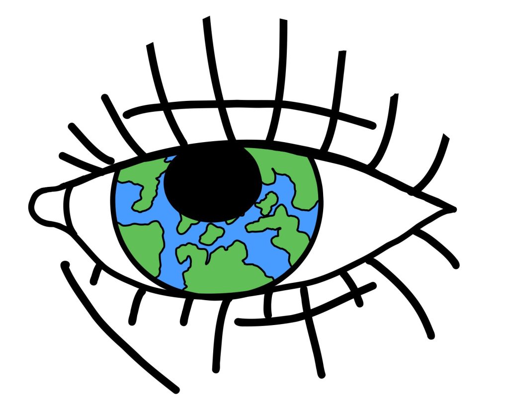
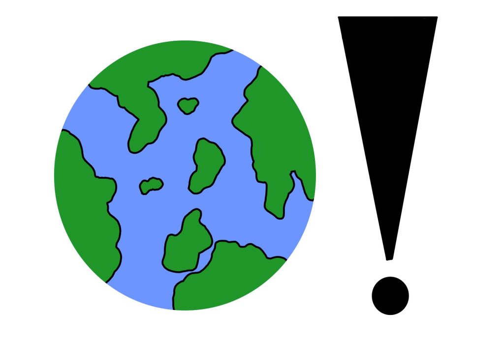
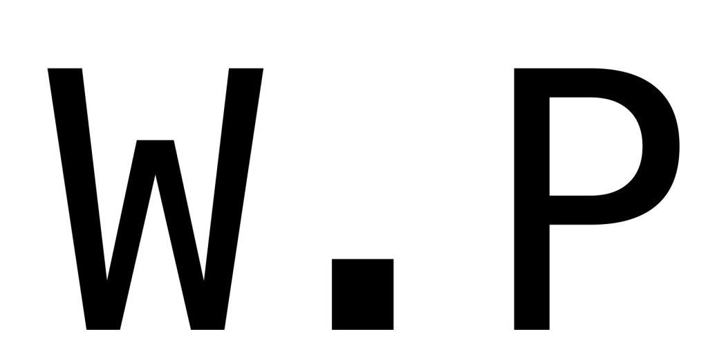
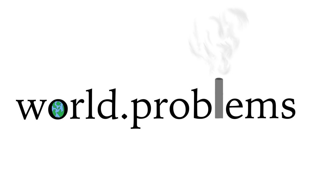
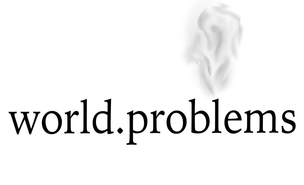
On my third assignment the topic was about overpopulation and doing poster / magazine covers so we had to make name logos and such also do a lot of sketches and information pages about the topic on the name logos I did multiple different styles and forms of the logo to add some range of the logos and my favourite one is world. Problems but the ‘o’ is an earth and the ‘l’ is an chimney from air pollution its quite colourful and interesting because even though it says what its about in the name It gives it colour and a bit of extra detail to the name logo I also did an more simple one of the same logo what I was recommended to try by Robert and its nice but I don’t think it gives much attention to the poster and in the information pages I used a chunky like font to scream DANGER or IMPORTANT INFORMATION and when people hear that they automatically think oh no we need to look I also added drawings in the information pages to give a positive hope to the information pages , the last part of this project was the posters and I did three covers one drawn two photography I felt like photography was an good aim on these posters so we could show people how the public is and how over crowded it is I also loved the drawing one that I did its simple blunt but it also gives off an powerful energy to all the work i did on this projects I used a lot of sketches even some of them I never used but its good to sketch what comes to your mind even if you don’t take it any further