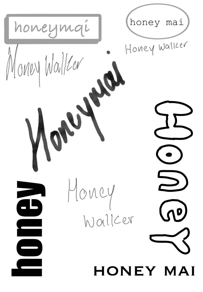
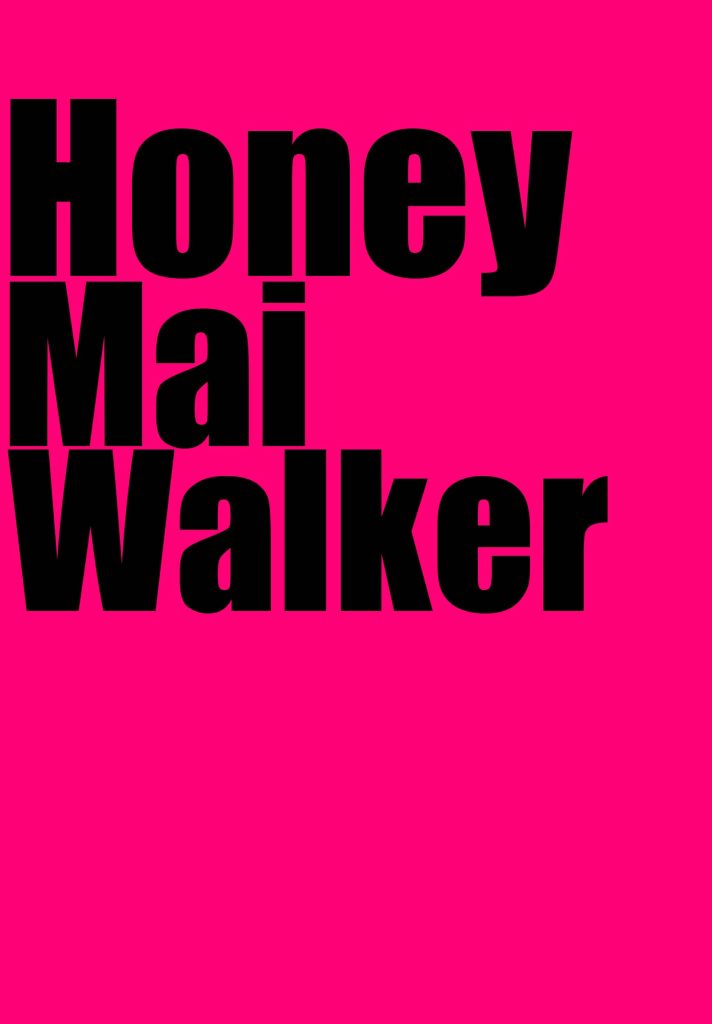
On these posts of original artwork, you can see I’ve explored many different forms of typography and what I personally think is best I’ve also done forms of my own hand writing drawn from my iPad. all the fonts give off certain feelings and emotions as some of them show shocked emotions and some of them show positive and I’ve also noticed how some of them have fonts based of certain times of the pasts in newspapers and films they can go from 60s fonts and earlier in certain fonts. All fonts have different thickness and thinness some fonts also have different thickness on flicks some fonts are also tall and thin and some are chunky and tall also the same with shortness. it’s like people. they come in different ways and all fonts was created by multiple different people and they also put emotion and feelings into them fonts to show how the make others feel while reading a title or a page on that font. one of the most popular fonts what are used are futura what was crated 1927 by an typographer called Paul Renner , to read more information on this man and this font is on the typismcommunity.com . I personally like the chunky fonts because I feel like it gets in your face and shows loud and proud, confidence and uniqueness. That personally screams my name as I am a very open, loud, confident person. if I was a font, I would be Algerian because of how it styled it’s a font that stands out and makes people think wow it must be a big deal, It stands out and makes people interested it’s also a font what would be great for newspaper titles because it stands out and it would make others interested reading it or could be used as a book , poster title . it stands out to the public eye.