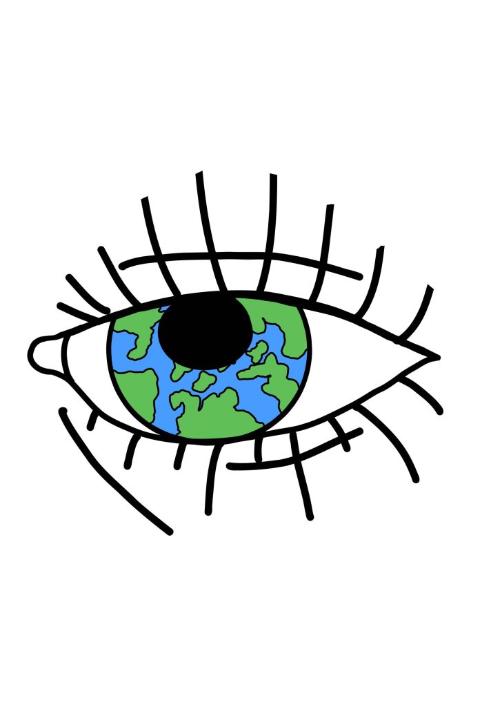
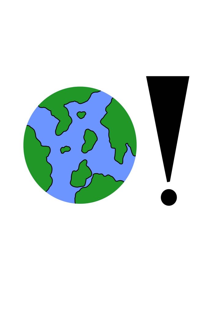
The logos I have designed are based of my theme overpopulation. I have used adobe fresco to make them. The first logo I made is a drawing of earth and big exclamation mark next to the earth and when its upside down it looks like a person in a dress from how its shaped. this is to show world problems and one of the main ones is overpopulation and a lot of other problems connect back to us people because we created the problem at the start and made it worse over the years. I’ve also done sketches of these logos that I will be sharing and putting this website, the sketches explain the process of the drawings and how they are set out they also explain the meanings behind the logos. The second logo is an eye and the inside of the eye is the earth to show how we should see our planet and its problems to look at how we can stop these problems and look at fixing them I like how simple yet meaningful these logos I had made I feel like it shows an Morden version of the future and how we can look for a bight future . these logos mean a lot to me when it comes to fixing our planet because it stands out simple yet colourful and people will come across it and find interest and read into it because of how its presented. people need to realise our planet isn’t well taken care of and there needs to be awareness on these topics we can do it in a way by promoting these logos to the public and make tips on how to make the earth a better place. The logos are the starting of the posters, websites and such more .